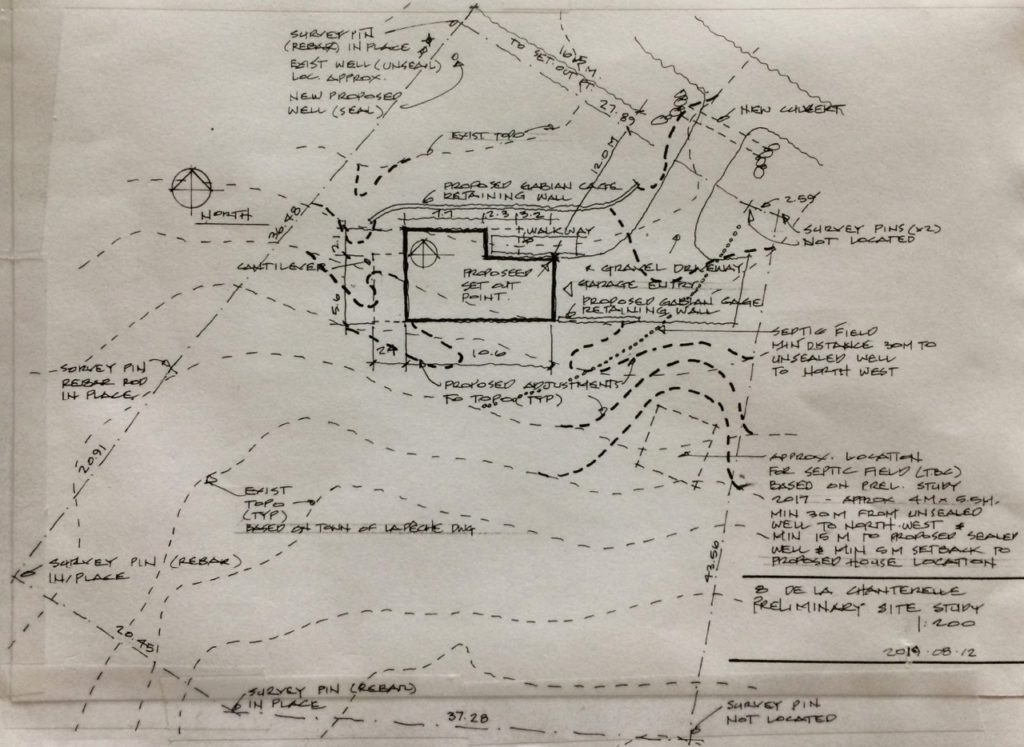
Le 12 aout / August 12th – The site plan shown above was done in advance of bringing in a surveyor – and as a general review and update of the proposed site layout and grading. The drawing could also be used in preliminary discussions with a contractor.
The survey work was needed to stake out the east property line, the only portion of the site’s boundaries where markers had not been found. This information was key to finalize the location of the well and septic field. On some properties, the requirements of this infrastructure will have a major impact, if not drive many site layout decisions.
*
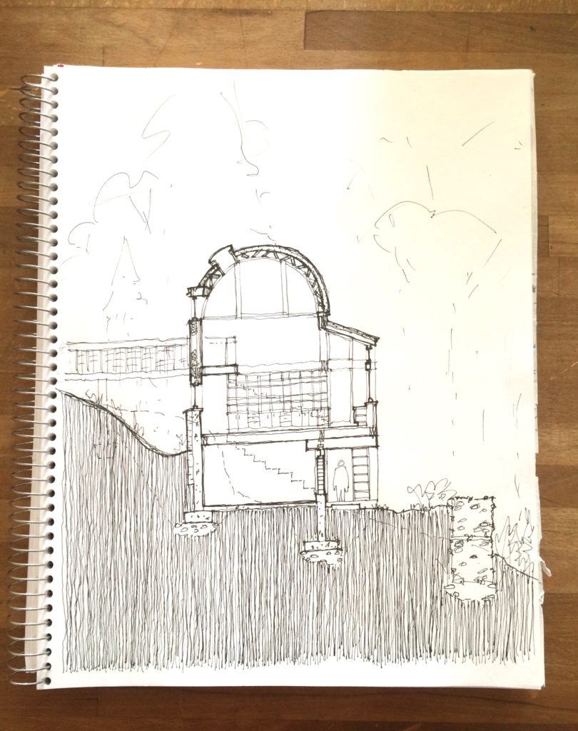
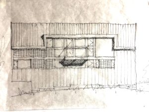
Le 5 septembre / September 5th – This north-south freehand section does not reflect one particular place in the plan. It shifts to capture several conditions. The purpose of the drawing was to look at specific details in section – to show architectural intent for materials and assemblies, and how they come together at typical junctures. For example how a typical wall and floor meet, or a wall and roof juncture. The individual components of the wall and roof assemblies, their thicknesses and sequence, start to be explored and identified here. As these details begin to have some level of technical resolution, they would be drawn larger, and to scale.
A section is also a tool to understand spatial relationships within a building. For some projects the building section is the ‘parti’, or core idea for the overall design.
Through completing this exercise, the design has evolved. Current thinking is to extend the use of exposed concrete for walls and floors to the upper levels. The drawing was done ‘by eye’ and ‘from memory’ – without a scale, straight edge, or reference to the plan. Not that there is any particular benefit to working this way – it just as likely could have been done using those tools.
While the photo here was taken in September, the sketch was completed sometime in July or August, at a time when there was some compulsion to really understand the building components and how they fit together. A next step in terms of sectional studies would be to complete a series of transversal cuts, at each of the main variations in the object – and at least one section on the east-west axis, at the top of the roof’s arc.
**
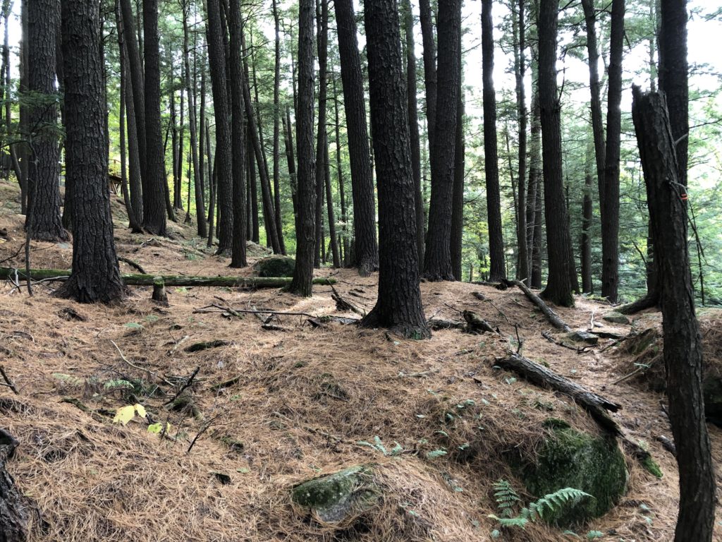
Le 8 septembre – sur le terrain / September 8th – on site
***
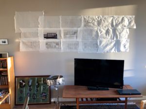
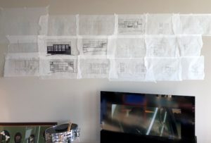
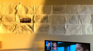
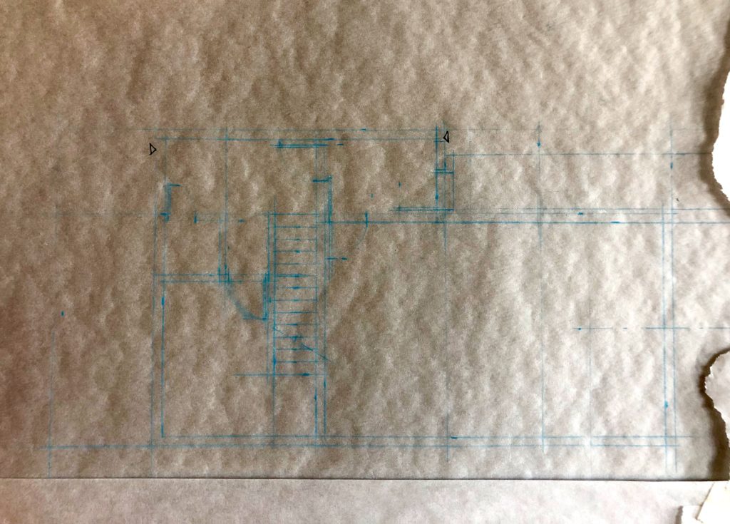
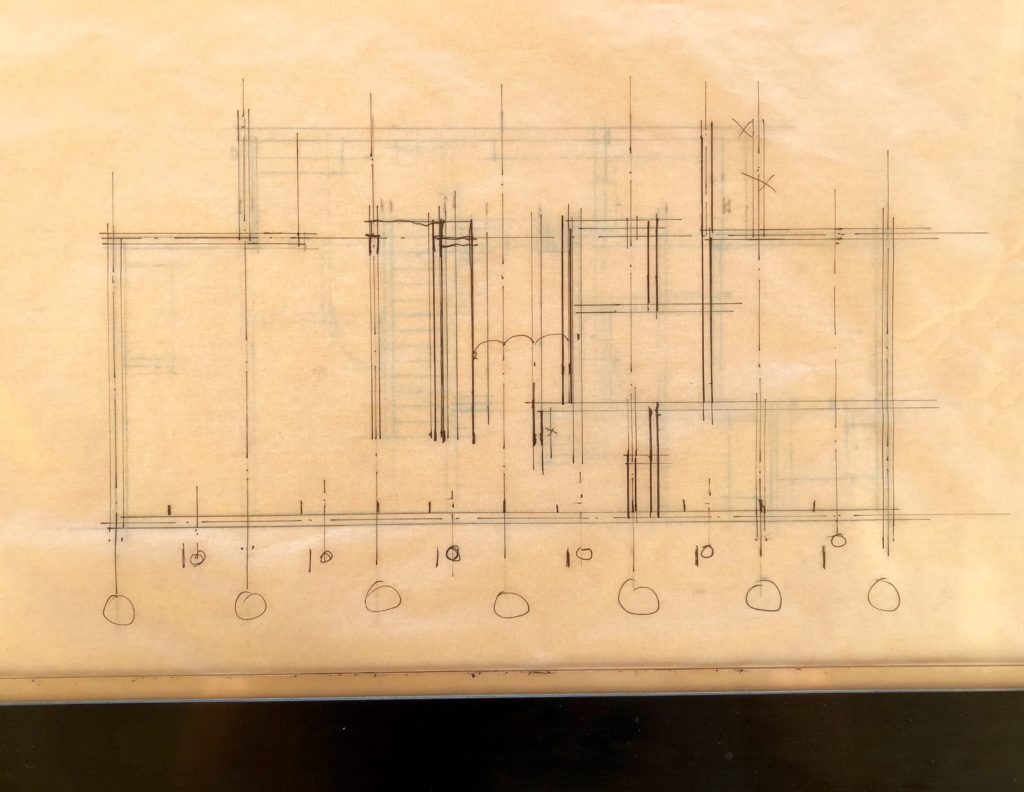
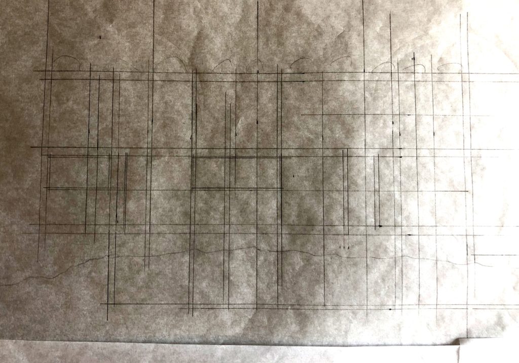
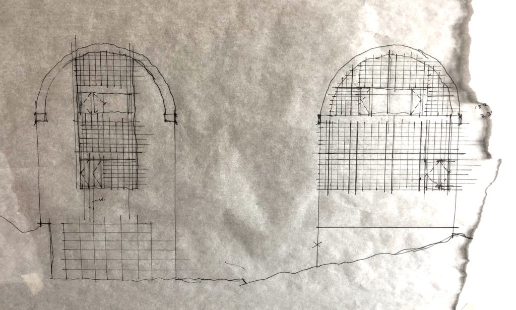
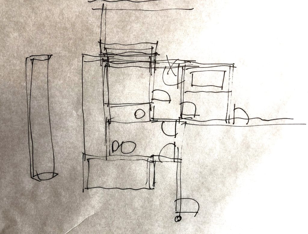
Design development drawings from September and October were collected recently and pinned up. The photos shown here were taken between October 19th and 26th.
Following up from previous work that was done in Sketch-up, the floor plans were re-laid out and hand drafted at a scale of 1:50. This is a good scale to look at the intricacies of plan for small or complex buildings. Most of the time that was spent on the plans, focused on the main ‘living area’ floor, which is the second level. Next, the house elevations (building facades) were drawn – overlaying or pulling from the plans – so again at a scale of 1:50. A smaller scale, 1:100, would be appropriate for a next round of elevation studies – simply that it would be faster to work through options and general refinements at that scale.
The study of structure and window rhythm patterns in the elevations – across the three levels – proved to be a key tool in going back and fine-tuning the plans. The floor plans had originally been driven by functional requirements and views, the sun, interior spatial relations, and the interest in keeping the house’s footprint simple and tight. A preliminary planning rhythm had been assumed early on, however with subsequent elevation studies and the interest in having some regular, if syncopated, window pattern, the horizontal planning modulation came into sharper focus.
As for elevations, while a true ‘flat’ view is not the typical way we see buildings, and not generally how I have worked in Sketch-up, it is the most effective way to study the rhythms and relationships of the elevations. A true elevation is a test of a facades resolution – a great successful facade will sing in harmony.
The elevations for La Peche, particularly the south elevation which had had the most consideration in the Sketch-up model, shifted considerably based on interior and exterior considerations. In terms of windows and light – glass block had been thought of as a significant glazing material for the house. This had not been drawn in Sketch-up, so was explored with the current (not to be confused with final) elevations. Through these studies, the understanding of interior spatial qualities also evolved – particularly for the main level double height living/dining room, as well as for the kitchen and bathtub room.
The i-photos app on my computer indicates the location for these images is Almaty, Kazakhstan.
****
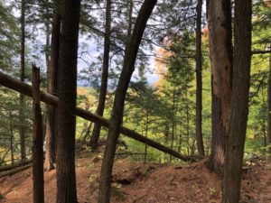
Le 6 octobre – sur le terrain / October 6th – on site. The i-photos app indicates the location for these images is Almaty, Kazakhstan.
*****
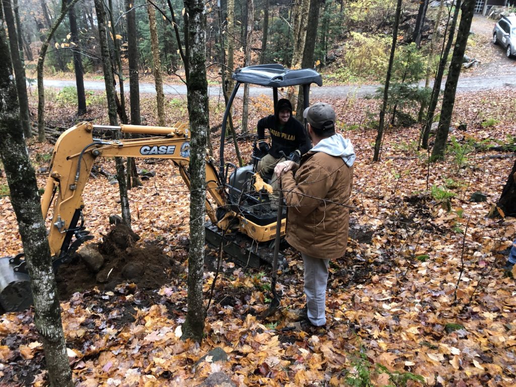
Jeudi – sur le terrain. The small backhoe was on site following the survey work. It was there to do a test pit for the septic field.
The i-photos app indicates the location for these images is Almaty, Kazakhstan.
******
