
The last image here was taken a couple of hours after the St. Patrick’s Day Parade 2017
Notes on architecture 11 – a new museum in quebec city
The new contemporary arts addition at the Musee Nationale des Beaux Arts de Quebec, opened in June 2016. The project was designed by the Office for Metropolitan Architecture out of Rotterdam and New York. OMA is a progressive, progressive-debatable, international design firm. To complete the work, OMA collaborated with Montreal architects Provencher Roy et Associés.
The project, Le Pavillon Pierre Lassonde, was developed through an international competition that at the initial stage, received 108 submissions from 19 countries. As a built design, the project would be considered a cool minimalist sculptural work by some; and by others as too assertive in the context of this historic town – or perhaps anywhere. For others still, the mix of new and old in this environment is positive. One could argue that if a contemporary arts museum can’t be contemporary, what can. The intent of the text here is to simply look a few characteristics of the work; the project parti, the use of glass, and the structural cantilever.
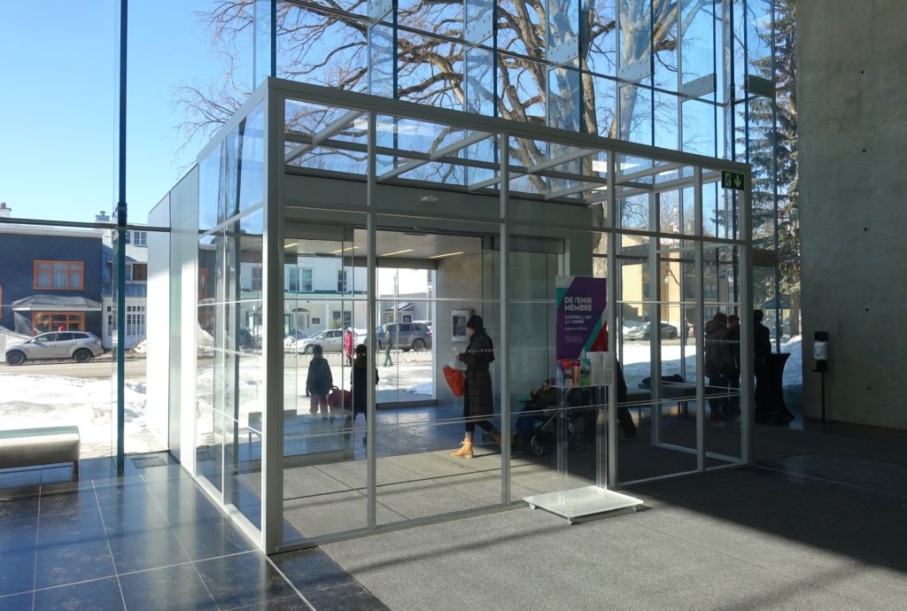
The ‘parti’, that is the project’s core conceptual relationships shown as a diagram, is the shifting of three large stacked rectangular boxes of space. These boxes slide one above the other creating a set of steps on one side, and a cantilevered gallery on the other. The steps form two terraces on the back, which is south. The views from the terraces are to an adjacent park slope that has some trees, and below, several older cultural buildings. Three of the park buildings house other collections of the MNBAQ. On the north side, the significantly cantilevered top level gallery covers the lobby and a small plaza. The Pavillon entrance and plaza face one of Quebec’s main streets, La Grande Allée, a ceremonial and entertainment street that leads from here to the old city. The cantilever is impressive as a structural move, but in some respects the engineering accomplishment is lessened by the lobby below which has glazed walls on three sides. The glass encloses half of the cantilever’s length. Glass is not always transparent – during the day a conventional modern glass box appears dark from the exterior, and we generally understand that structure to support the glass and spaces above is provided, whether there is supporting structure there or not. At night and from the interior, one may pick up, or miss the fact, that there are not columns in the corners.
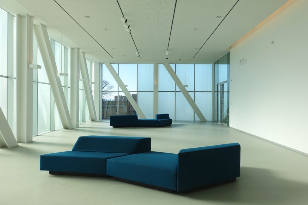
Much of the glass on the project has a white ceramic frit applied. This regular mist-like pattern tempers the solar heat gain on the interior, and allows a somewhat shaded view to exterior. In the daytime the frited glass appears lighter from the outside than conventional glass. The white ceramic frit was used on the large boxes of space in combination with light coloured metal cladding. This makes the big boxes of space appear more uniformly as simple volumes. In the lobby the glass does not have frit, and is thus in contrast to the large light coloured boxes. Similar to the cantilever, the lobby glass wall is a highly technical structural design. The glass ‘curtain’ (here not actually called curtianwall but instead structural glazing) is in fact supported by laminated glass fins. Other than some metal hardware, no mullions, steel back sections or other support members are used. The entrance vestibule that is inserted into the glass wall is similarly an exercise in reduction. While the glass never fully disappears, the interior-exterior connection is taken to an exceptional level.
The overall impression of the Quebec arts pavillon, materially and formally, is one of big moves and lightness – from the exterior and interior. The entrance cantilever, as it’s seen standing across the street, or from being sheltered in the lobby or under the overhang, does maintain some drama. While the shifting box parti, or minimal sculptural quality may not be of interest to all, the building is not out of scale to the older adjacent church, park, or street neighbours. It is a contemporary piece by a significant critical architectural firm. There are spaces scattered across the project, inside and out, that are broadly engaging and would be considered smile-worthy or photo-worthy by many. It is reported that the new addition has had a positive impact on museum attendance.
