CEF Building 50 ……. 2006 – 2017


Summer evening –  Interior detail + facade – July 2017


Topiaried entrance – Interior detail + facade – June 2016


Light Snow – Facade, interior detail + approach shot – November 2016


Summer day with clouds – August 2014


Summer day overcast – August 2013


Plywood  – Facade + interior view – October 2011


Koi – Interior detail – November 2006

NOA 22 – Ottawa Ontario Canada 2017 – Two Views at 180 Degrees

A little more than a week ago on the summer solstice, Canada’s National Indigenous Peoples Day, Prime Minister Justin Trudeau announced that the space behind him would become an Indigenous Centre.  The building is the former US Embassy and has been unoccupied for almost twenty years.  It has a direct relationship to Parliament Hill.

Ottawa, ontario and canada are place names based on indigenous words.  I am currently working on a project to create maps that only include the conventional contemporary names for regions and locations which are based on indigenous words.

NOA 21 – Revisiting Mississauga City Hall


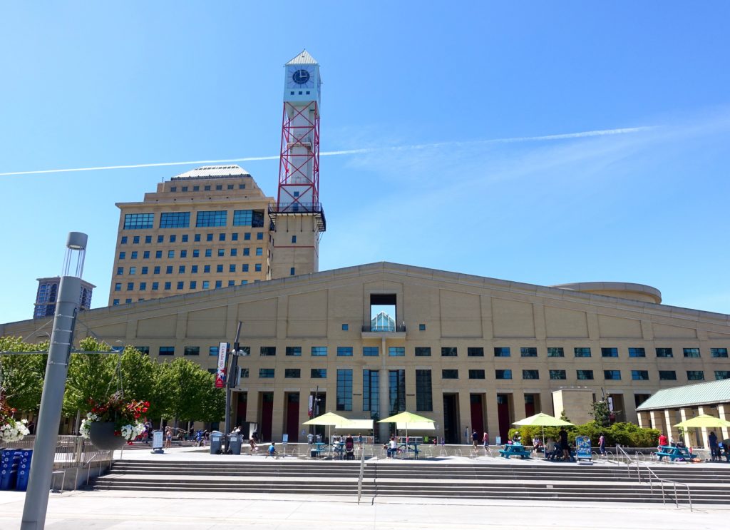
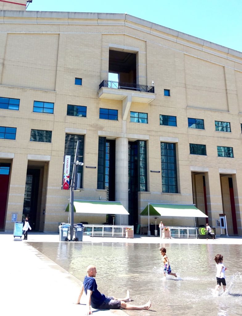
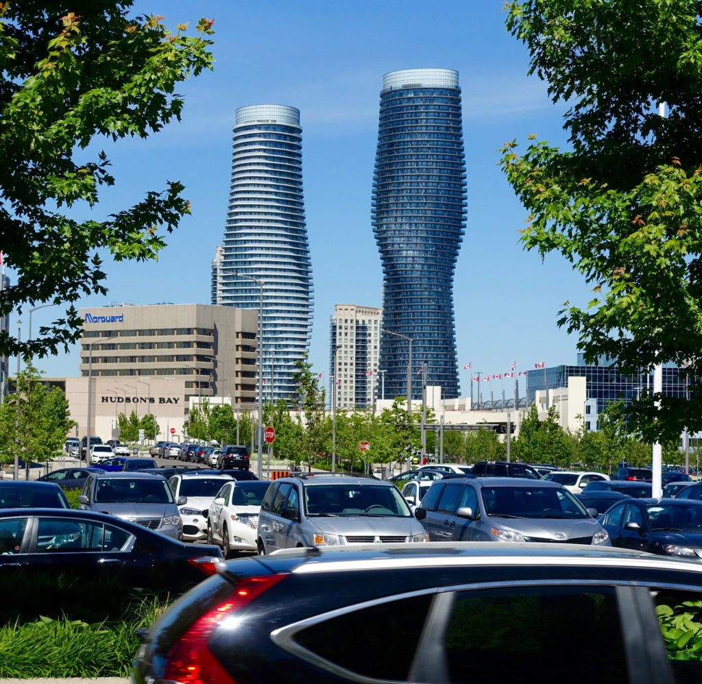
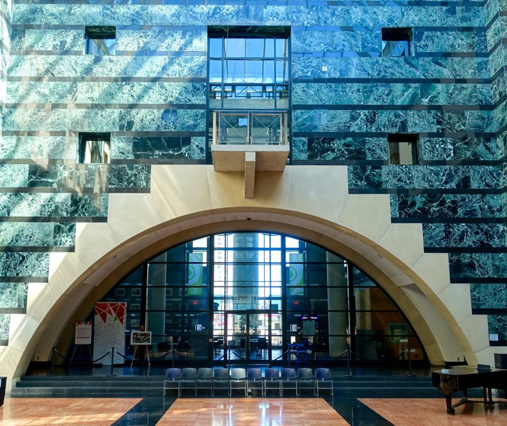
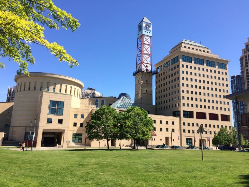
Mississauga is a southern Ontario suburban city, part of greater Toronto.  Its architecturally postmodern city hall is the result of a international design competition in 1982.

Recently within the space of a week or two, this project came up randomly in conversation as the best or worst building in Canada.  I had visited the project in the 1990s and had mixed impressions.  Based on the recent discussions, I revisited the building earlier this month while in Toronto.

The competition had 246 entries.  Its jury included respected British architect James Stirling, as well as Phyllis Lambert,  an architectural patron from Montreal.  Ms. Lambert is credited with the selection of Ludwig Mies van der Rohe as the architect for the Seagram Building in New York, and was instrumental in the establishment of the Canadian Centre for Architecture.  The Mississauga competition was won by Jones and Kirkland from Toronto.

———————-

In 1982, postmodernism in architecture was at somewhat of a high point. The pure simple forms of modernism had largely lost favour with many in the architectural community and the public.  Unornamented buildings with large expanses of simple repetitive features, on bare plazas (that by the 1970’s were frequently referred to as windswept), were seen as unrelated in scale to the individual. Modernism’s mathematical abstraction generally lacked any emotional or social content. Often you couldn’t tell where the door was.

While there is a wide range of postmodern output, there are a number of key conceptual or aesthetic elements that come together under the PM banner.  Postmodernism looked to bring human scale and human experience into design solutions.  Large architectural volumes were broken up into smaller human scaled volumes.  Historical elements and references,  clumsily simplified or playfully re-interpreted, become popular – and some level of decoration was re-introduced.  Robert Venturi and colleagues, who had also looked at Las Vegas and the american commercial strip for inspiration, published a treatise titled ‘Complexity and Contradiction in Architecture’ in 1966.  In the book’s introduction  Vincent Scully makes the claim that this is “probably the most important writing on the making of architecture since Le Corbusier‘s ‘Vers Une Architecture‘, of 1923.”  The book was influential through the 1970’s and 80’s.

With postmodernism public spaces were designed, not as abstract compositions, but in terms of human activity.  The italian piazza was thought of as an ideal.  In the same way that stage sets provide cues to meaning, architecture and urban planning did the same – at times literally theatrically.  Communities were designed to be walkable.  One always knew where the door was.  The points here are not a definitive list of postmodern architectural characteristics, but provide some background to the discussion of the day.

Many of these ideas about personal and social experience that came to the fore with postmodernism have remained.   Though typically buildings today are dressed with a different aesthetic, there are lessons learned from postmodernism that architects and planners still use to approach the design and development of space – at the scale of a building, a plaza, or a city. The literal use of irony or historic references in architecture has largely gone out of fashion except for the tourist, entertainment  and residential sectors.

Revisiting Mississauga City Hall after almost two decades,  the city is still predominantly suburban, but filled out and busier.  As for the city hall, there are in my opinion better candidates for the winning place in the categories of best or worst building in the country.

NOA 20 – A Rapid Transit Station Under Construction

The Ottawa rapid transit station shown here under construction, is in fairly close proximity to two projects referred to previously on this web site – the Canadian War Museum designed by Moriyama Teshima, and the National Holocaust Monument by Daniel Libeskind.  All three projects are highly expressive formally, and are meant to be seen from many angles.    They are a reflection of a popular approach in contemporary architecture – popular with architects and the public. These dynamic asymmetrical buildings – DAB –  imply movement and are generally more sculptural than tectonic. They are not about building technology or architectural convention –  the intent is to create iconic forms, often in contrast to a more static urban environment, or as a set piece in a natural environment.  In rural or parklike settings, dynamic forms can be explained, if explanation is needed, in terms organic or in terms of landscape.   For two of the projects referenced here,  the day to day use and purpose relates to very serious subject matter.  Often with sculptural pavilions, a key element in their architectural and urban raison d’etre is ‘delight’, the third criteria of Vitruvius’s famous 1st century BC maxim for architecture – Firmness, Commodity, Delight.  The war museum and monument, as pieces, show that there is in fact some emotional range with this sculptural  approach .

There are many great examples of dynamic asymmetric buildings through 20th century modernism – some high profile ones would include Frank Wright’s Guggenheim, LeCorbusier’s Ronchamp Chapel, and Frank Gehry’s Guggenheim.  It could be suggested that once grouped, multiple iconic forms lose impact – though of course for world’s fair pavilions, as temporary entertainment vehicles, this is the standard approach.  Seeing a grouping of new permanent buildings of this type might suggest the phenomenon is on an upswing.

In the image below, the lower end portion of the new transit station is on the right.  The  white concrete volume at the Nation Holocaust Monument is central in the image.  On the left side, the dark triangular form is a feature element of the  Canadian War Museum.

Note – design credit for the rapid transit station is to be added.

NOA 19 – A Community Renovation Project


This is a small but architecturally ambitious renovation project on Victoria Island that is nearing completion.  Victoria island and the adjacent Chaudière Island are in a dramatic, fast moving section of the Ottawa River, between the city of Ottawa and Vieux Hull.  In terms of development the area has seen multiple industrial uses, including milling and early power generation.  For the project shown here, the assumption is that stone portion of the building could be more than 100 years old.  The roof and glazing appear new.  At this time Google earth still shows a flat roof on the building indicating that at least in it’s most recent past, a peaked roof was not how the building’s massing was expressed.  The project’s simplicity has much in common with vernacular architecture but also shows a restrained contemporary sensibility.

Victoria island is the subject of a territorial claim. We understand the building’s use relates to indigenous culture.

Note: Information on the architectural team and further clarification of building’s  function will be added.

NOA18 – New York Map & Compass

This post is a follow-up to a previous discussion that looked at public maps and orientation in the context of Tokyo.

In New York City subway maps typically orient north towards the top following a standard practice.  The maps are aligned slightly off true north to suit Manhattan’s predominant street grid.  A  north arrow is in many cases not provided at all on subway maps, at both the system wide and neighbourhood scale.  In Manhattan at grade, a general understanding of direction is aided by the street grid, (Avenues north-south,  Streets east-west), the proportion of city blocks, as well as by relationships to major landmarks including significant buildings, the Hudson and East Rivers, and Central Park.  At street level direction is often intuitively understood.   The terms uptown and downtown here may at times refer to a specifically defined area , however the words are also interchangeably used to simply mean north and south.

While there is a good chance of being right about direction on a sidewalk, below grade this would less commonly be the case.  The subway map system, following the predominant convention, locates one to a relative point but without providing a direction. Other miscellaneous maps and diagrams including bus maps may be turned around for us to  simplify way-finding.


You Are Here Now        Standard Manhattan subway map.  North on top is understood – a north arrow is not included.


Taxiway        Eastside is on top as one is physically facing east looking at this diagram.  As a relative direction, Uptown is simply left, Downtown right.


Bus Map        Bus map with with north on bottom.  The words north and south have been replaced by Uptown and Downtown.


Up Is Down          In this case, one is traveling from street level to the subway’s Upper Platform.


Fall Protection        Required Beyond This Point

NOA17 Service Stations – Island Park + Almonte

The two Island Park Service Stations above are across the street from each other on the Corner of Richmond Road and Island Park Drive in Ottawa, Ontario.  At the time the stations were built, Richmond Road would have been a major route out of town in the direction of Richmond.  Over the last 30 years, a significant section of the Road has evolved into a popular trendy commercial strip. The first  station, recently Island Park Auto, has now an application to the city to be re-purposed as a restaurant with patio.

The two stations immediately above are in the small town of Almonte Ontario and are across the street from each other on Ottawa Street.  Ottawa Street is the current and historic route out of town in the direction of Ottawa.

The assumption is that this short survey of four service station images are shown in the order of oldest to newest.


NOA16 Roosevelt Memorial New York


Photos 2017 04 30

The Franklin D. Roosevelt Four Freedoms Park in New York was designed in the early 1970’s by Louis Kahn.  Kahn was a highly respected architect of his generation.  While this would be one of his last design projects, as he died in 1974, he continues to be influential today.  It took several decades before the  memorial park was completed, opening in 2012.  It is located on Roosevelt Island which is in the East River in New York City.

The Roosevelt park is spatially dynamic.  In its simplest form it is made up of three outdoor spaces that one moves through, sequentially arranged north to south.  The first is an entry court, followed by a stretched and tilted triangular lawn and garden.  The final element in the design, is a solid, simple, outdoor room, and is the park’s key space.

The entry court is granite paved, restrained and neutral.  On its south side is a set of broad steps that rise up about 3 metres, and lead to the stretched, triangular shaped, lawn and garden. This  green amphitheatre has, based on its shape, lengthening or foreshortening optical effects depending on one’s direction.  Kahn accentuates this further by the addition of the slope.  On the far end, to the south, the slope returns visitors to the park’s base level, close to water level.

The focus of the garden’s layout is the stone semi-enclosed room, that is on axis at the end of the island.  As you approach this end room, you see a large cast bronze head of Roosevelt.  It is set in a raised alcove in the room’s main facade – a light coloured massive stone wall.   The room is open to the sky.   On the back side of the front wall that you pass as you enter this semi protected space, there is an engraved quotation from a State of the Union address that the former president gave in 1941.  This speech to congress became know as the Four Freedoms.  Entering the room, it would be easy to miss the quote initially,  as the view out to the river and beyond is a definite draw. The controlled view becomes more expansive as one approaches the water. This is a place where people pause – it is the destination.  It is also a popular site for photos.  As I visited, people recorded their being there – shooting both the views and the quote, or had themselves photographed with the views or quote as background.

For the approach and return paths,  those that run north-south on the grounds, there are several options – all are good  The sloped paths and the transition areas between the key spaces have an intimate tree canopy made up of Little Leaf Lindens.  These blossom in the spring.  The outer paths, on the east and west side of the garden are level, and offer views out over the water to Manhattan, Queens and Brooklyn.


*** *** ***