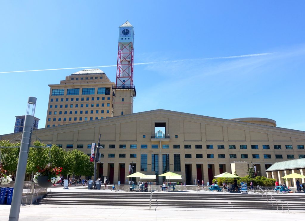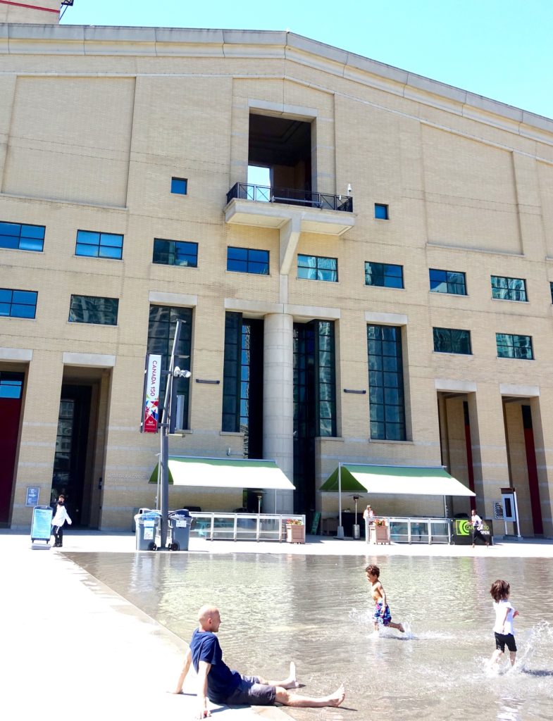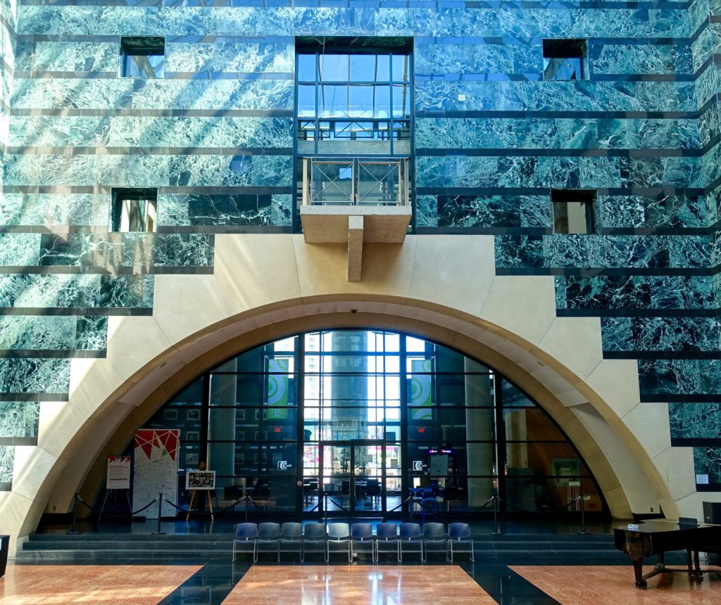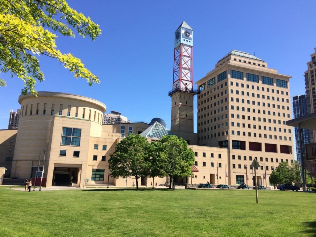


Mississauga is a southern Ontario suburban city, part of greater Toronto. Its architecturally postmodern city hall is the result of a international design competition in 1982.
Recently within the space of a week or two, this project came up randomly in conversation as the best or worst building in Canada. I had visited the project in the 1990s and had mixed impressions. Based on the recent discussions, I revisited the building earlier this month while in Toronto.
The competition had 246 entries. Its jury included respected British architect James Stirling, as well as Phyllis Lambert, an architectural patron from Montreal. Ms. Lambert is credited with the selection of Ludwig Mies van der Rohe as the architect for the Seagram Building in New York, and was instrumental in the establishment of the Canadian Centre for Architecture. The Mississauga competition was won by Jones and Kirkland from Toronto.
———————-
In 1982, postmodernism in architecture was at somewhat of a high point. The pure simple forms of modernism had largely lost favour with many in the architectural community and the public. Unornamented buildings with large expanses of simple repetitive features, on bare plazas (that by the 1970’s were frequently referred to as windswept), were seen as unrelated in scale to the individual. Modernism’s mathematical abstraction generally lacked any emotional or social content. Often you couldn’t tell where the door was.
While there is a wide range of postmodern output, there are a number of key conceptual or aesthetic elements that come together under the PM banner. Postmodernism looked to bring human scale and human experience into design solutions. Large architectural volumes were broken up into smaller human scaled volumes. Historical elements and references, clumsily simplified or playfully re-interpreted, become popular – and some level of decoration was re-introduced. Robert Venturi and colleagues, who had also looked at Las Vegas and the american commercial strip for inspiration, published a treatise titled ‘Complexity and Contradiction in Architecture’ in 1966. In the book’s introduction Vincent Scully makes the claim that this is “probably the most important writing on the making of architecture since Le Corbusier‘s ‘Vers Une Architecture‘, of 1923.” The book was influential through the 1970’s and 80’s.
With postmodernism public spaces were designed, not as abstract compositions, but in terms of human activity. The italian piazza was thought of as an ideal. In the same way that stage sets provide cues to meaning, architecture and urban planning did the same – at times literally theatrically. Communities were designed to be walkable. One always knew where the door was. The points here are not a definitive list of postmodern architectural characteristics, but provide some background to the discussion of the day.
Many of these ideas about personal and social experience that came to the fore with postmodernism have remained. Though typically buildings today are dressed with a different aesthetic, there are lessons learned from postmodernism that architects and planners still use to approach the design and development of space – at the scale of a building, a plaza, or a city. The literal use of irony or historic references in architecture has largely gone out of fashion except for the tourist, entertainment and residential sectors.
Revisiting Mississauga City Hall after almost two decades, the city is still predominantly suburban, but filled out and busier. As for the city hall, there are in my opinion better candidates for the winning place in the categories of best or worst building in the country.

