A series of studies for the Trinity Ouest Project in La Pêche were completed last year – See NOA 78, 80 and 84. Those studies focused on plans, the structural system and elevations – advancing a schematic design . With that work, the elevations were fine-tuned from a main planning grid of 5m, with the introduction a secondary series of guidelines; the latter in a repeating pattern of 1.5m and 1m. The intent then was for the secondary guidelines to allow some play across the facades while meeting internal layout requirements. That elevation work resulted in some further minor adjustments of the plans, and did generate a window pattern with some syncopation on the north and south sides.
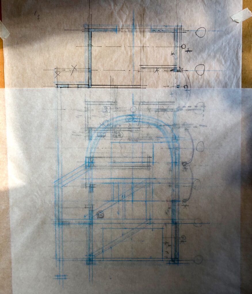
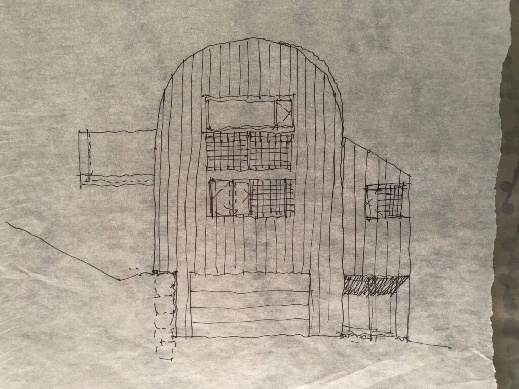
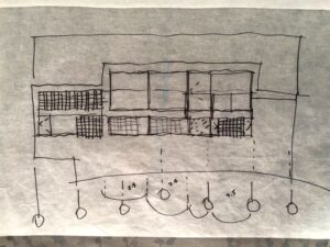
Those plan and elevation studies had been shelved for some time, but were pulled out recently for further exploration. The rough in-progress sketches shown here were done in the last few weeks. Most of these new drawings are incomplete, and some include more than one alternative to a particular issue overlaid on the same sketch. Though the work shown here was done without any intention to share, they do reflect a process of design.
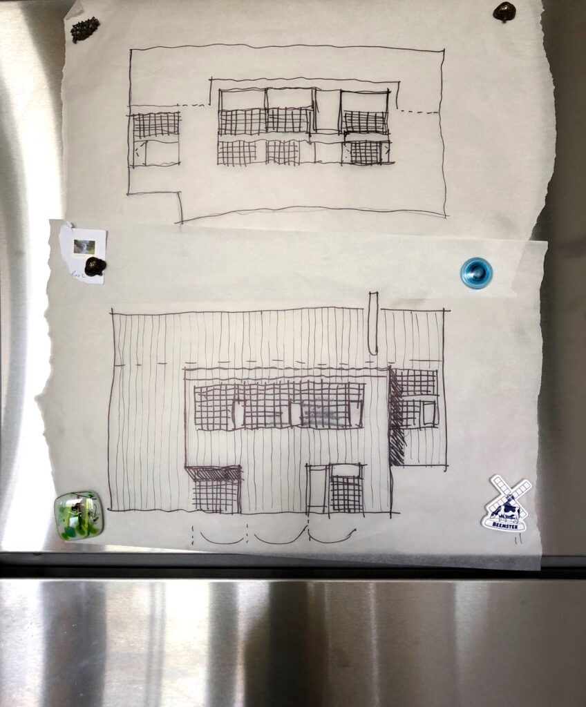
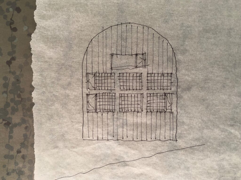
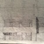
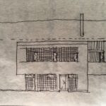
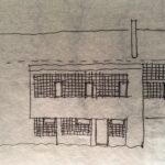
What is shown above are the south and north elevations. The south side (top drawing) faces a wooded uphill slope, and although not the public side of the site, would be considered the house’s main facade. Resolving it is not a linear exercise, all elevations and the plans need to be considered holistically, but as this main facade gets closer to being finalized, it will confirm the thinking for all facades.
Elevation drawings, in addition to representing a facade, often give a good summary of a building. There is always some relationship to the plan (tightly coordinated, loosely coordinated, or indifferent), and elevations can give cues to, or actually present the core conceptual idea that the designer is proposing. In this case, while the elevations should demonstrate some design rigor, three dimensional views would tell a clearer story of the design intent for this project. For example, given that the roof and wall are now intended to be a continuous metal surface, (up the walls and over the barrel vault), the flattening effect of the drawn elevations is somewhat misleading. Here the elevations give the appearance of additional building height and mass, and make the compositions more formal, appearing just off symmetrical. In reality, given the foreshortening of the roofline, the cantilevered sections, the north side addition to the main volume, and the balcony, the eye would perceive the elevations differently walking around the building, the impression would be more horizontally focused and quietly dynamic.
In this case, the south and north elevations that are shown above, do not clearly telegraph the plan. For example, the south elevation, with the majority of the fenestration consolidated more or less centrally, might suggest one or two large rooms behind. The main rooms of the house are in fact to the sides. The two storey living/dining room on the west side is half cantilevered, and has glazing only on the cantilevered half. The top level studio on the east side is also only half glazed on the south facade. What is dead centre in plan, the two storey galley kitchen, relates to, but is not what drives the centralized consolidated glazing on the south or north facade.
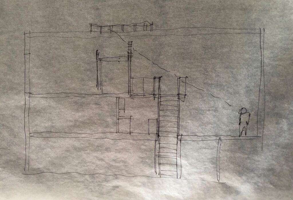
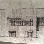
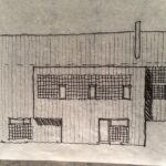
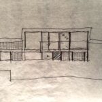
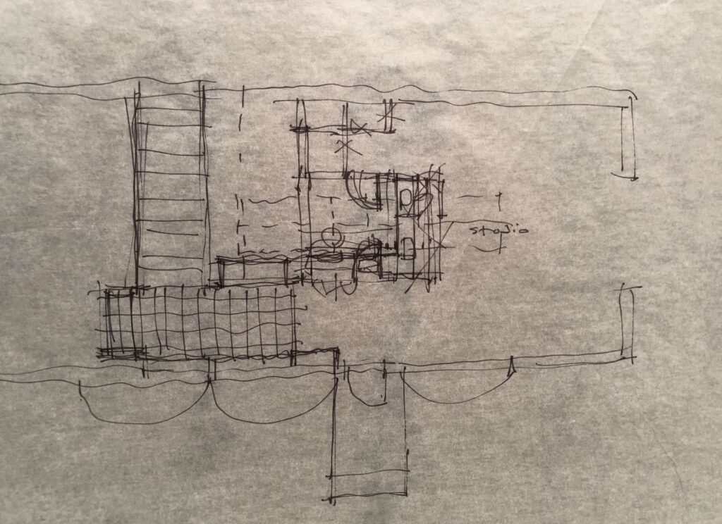
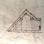
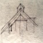
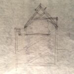
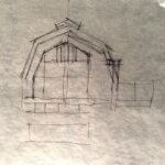
The top north-south section was completed in order to study the east and west facades, and to be used as a base drawing for multiple north-south sections of the house – see sketches below. The east-west section cuts through the high point of the barrel vault. It was done in relation to plan studies for the top level. This upper floor is to function as a studio or guest bedroom. A small washroom is to be included here as a discrete volume that would not connect to the roof structure. At this stage the roof structure is planned to be a lamella truss – copy and paste links below for more info:
https://wiki.opensourceecology.org/wiki/Lamella_Roof
https://www.archdaily.com/120391/native-child-and-family-services-of-toronto-levitt-goodman-architects
Planning options for the third level would be to have the studio/bedroom overlook and have a visual connection to the two storey Kitchen and Living/Dining Room below. Or alternatively, to have the Studio conceptually separate from the level below. …….. to be completed…
Recent studies have included elevations, plans and sections.
