NOA15 – Update – daniel libeskind and team – project in ottawa

Update photos from earlier construction shots posted on March 17th.

N15 – Update – daniel libeskind and team – ottawa project

The proper title for the project is the National Holocaust Monument.  In the top image, the building to the left (dark sloped triangle) is a portion of the Canadian War Museum designed by Toronto based Moriyama Teshima Architects.  That building, which is actually across an adjacent street, opened in  2005 and was recognized with several significant architectural awards.  From a number of perspectives, there will be some ongoing formal and conceptual dialog between the museum and monument.

The monument project is the result of a design competition that was international and juried. We understand that a Call for Qualifications went out in 2013.  The call  invited teams of artists, architects, landscape architects and other design professionals to submit credentials.  Teams had to be led by a Canadian citizen.  Architectural names amongst the final submissions in the short listed competition phase, included Gilles Saucier, Ron Arad and David Adjaye.  The winning project team,  included Daniel Libeskind,  Edward Burtynsky, landscape architect Claude Cormier and Holocaust scholar Doris Bergen.

The construction is expected to be completed this year.  The image below is from an information panel that is mounted on the project hoarding.  On the Studio Libeskind  website, it states that the “Monument is conceived as an experiential environment comprised of six triangular, concrete volumes configured to create the points of a star.”  This is a loosely shifted star of david.  It will be interesting to see how the space will be used.

Map and Compass – NOA14


Map & Compass – Notes on architecture 14

City and country paper maps usually have north towards the top of the sheet.  Paper is portable and will be used in many locations –  it can be turned around.  Likewise computer maps default to north on top.  At the larger scale, and in these formats, the convention of north up is one that most people get – but it is still only a convention.  In architectural drawings, this is a usual option but certainly not the definitive rule.  In subway or local street maps , the top of the map may be oriented in the actual direction one is facing as one is looking at the map.  It becomes a simpler diagram to understand – if my destination is shown to the right on the map – that is the direction I need to go.  The fixedness of the subway or local  map, its intended purpose, along with the scale and nature of the environment,  promote the shifted layout.  The map is turned around for us.

Like the convention of having city and country maps with north towards the top, the random north of local maps is something that one intuitively understands. One question would be whether we would develop a more consolidated and integrated mental map of our neighborhood and and extended environment, if local maps used a consistent convention.


NOA 13 – Downhill Ski Environments – Mont Tremblant et d’autres. An Alternative Perspective

Mont Tremblant

The runs and lodge on the right (east) side in the photograph of Mont Tremblant above, are referred to, officially and by all, as the North Side.  To the left (west), the runs and the manufactured Disneyesque ski village is referred to as the South Side.  The runs and area towards the bottom (south) is called Soleil.  While one might be tempted to ask, did they not have a compass, I expect that there is some rational explanation or folk story of how the various sections of the hill were named.  The sequence of development , how the hill was originally accessed, or marketing may be part of this.  Or something else?


Le Massif de Charlevoix


Stateside Hotel and Baselodge


Whitehorn Bistro


Cliffhouse Bistro


Mont Norquay


Nakiska Resorts


Notes On Architecture 13 – Downhill Ski Environments – Mont Tremblant et d’autres.  An Alternative Perspective

Six of the seven images here are photographs of a MacBook Air laptop screen taken with an iphone or Sony ‘point-and-shoot’ camera.  In terms of process there is no significant manipulation of these ‘aerial’ photographs.

The soft effect in the second to last image is basically the outcome of blowing up a detail in a photo.  The resultant crop became unusually pixilated.


NOA12 – Study for a three sided house


The notes here are a continuation of earlier posts regarding the design of a three sided house.  The intent for these is to show a range of considerations in the development of a project – aspects of a design process.


Study for a three sided house – Notes on Architecture 12

Similar to the earlier referenced high school project for a cottage in a valley (Notesonarchitecture 1), the organization of the newfoundland house became less typical than that of most homes.  In the case of the high school design, the living area was on the upper level working  with the assumption on an idealized sloped site.  On that project the main cottage access from parking was via a wooden bridge.

In terms of how the floors spaces were thought to be used in the later prototypes for the newfoundland house – the ‘plan’ showed on the first level a small  entry hall, a modest separate kitchen, and a living/dining room.  The second level would usually contain one or two bedrooms, and a bathroom.  The prime intended aesthetic for these spaces was a restrained, warm simple home with good light.  The third floor became at some point, a bright naturally lit studio, and social space. This room would  have  views.  The idea, of having a special space at the top, wove itself into quite a number of the later versions of the tower house, then the newfoundland house, and finally the glass roofed triangle cabin.

NOA 11 – A New Museum

The last image here was taken a couple of hours after the St. Patrick’s Day Parade 2017

Notes on architecture 11 – a new museum in quebec city

The new contemporary arts addition at the Musee Nationale des Beaux Arts de Quebec, opened in June 2016.  The project was designed by the Office for Metropolitan Architecture out of Rotterdam and New York.  OMA is a progressive,  progressive-debatable, international design firm. To complete the work, OMA collaborated with Montreal architects Provencher Roy et Associés.

The project, Le Pavillon Pierre Lassonde, was developed through an international competition that at the initial stage, received 108 submissions from 19 countries.  As a built design, the project would be considered a cool minimalist sculptural work by some; and by others as too assertive in the context of this historic town – or perhaps anywhere.  For others still, the mix of new and old in this environment is positive.  One could argue that if a contemporary arts museum can’t be contemporary, what can.  The intent of the text here is to simply look  a few characteristics of the work; the project parti, the use of glass, and the structural cantilever.

The ‘parti’, that is the project’s core conceptual relationships shown as a diagram, is the shifting of three large stacked rectangular boxes of space.  These boxes slide one above the other creating a set of steps on one side, and a cantilevered gallery on the other.  The steps form two terraces on the back, which is south.  The views from the terraces are to an adjacent park slope that has some trees, and below, several older cultural buildings.  Three of the park buildings house other collections of the MNBAQ.  On the north side, the significantly cantilevered top level gallery covers the lobby and a small plaza. The Pavillon entrance and plaza  face one of Quebec’s main streets,  La Grande Allée, a ceremonial and entertainment street that leads from here to the old city. The cantilever is impressive as a structural move, but in some respects the engineering accomplishment is lessened by the lobby below which has glazed walls on three sides.   The glass encloses half of the cantilever’s length.  Glass is not always transparent – during the day a conventional modern glass box appears dark from the exterior, and we generally understand that structure to support the glass and spaces above is provided, whether there is supporting structure there or not.  At night  and from the interior, one may pick up, or miss the fact, that there are not columns in the corners.

Much of the glass on the project has a white ceramic frit applied.  This regular mist-like pattern tempers the solar heat gain on the interior, and allows a somewhat shaded view to exterior.  In the daytime the frited glass appears  lighter from the outside than conventional glass.  The white ceramic frit was used on the large boxes of space in combination with light coloured metal cladding.  This makes the big boxes of space appear more  uniformly as simple volumes.  In the lobby the glass does not have frit, and is thus in contrast to the large light coloured boxes.  Similar to the cantilever, the lobby glass wall is a highly technical structural design.  The  glass ‘curtain’ (here not actually called curtianwall but instead structural glazing) is in fact supported by laminated glass fins.  Other than some metal hardware, no mullions, steel back sections or other support members are used.  The  entrance vestibule that is inserted into the glass wall is similarly an exercise in reduction.  While the glass never fully disappears, the interior-exterior connection is taken to an exceptional level.

The overall impression of the Quebec arts pavillon, materially and formally, is one of big moves and lightness – from the exterior and interior.  The entrance cantilever, as it’s seen standing across the street, or from being sheltered in the lobby or under the overhang, does maintain some drama.  While the shifting box parti, or minimal sculptural quality may not be of interest to all, the building is not out of scale to the older adjacent church, park, or street neighbours.  It is a contemporary piece by a significant critical architectural firm. There are spaces scattered across the project, inside and out, that are broadly engaging and would be considered smile-worthy or photo-worthy by many. It is reported that the new addition has had a positive impact on museum attendance.

NOA 10 – Downhill Ski Infrastructure + Environment

Notes on Architecture 10 – Ski Resort Infrastructure + Environment

Similar to Gas Stations, infrastructure serving the hill of a downhill ski resort is constructed output, that reflects a time, changing technology, and the decisions of individuals making practical and aesthetic choices. The age of the infrastructure shown in the first four images here is assumed to be oldest to newest.  The third image from the top reads as a small tower, and is presumably an enclosed race official space.  The newest small piece of ski hill infrastructure shown in the 4th image (on the right of the Gondola), is conceived as a small rustic wooden building – a log cabin being the obvious aesthetic cue. Likely the log aesthetic is veneer thin.

The top six photos are all from the Banff area and taken randomly in the last decade.  The last two images are from Le Massif in eastern Quebec, and taken this past week.

NOA 9 – tower-tower


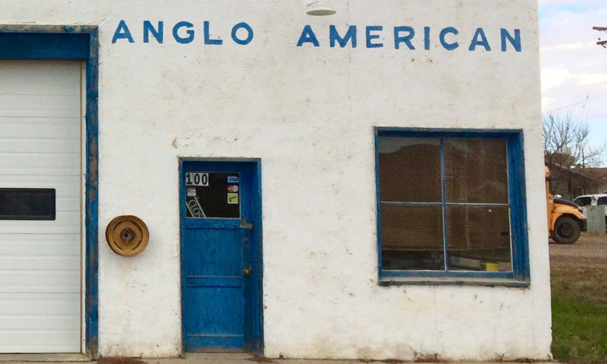
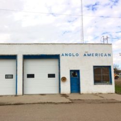
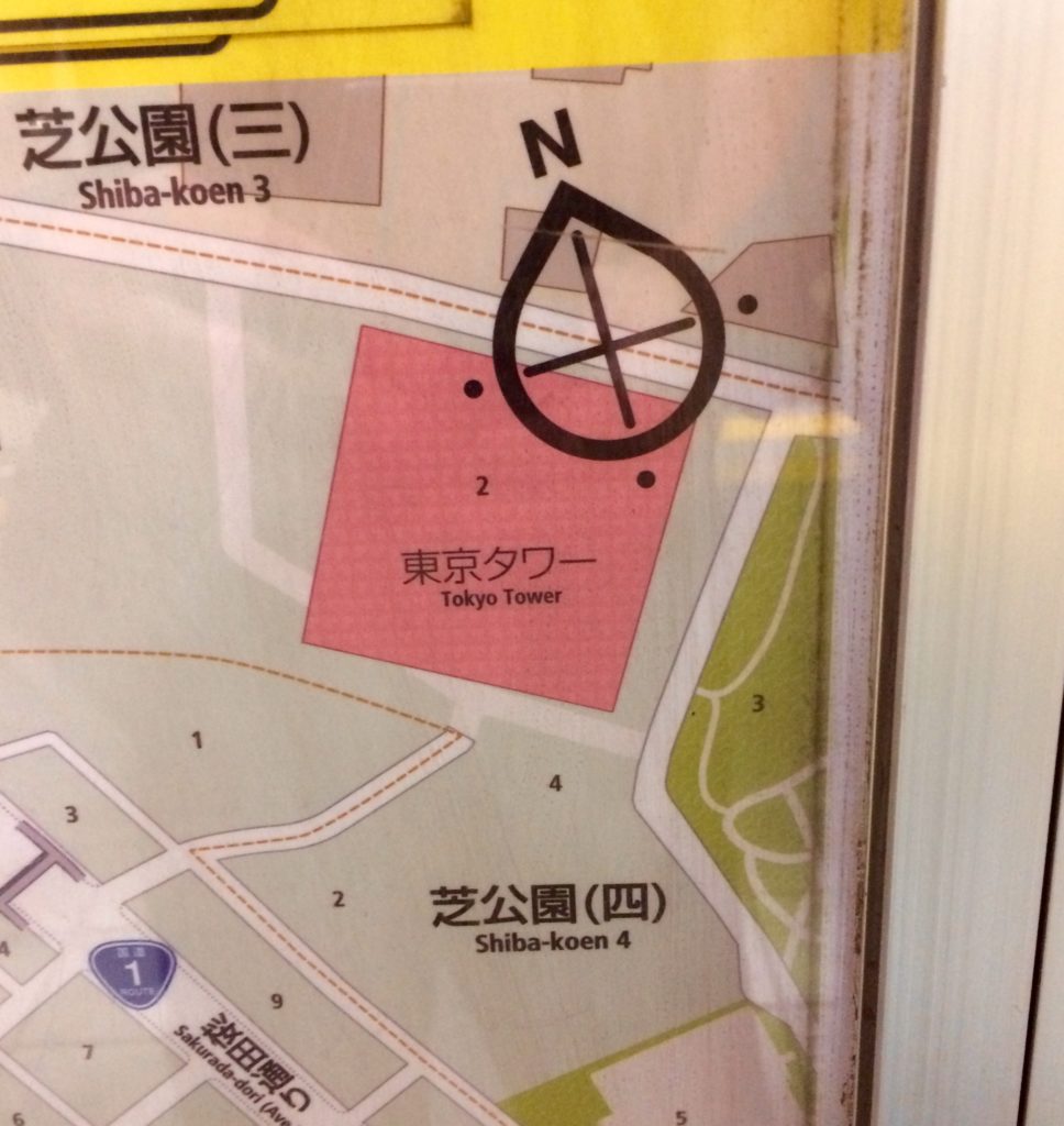
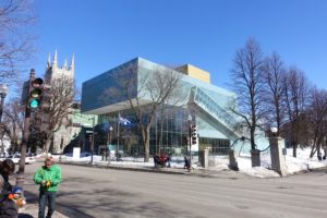
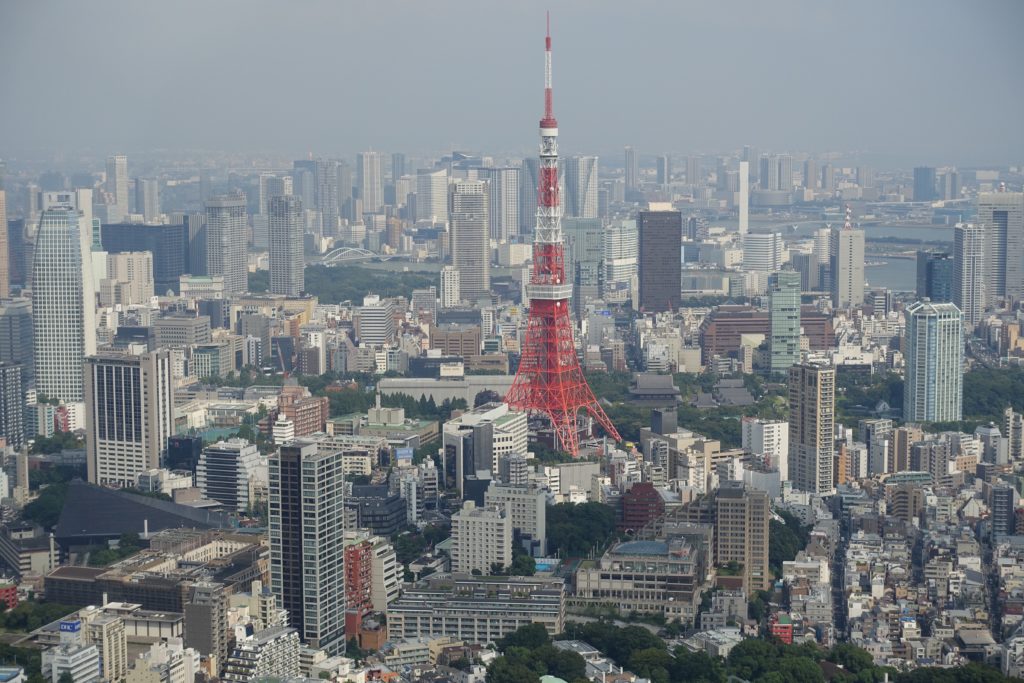
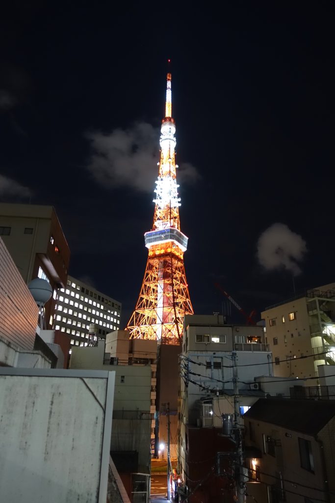
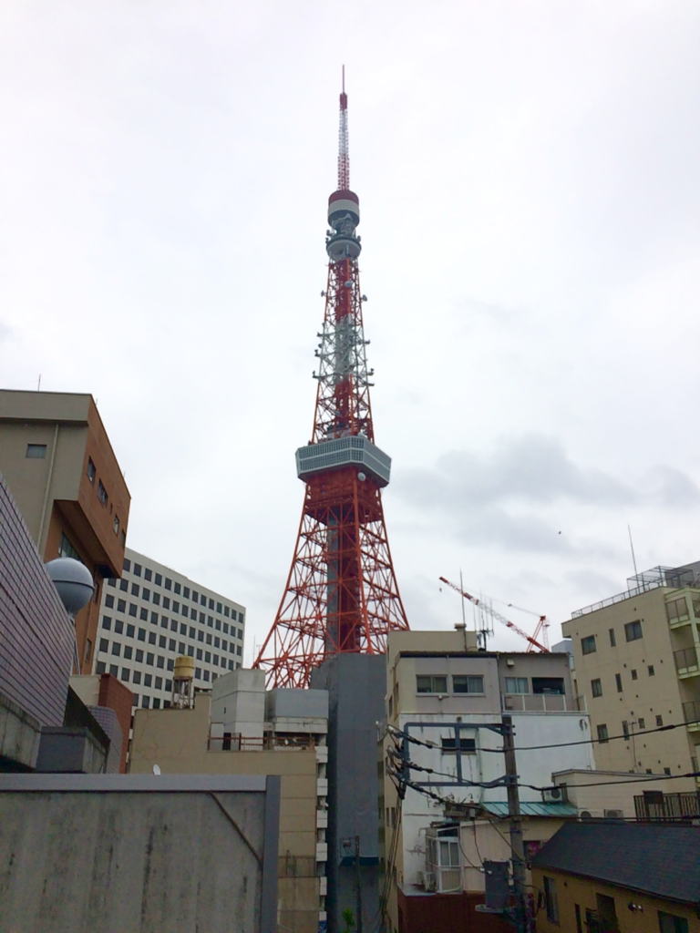
The image above is from a student ideas competition 25 years ago.  The thematic link here is simply to ‘the idea of a tower’. The top photo is the Tokyo Tower taken from the balconcy of an AirBnB in 2016 .


Notes on Architecture 9 – tower-tower – A Student Project

While a student in a masters program in Tokyo in the early 1990’s, I completed several entries to architectural competitions.  During first year, submissions were primarily to competitions sponsored by japanese architectural publications, where most participants were university students. Redeveloping the Tokyo Tower was the challenge of one of these.  The Tokyo Tower is a heavy steel, loose version of the Eiffel Tower.  It was completed in 1958, and is the second tallest structure in Japan according to Wikipedia.  It has none of the detailed, lace-like sophistication of the original french tower, in favour of a robust simple approach. It is a designed product of it’s time.  While the shape is unmistakably that of Eiffel’s, this prototype is mid-century japanese engineered modernism.  The tower’s design is credited to Tachū Naitō (内藤 多仲) 1886 -1970, a Japanese architect and engineer, who started his career studying navel engineering.  Nikken Sekkei, a major engineering and architectural services conglomerate, was also involved.   The Tokyo Tower remains popular with Japanese broadly, however at the time of the competition in 1992, I would think it may have appeared clunky to designers.  In copying the french form so closely, it was minimally unoriginal.  In any case, at least some individuals at the time of the competition, thought it interesting or worthwhile to have students look at options to revisit the tower.

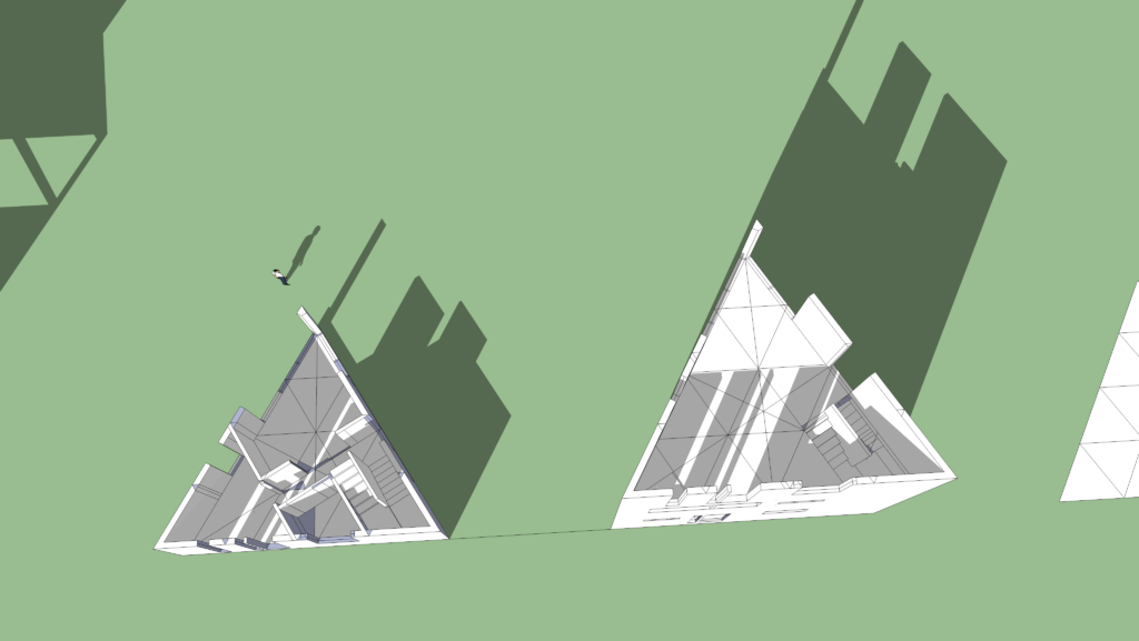
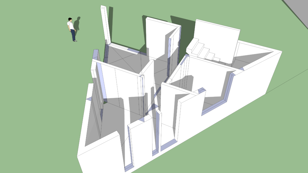
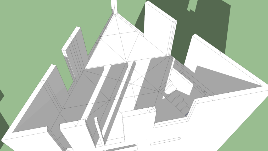
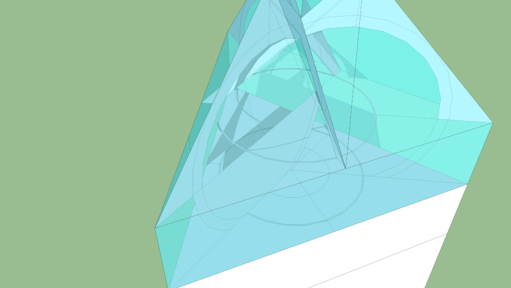
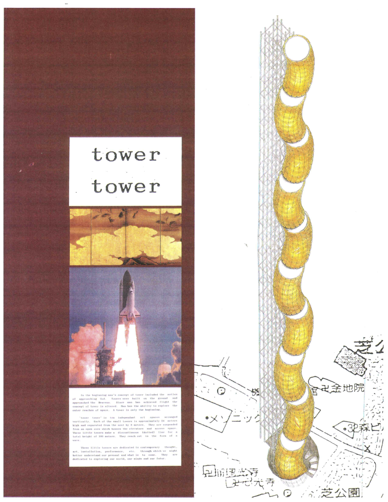
Broadcasting and tourism were key programme elements of the existing structure.  The proposal here, ‘tower-tower’, consisted of a simple open steel frame that would contain elevators, stairs and services. Cantilevered off the main open structure, that was intended to be as light as possible, were a series of ten large, fat macaroni-like volumes.  These were unconnected to each other.  Inside the large curved pieces, exhibitions, event spaces, bars, restaurants, and viewing platforms could be located.  A wavy dotted line pointing up was created by the unconnected little towers.   The project was hand drawn and developed in an axonometric view by shifting faceted rings upwards on an arc.  The form partially came out of an earlier student project for a small building in suburban Tokyo.  That programme was for offices for a local steel manufacturer.  A round, steel faced building, 6 stories high was developed with a facade that had some level of panelization, and three-dimensional articulation. The exercise was proposed by a professor who was in fact working on a real commission – a  small suburban Tokyo office building, for a steel manufacturer.

At the time I was interested in colour field painters, Louis Kahn and contemporary french, english and japanese modernists like Jean Nouvel,  Foster+Partners and Fumihiko Maki.  The aesthetic lessons for the tower-tower project came from these, as well as earlier studies, including the steel office building – but also from developing work by fellow students, artist friends and teachers.  These are, then as now, all important factors that together through trial and error,  intertwine and contribute to form a design language – a framework which potentially may communicate something with rigour and consistency.

The explanatory text that accompanied the tower-tower submission, was purposefully written in simplistic english.   This was based on previously published winning japanese student entries, that I had looked at.  Submission texts that appeared with published entries were often in english, with varying levels of brokenness, and many a poetic line.  Loosely copying this, the text for tower-tower was an affectation, partly in an effort to find the right tone, language and expression, that might have resonance with those in the japanese architectural community who were the judges.  In the case of this exercise however, the communication strategy, along with the design, were not differentiators.