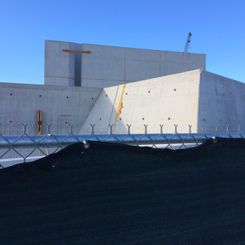
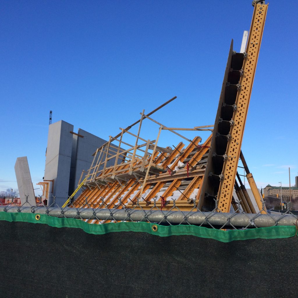
daniel libeskind and team – project in ottawa
The holocaust monument in ottawa, now under construction.
Architectural Design+Process
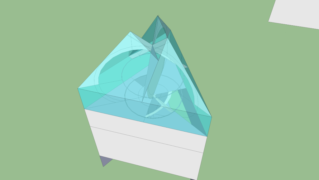

The aerial perspective directly above shows the roof planes as solid, as opposed to the intended material, glass. This view illustrates the roof form as a simple diagram.
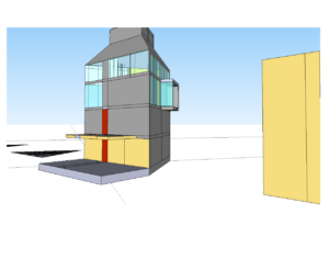
Study for a three sided house – ongoing process and details – NOA 8
The process of reviewing the height of the newfoundland cottage prototype, and come to something that appeared to work as a formal object, was in parallel with the development of the interior layout. Once a decision was made to include a studio/social space, and to have it on the top level, there was consideration for this to be a room with some loft – a bright open space at least a floor and a half high. Good views, good light. The roof structure would be exposed on the interior, and have some level level of complexity and interest. A high ceilinged room anywhere can be nice, but in some locations, this is a spatial luxury that has impact.
The use of variations in volume is also explored in the project. This is a common architectural strategy where contrast is used as one progresses through a series of spaces, making one subtly or highly aware of the proportion and character of rooms. Examples are multiple – from entering a japanese garden or teahouse through a small gate or door, or the central space of the Villa Rotunda. With this project, the contrast of spatial qualities and volume would be experienced moving up through a typcal domestic scalled stairs to arrive at the more open top level.
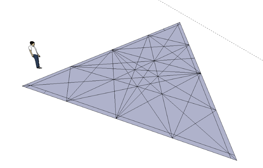
In terms of building materials and other considerations of design, the newfoundland-triangle house’s direct predecessors were conceptually wood structure and cladding; and in plan, square or rectangular. Planning studies also included octagons, hexagons and a few circles. For a small tower solution, a square floor plate with a high facade ratio of height to width, worked well – and this took some effort to achieve. Positively the square plan was rational and perfect. The impetus for the triangle layout was partly an effort to reduce further the simplicity of the square plan. This approach did however add other aspects of complexity to the project and required a review of trade-offs.
From some angles the top level of the retreat appears abstract and gestural. The form is actually highly regular based on three intersecting main arches that support the roof. The roof is made up of flat sloped planes that rest on the arches. The top of each arch is distinct and separate, and has a corresponding high point above.
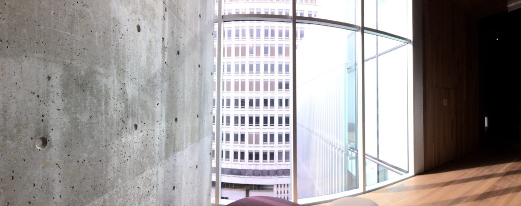
As part of their Sherbrooke Street complex, the Montreal Museum of Fire Arts opened in the last year a fifth building, the Pavilion for Peace. It received some coverage in the quebec and national press. This new addition is a series of stacked galleries, occupying a relatively small footprint. It was designed by a local progressive architectural firm, Atelier Tag. The exterior of the addition is light and contemporary, with some contrast to the existing urban fabric. Interior circulation between the galleries is through a series of staked lobbies and open stairs that have abundant natural light and views out to the city – this project, this path, sets up an engaging evolving relationship between the museum’s space and the city and sky. The city backdrop, and the stairs and lobbies that one passes through, form an urban installation – une promenade architecturale.
——————————
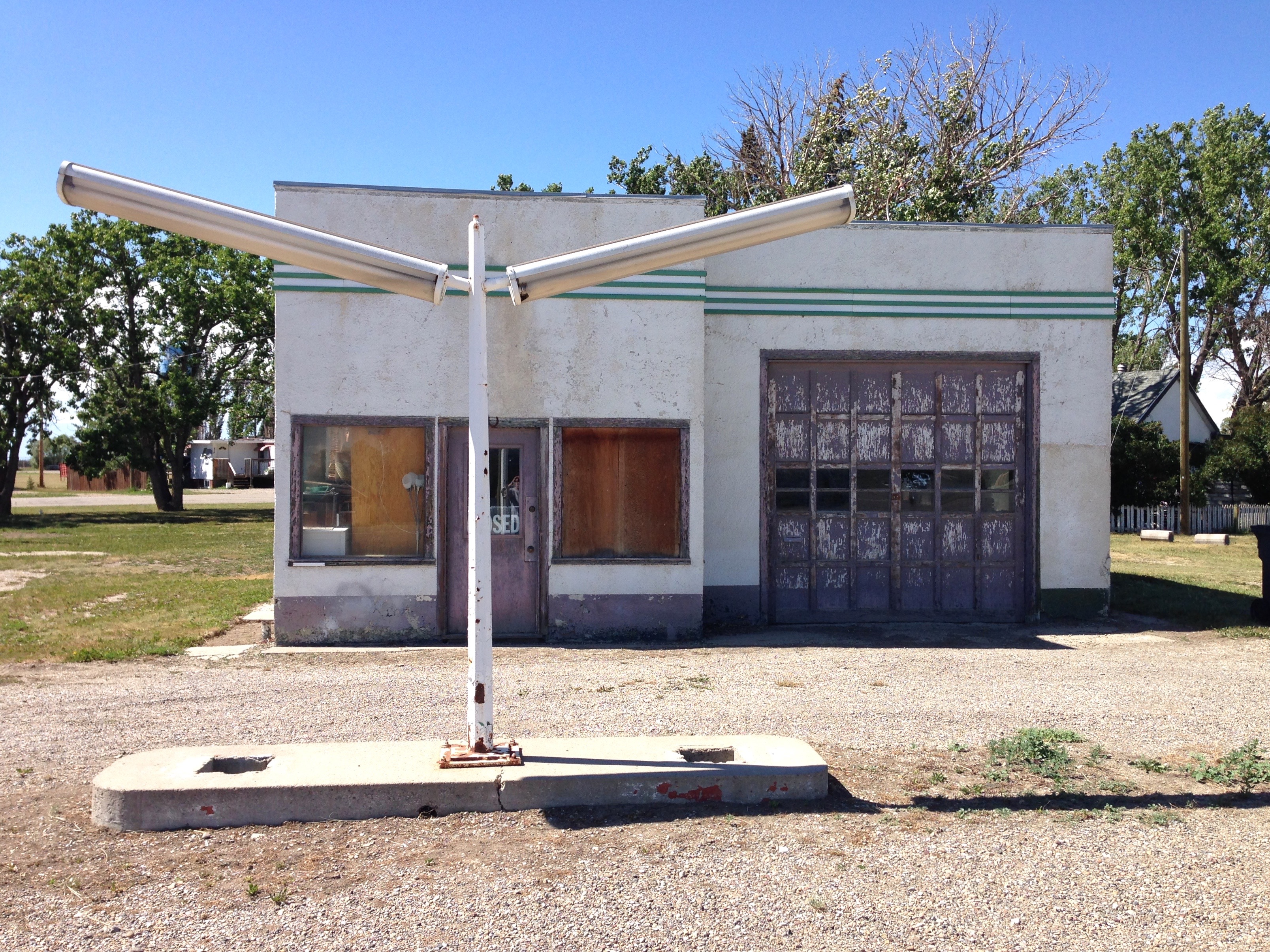
While at university I completed a research and photography project on the subject of Gas Stations. The project focused on the design progression of Irving Stations in Nova Scotia, from the 1930s, to their current models. I wrote an essay, and produced about 7 or 9 black and white photographs of local stations. The photos, I shot, printed, and mounted myself. The essay was later submitted to a academic journal, that dealt with industrial heritage architecture.
At the time of this project in the 1980’s, there was interest in re-visiting early and mid-century architecture and popular culture. Robert Venturi and his associates had, for more than a decade, been looking at suburban america’s retail and entertainment environment from an academic perspective and were broadly influential. Their approach was somewhat counter-intuitive; they looked at the commercial strip as something worthy of study, and had published a book titled ‘Learning From Las Vegas’. Their perspective was playful and celebrated the exuberance of popular low-culture commercialism. Also circulating at the time of my study, were a series industrial photographs that one would see in art magazines or museums by a german artist couple Bernd and Hilla Becher. These showed repetitively, water towers or early industrial mine hoists. While there was sufficient subtle variation amongst the photos series, the images overall presented a sense of consistency. These precedents, along with other strains in the cultural air at the time, prompted the Service Station project.
I was interested in the topic, not only as a means to record the subject matter, but also as an opportunity to look at the evolution of design. This was a modern case study, looking at a particular pervasive building type that did not exist before the 20th century. The older stations were particularly interesting. The earliest were often designed as picturesque small buildings – rustic cottage imagery, adobe forms, etc. From there, the Service Station was an early adapter to modernism in the 1930s. The functional building requirements of a gas station, found an appropriate fit with this stripped down, progressive style – a reflection of the spirit of the age.
Study for a three sided house – A few aspects from a singular design process
With the high school project of converting a farm silo into a home (see NOA 1), a tower was the starting point. With the newfoundland cottage, it was not so much that there was an insistence to build a tower, or a triangle for that matter, it was as much about how various aspects and considerations of the requirements of the space, including, programme, image, views and light, shaped the proportions and structure. The function in it’s broadest sense, gave direction on shape and profile – in this case ultimately as a small triangular tower. Louis Sullivan is credited with the phrase ‘Form follows function’, and that expression has had some serious resonance within architecture, and broadly culture, over the last 120 years. When he spoke of function, Sullivan’s intent was fairly specific, it had an artistic meaning about composition as well as an overall rationalism in terms of form. Both Rationalism and Minimalism’s simplicity have been, and are enjoyed by many – at different times, to different degrees. And the aesthetic texture and arc, that these movements have expressed, pre-date Sullivan in western and eastern cultures.
Through the design development of the three sided house intended for rural newfoundland, it seemed that for the small cottage retreat programme, having the main floor a metre above grade – then with the equivalent of 3.5 living floors above, one might have with a realistic day to day usage, something that in the right light, might be called a tower.
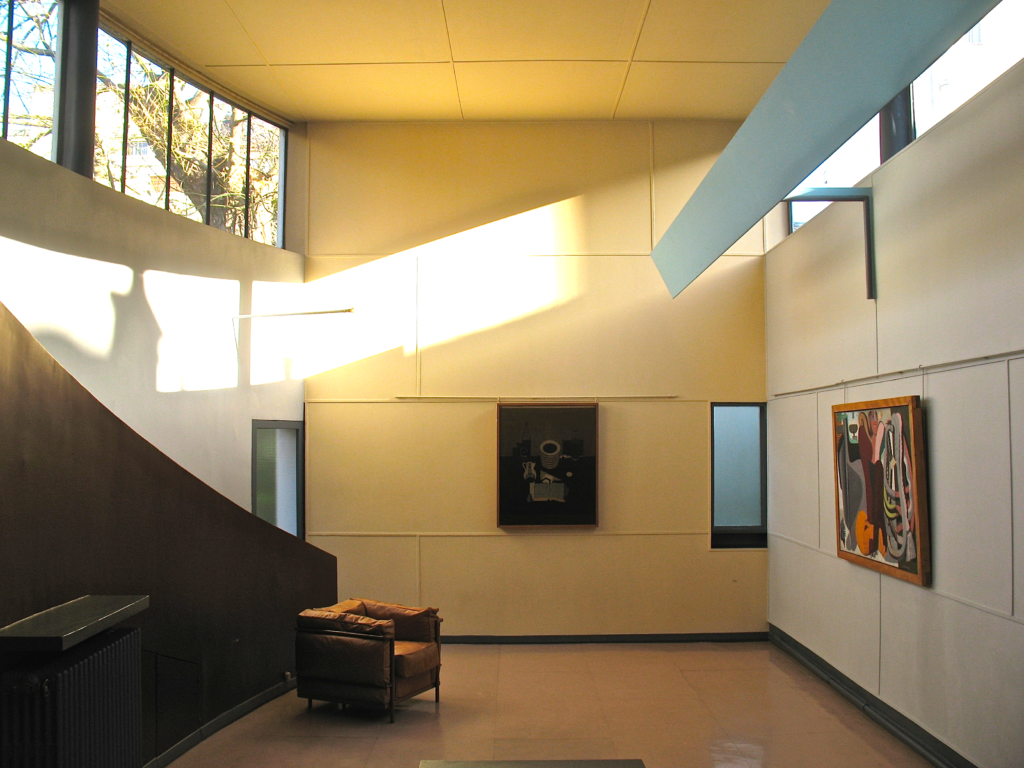
The photo is from the Villa La Roche, a project by LeCorbusier in Paris. Here main living spaces are located on upper floors. The photo was taken about four years ago.
Ongoing study for a three sided house
As the design for the previously referenced newfoundland house evolved – more effort to rational considerations were generally applied – perfect shapes and alignments. Simple, at ease, stability in form. As well in parallel, consideration was made in terms of ‘form as experienced’. How was it to be in front of, or inside the space, the building.
The rational options that were developed, were aesthetically in contrast to some periods in the design process, where potential solutions became more sculptural. Apart from being in contrast to the other design themes, these would also be in contrast with the local vernacular. As a solution for a home in a particular small village that I was thinking of at that time, in rural newfoundland, a less iconic or sculptural solution seemed likely to be the right fit.
This enters into the discussion on what is appropriate where, and design excellence. The contemporary interest in iconic architecture often comes from a methodology where high contrast in an environment is a key objective. Certainly there are many times when that’s the right approach, though not always the wise solution consistently. Like any solution, a range of options needs to be considered and tested. In many respects, the bigger challenge for an architect or designer consistently is designing something good, a design and building that works on one or more levels, that engages in architecture, that makes some or many people respond – often positively, perhaps through the expression of an un-selfconscious smile.
The understanding of design excellence – the idea of designing something good, isn’t original. There are more than a few quotes out there that say this, most notably Mies. The imperative to do something good is always there, whether one is designing something in contrast with a local physical or sociological environment, or not. This is about architectural criteria of proportion and materiality, relationships, subtle choices, this is about a perfection that has the potential to resonate within the individuals experiencing the work, the space. This is the bigger challenge.
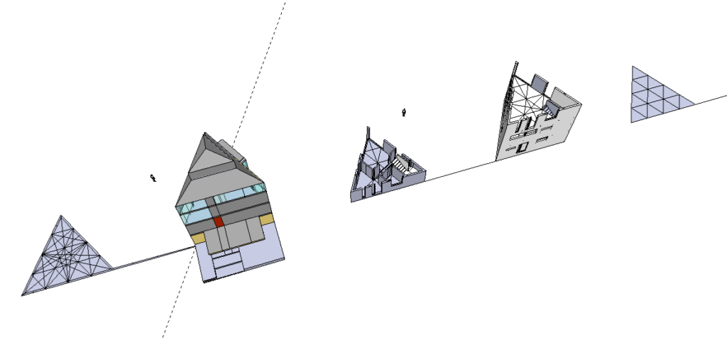
Study for a three sided house – Notes on Architecture 3
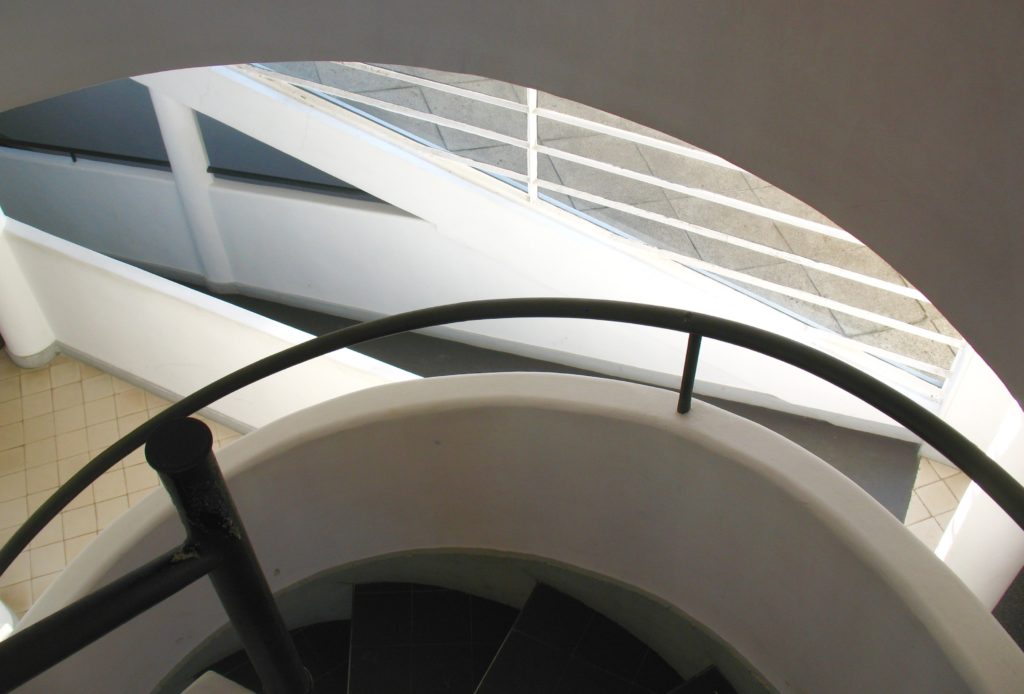
In my first year in architecture school, in Halifax in the early 1980’s, we were given a number of basic design exercises that were intended to make us look at architectural detail, and exercises that required a certain self-consciousness about space and form. One of these assignments had us visit several local buildings and consider details – like deep window conditions, variety of handrails, textures etc. A handrail is special in that it is something people actually use, that people actually touch. It has to do it’s job – and it can also be architecture. In fact, detail like this should both work in every sense, and be architecture whenever it can.
Projects in architecture school varied widely, but they tended to focus on domestic projects, that is homes, and then community projects – things presumably interesting, and often higher profile. I recall a first year project was to do a house for oneself in 10 years, another first year project was a mountaineering hut – and there was also a bus shelter.
Over the years, while other miscellaneous design projects and work ran in parallel, I have developed without any real purpose, a small number of versions of ‘a house for oneself in 10 years’. Though typically never framed literally in this way, the exercise or diversion, was in fact about a nearish enough future retreat. A creative space for oneself, or potentially a space to share with others. In most cases the design and effort consists of a few two-dimensional sketches, sometimes three dimensions. These followed a number of themes. I have even returned to the small round tower house project at least once or twice. Often the studies are on graph paper but sometimes on blank, or even occasionally on lined. Later Sketch-up was a tool that allowed fast and more complex studies.
One exploration within this informal series, starting ten or so years ago, was a house design for rural newfoundland . It wasn’t intended to be a tower, at the beginning at least, it was thought of as a comfortable well designed small home – with good light and views
The triangle house study would be one of the later projects that might be thought of, or called, a newfoundland house prototype. There wasn’t a specific site – it could be located in a small village on Trinity or Conception Bay, or in a more remote, dramatic, moors and sea location. In fact the triangle house could also travel further afield.
The usual programme for this loose ongoing exercise, was that of a small cottage for a single or couple, and/or a guest – and quite possibly used for extended stays. A refuge or retreat for contemplation, a space for someone with ambitions to write or draw or paint or sculpt – or write music or play music. Having space appropriate for some social gatherings would be good. Generally the programme was quiet.
The philosophy of the house has some alignment with that of Thoreau’s Walden – but, not to focus too much on what the newfoundland house was not, it was not Walden. First physically it would be somewhat bigger, and not be built by a single man. The new programme had a specific social component and architectural ambition beyond that of Thoreau’s place on a pond outside Amherst Mass. Still like Thoreau’s periodic home or any simply designed retreat, the newfoundland house’s potential is not only about structure, materiality and volume, it is about what conceptual opening can come out of such a small spatial gesture – that would shelter and frame a life or lives for a time.


‘To reach the cottage from parking, one would cross a short bridge to the upper level, passing through the trees.’
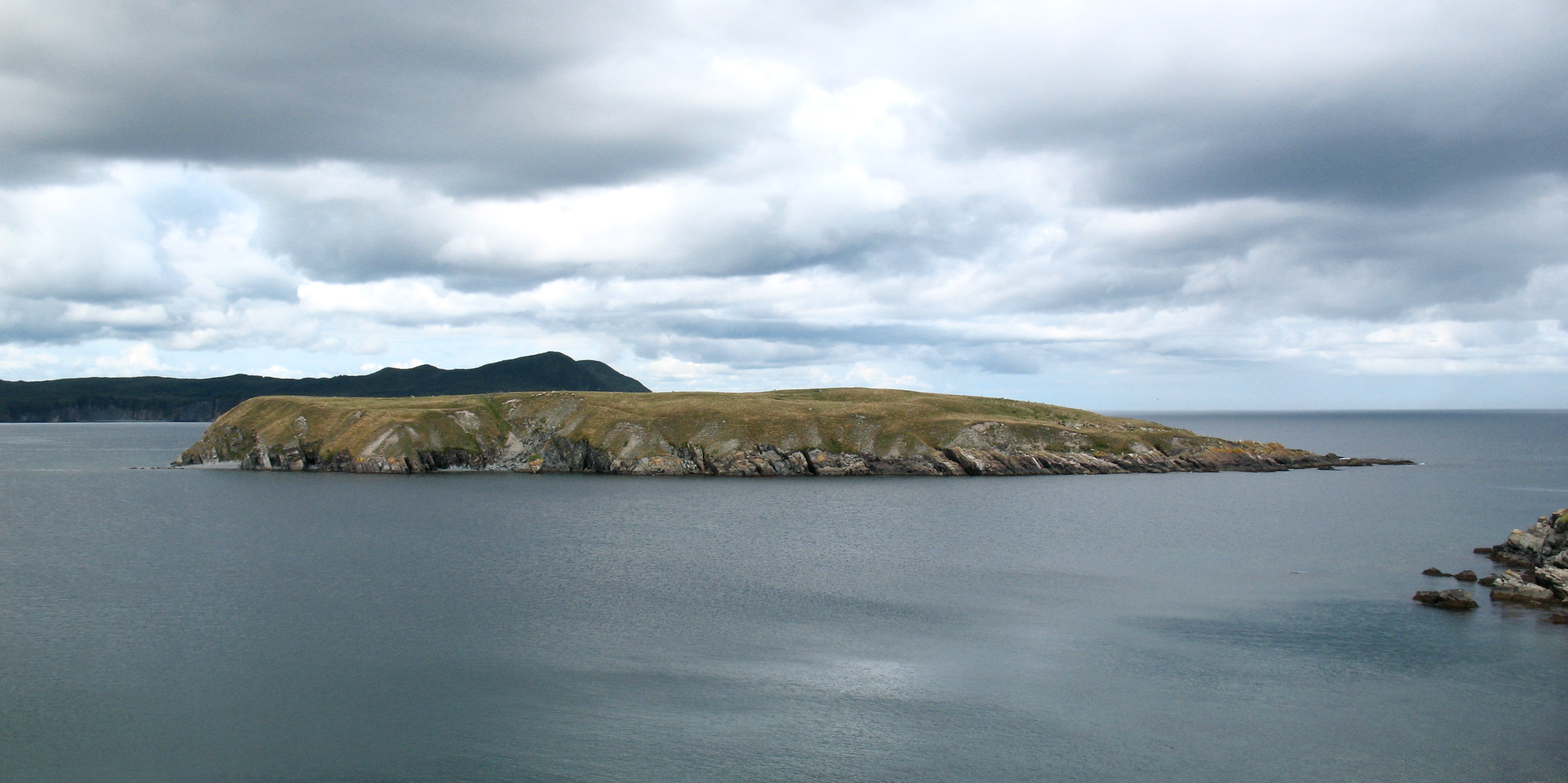
The Gatineau photos are recent. The patterns are graphic and overlay. The trees are in contrast to the clouds, or the effects of light or colour or nature.
La promenade architecturale
The image here is taken from inside the upper level of the SketchUp model – looking up towards the roof structure where the three main arches meet. The sub-supporting structure for the glass is to be developed. The wall that appears in the bottom half of the picture is essentially a remnant from the development of the geometry of the arches. The wall, is less likely to wholely survive in the design. As a flat graphic the image still reflects the spirit of the space.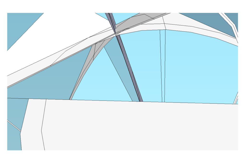
Study for a three sided house – Notes on Architecture 2
An interesting aspect of architectural design is that there is much that is similar between small projects and large, it is of course just the literal question of scale – and scale makes some things easier, some harder, and some considerations are the same. It is easy to find examples where scale and complexity don’t correlate in the the most obvious way. Small and large projects will have countless aspects to be be weighted and considered in depth.
The idea of a house design as an appropriate opportunity to explore an architectural idea – even a thesis isn’t new. Of course the thesis to be meaningful must prove right for the actual project itself, that is the house, but it must also speak to other scales of projects as well. Potentially bigger or smaller, and potentially for other uses.
The home as a small ritualized sequence of spaces, is a worthy place to make a broad architectural statement. In addition to scale and use, or even the possibly for an architectural thesis, considerations include those for layout as a pattern, the sequence of light and view and experience, details, materials, and relationships big and small. The list is endless, and all of these apply across the trade, across the art, at the scale of a house, a museum or a campus. There are many examples of houses as thesis – but to take just two, look at LeCorbusier – the Domino House, the Villa Savoye.