*****
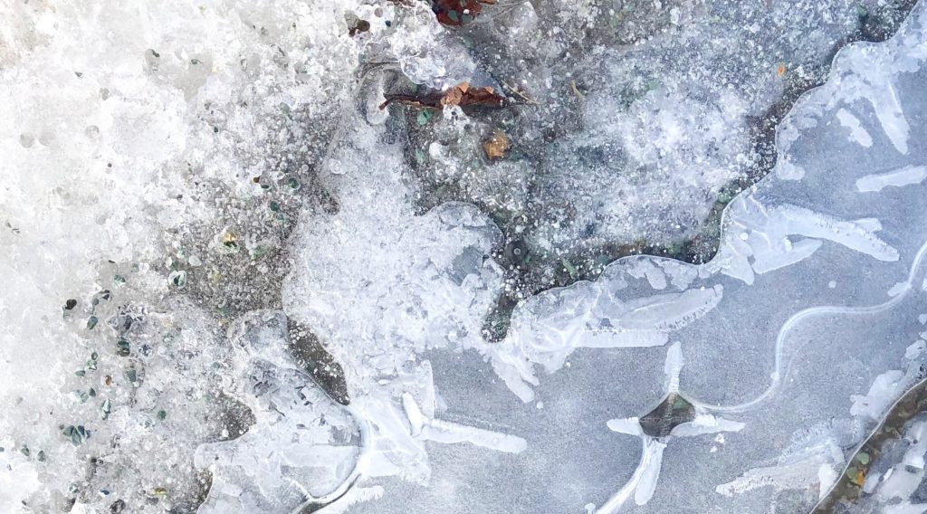
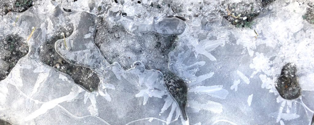
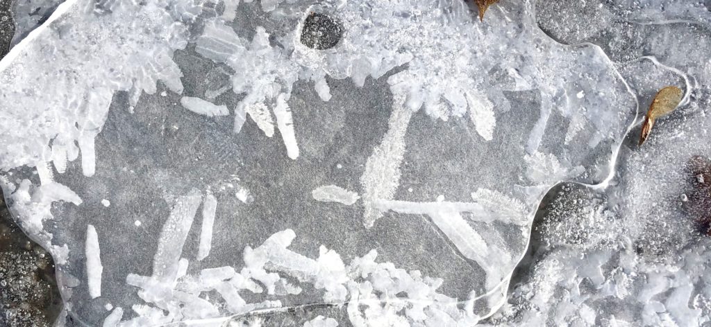
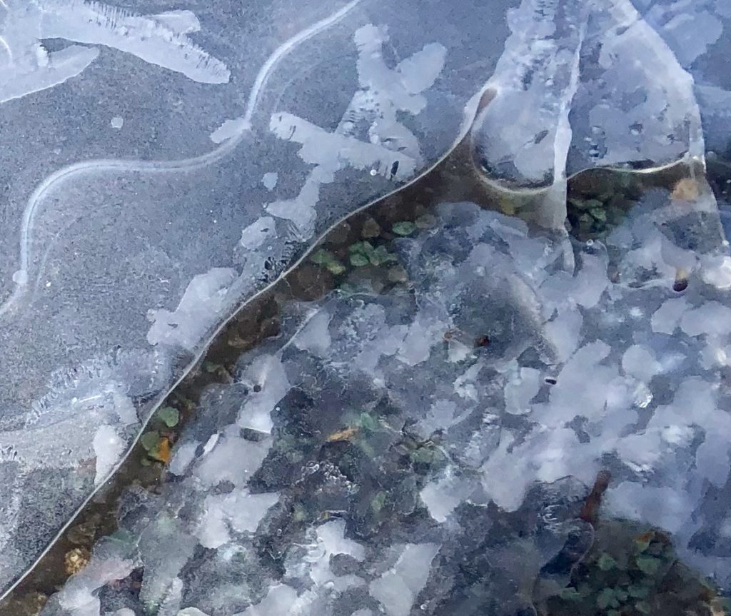
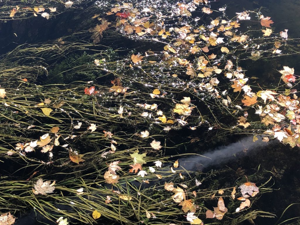
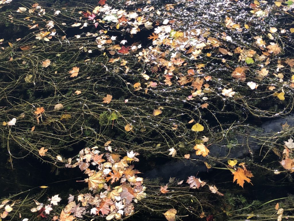
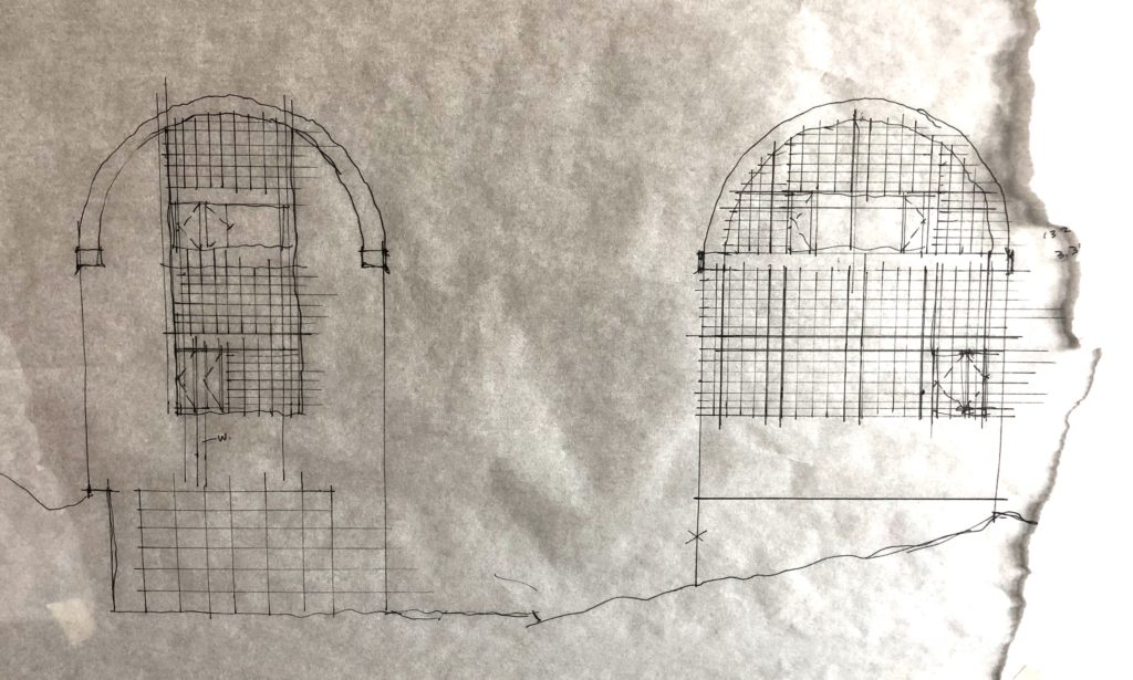
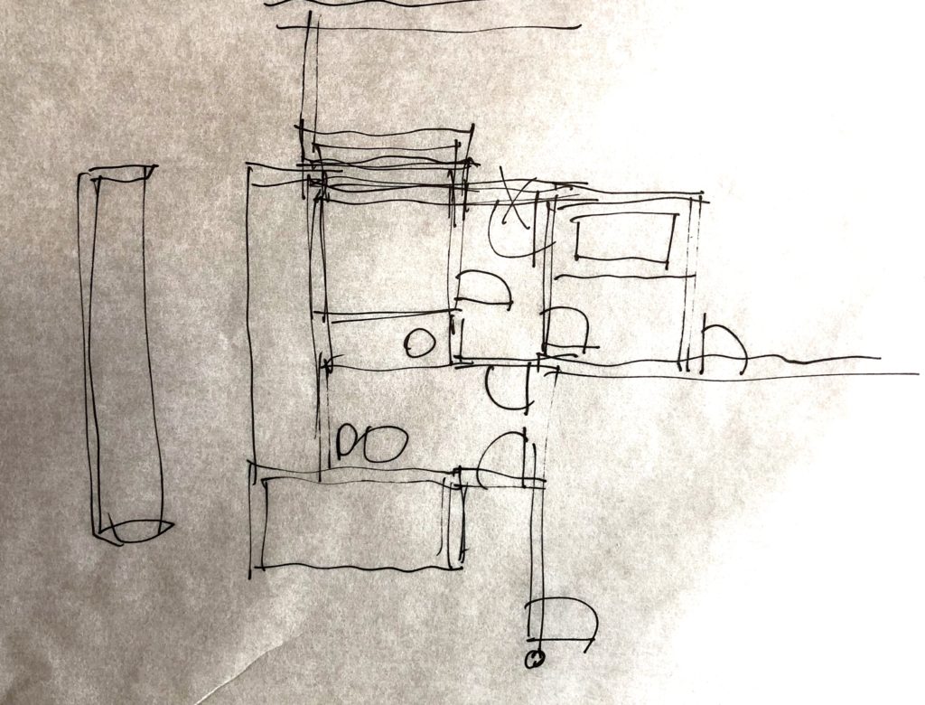
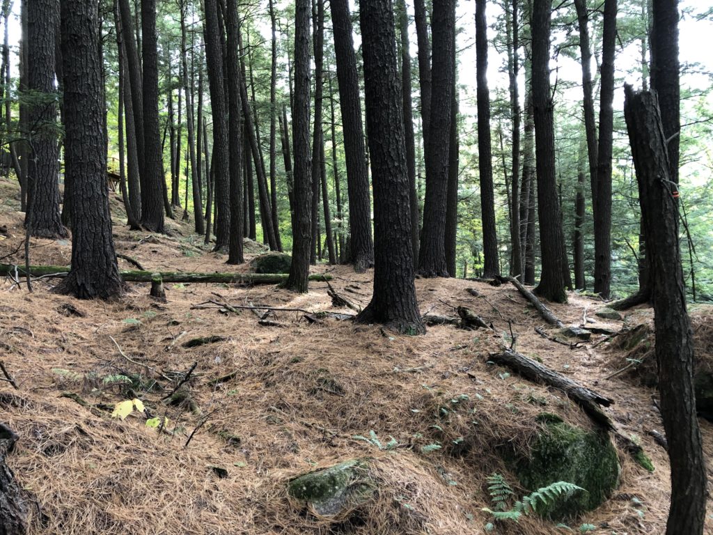
NOA 85 – Patterns in Frozen Water
NOA 84 – Context + Update for Trinity Ouest Concrete
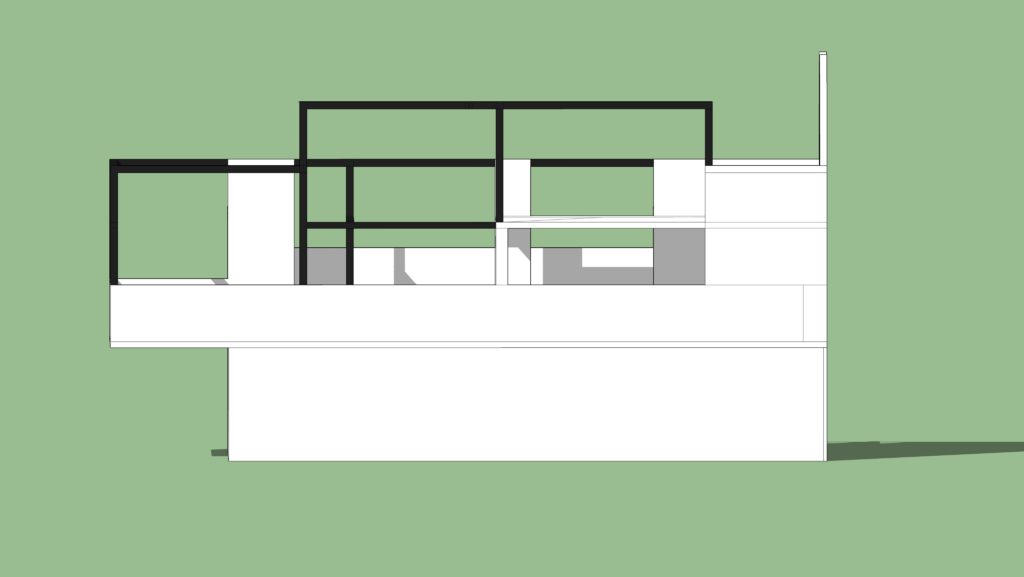
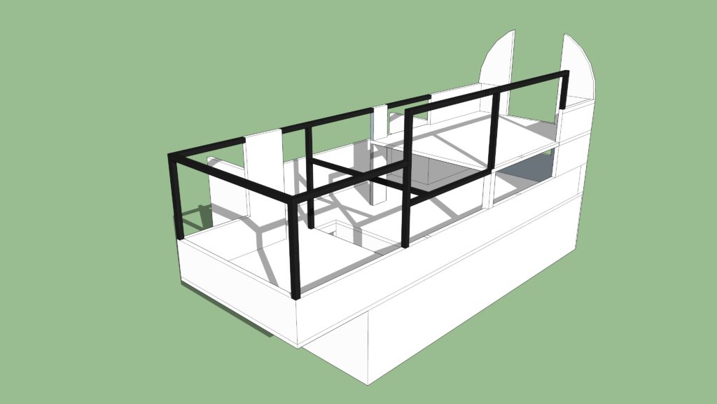
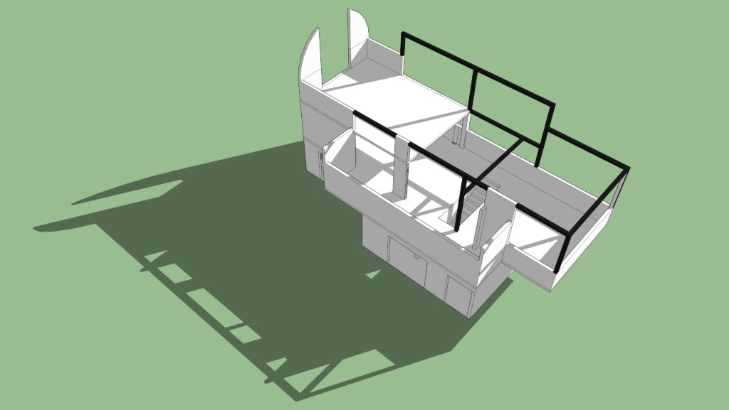
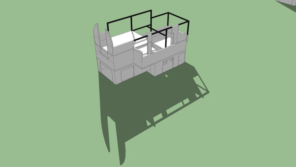
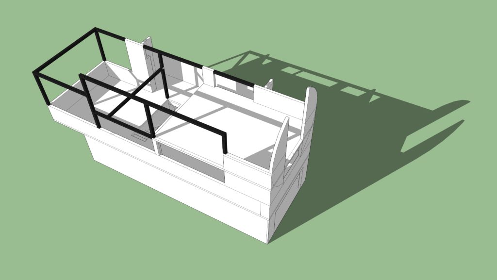
The Trinity Ouest Concrete Model was developed in early December, a few weeks before a construction trade show that was taking place in Toronto. Concrete industry representatives would be there to exhibit and provide advice on a wide range of products and systems. This was an opportunity to get feedback on technical design concepts and options, which in fact, proved to be helpful.
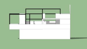
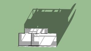
As the design developed from early schematics, so did a rationale for the use of exposed concrete as a main interior finish material, for floors and walls. This was an aesthetic choice that was intended to be simple, unpretentious and with a view to longevity. Modelling was a means to look at this specific aspect of the house in a stripped down way. Through the exercise, the form’s structural logic was considered. The model was also effective to begin to further think about the roof and wall assemblies that would be supported by the structure. Insulation and siding would be fixed to the concrete, and options were being reviewed for some aspects of the Passive House approach which would require higher R values. The detailing for thicker insulation needs some care. Connections between widows and walls would not be conventional
An additional consideration for the design, was the intent to make the concrete self supporting – in the sense that, other than rebar, steel as columns, beams or steel deck, would not be used to support the concrete. This approach, as a friend pointed out, is part of a material logic where the building transitions conceptually as it rises from earth to concrete, and above, glass, wood and sky.
The two screenshots re-posted above are: a flat perspective view of the concrete model from the south side: and an aerial view. The original post did not include any background info on the images or project status.
Next steps will focus on completing an information package that could be taken to a contractor for discussion. As well, an arborist should be consulted sometime in the spring.
*****
NOA 83 – Local Night Skiing
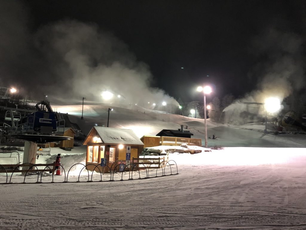
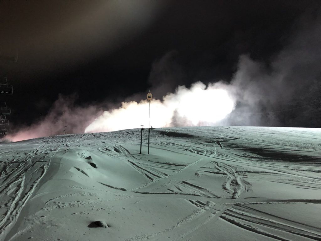
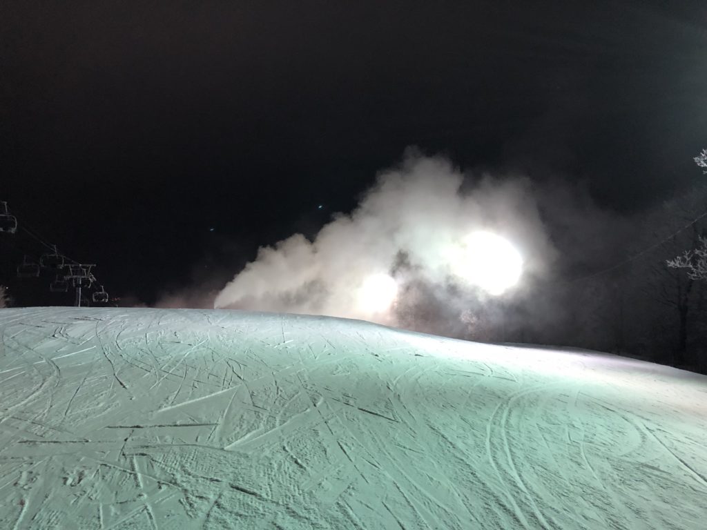
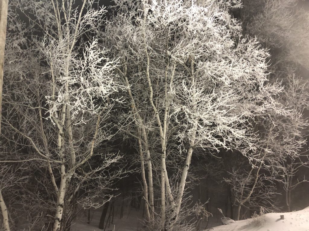
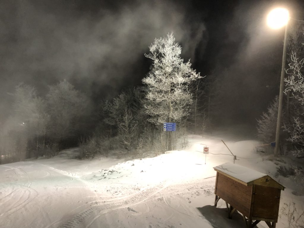
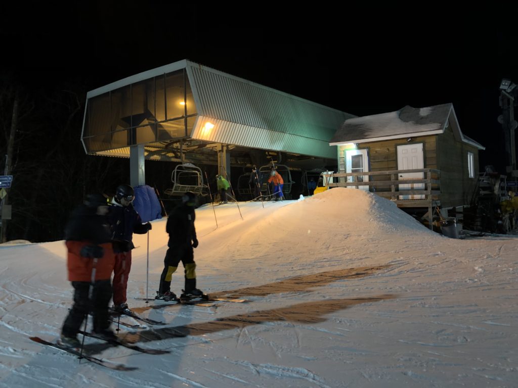
These night skiing photos were taken at Mont Cascades on Monday, January 13th, and at Sommet Edelwiess, Friday, January 24th. These are relatively small hills with vertical drops of 450 ft and 620 ft respectively. The images, all un-cropped, un-adjusted raw digital files , were taken with an iphone.
Not focusing on ski lodges, previous posts NOA 10, 13 and 50 have looked at or referenced, the infrastructure and environment of downhill skiing. Generally, built infrastructure on the hills is a mix of vernacular (sometimes faux vernacular), and industrial work.
*****
NOA 82 – A Small Unfinished Wood Carving Project
“Somehow I too must discover the smallest constituent element, the cell of my art, the tangible immaterial means of expressing everything”
The quote here is by Rilke from 1903, taken from a paperback that I had borrowed many years ago from a colleague – and never returned. I pulled out the book, Letters on Cezanne by Rainer Maria Rilke, yesterday after seeing the movie Jojo Rabbit the day before. The movie references the poet more than once, and includes a quote before the closing credits.
The quote above is included here based on timing, and on its general resonance of truth in the idea that a work at it’s core, and in fact for me as an overall outcome, has the potential, and it must be the artist’s objective, to encompass the tangible immaterial means of expressing everything.
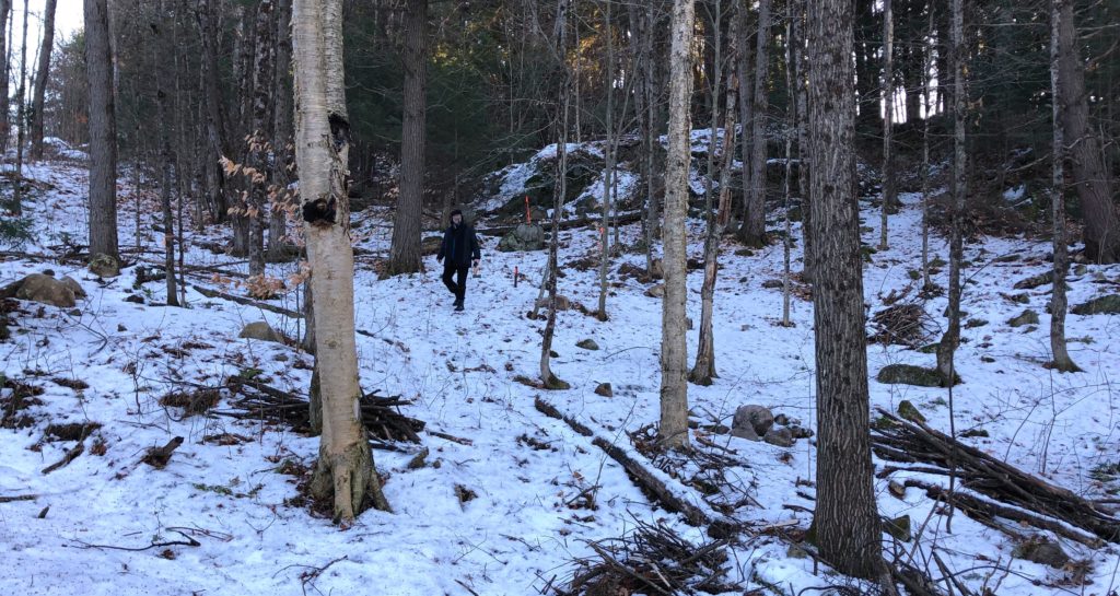
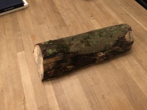
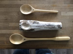
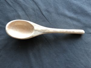
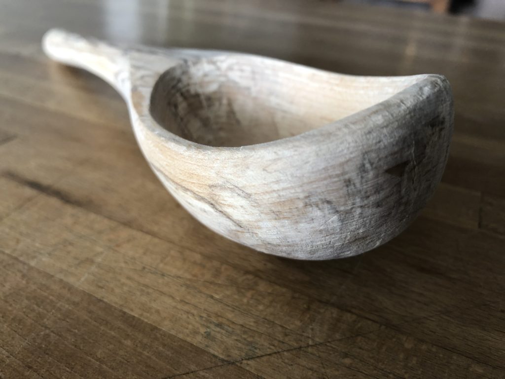
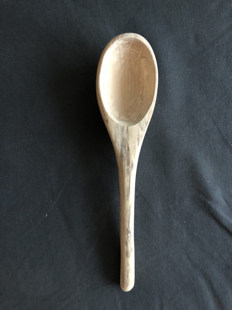
December 28, 2019 The wood chunk shown above, comes from the site for a small house project in La Pêche. See previous posts on this website for info on the La Pêche house plans as they developed over the last year, as well as multiple seasonal images from the property. The tree was not freshly cut, but had been felled two or more years prior.
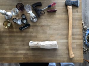
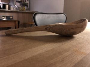
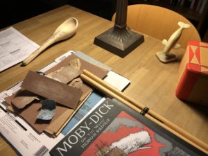
December 29th, 2019 The other two wood pieces shown in the photo above, ll and l, were done in the last year. These were carved from small pieces of scrap hardwood that were purchased from a specialty lumber shop. The thinking with the new piece was, in simple practical terms, to create a utensil with a deeper bowl than the previous two; and from a more symbolic perspective, the object would somehow incorporate some of the rawness of the wood from which it was carved.
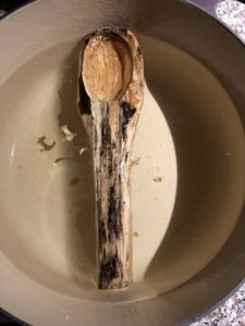
January 1st, 2020 The wood, not being freshly cut and presumably a hardwood species, turned out to be tough to carve – and started to show cracks after a few days indoors. Keeping it in water, swelled the piece and stopped further cracking. There was some hope that it would be easier to hand carve wood with a high moisture content, but this did not prove to be the case.
January 2nd, 2020
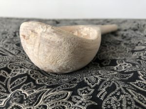
January 7th, 2020 With the piece nearing its final shape, it was boiled following a recommended method of curing. In principle, curing would help the piece resist further cracking. The wood did open up a day or two after being boiled as is seen in the photo above. While this was clearly a flaw, a decision was made to continue to work on the imperfect object. In the following days the crack closed again.
January 9th 2020
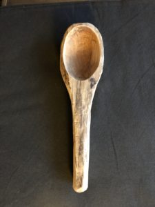
January 11th, 2020 The entire top edge/surface of the piece not only reflects, but is the actual face of the tree trunk’s core – just below the bark. As the bowl is shaped, the outer circumference of the tree generates an undulating line around the lip of the bowl. This ‘scoop’ line is thus not purposefully created, but simply a result of the tree trunk’s tubular form.
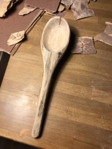
January 12th, 2020 For about half of the photos in this post, the object is presented singularly as an artifact. For the remaining images, those that include some visual clutter, the photos are just a sequential record of the life of the piece in an ‘as is’ environment, that was for whatever reason deemed photogenic.
January 16th, 2020
January 17th, 2020
*****
NOA 81 – Aga Khan Museum – Toronto – Saturday
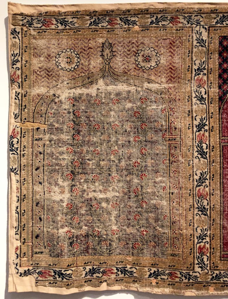
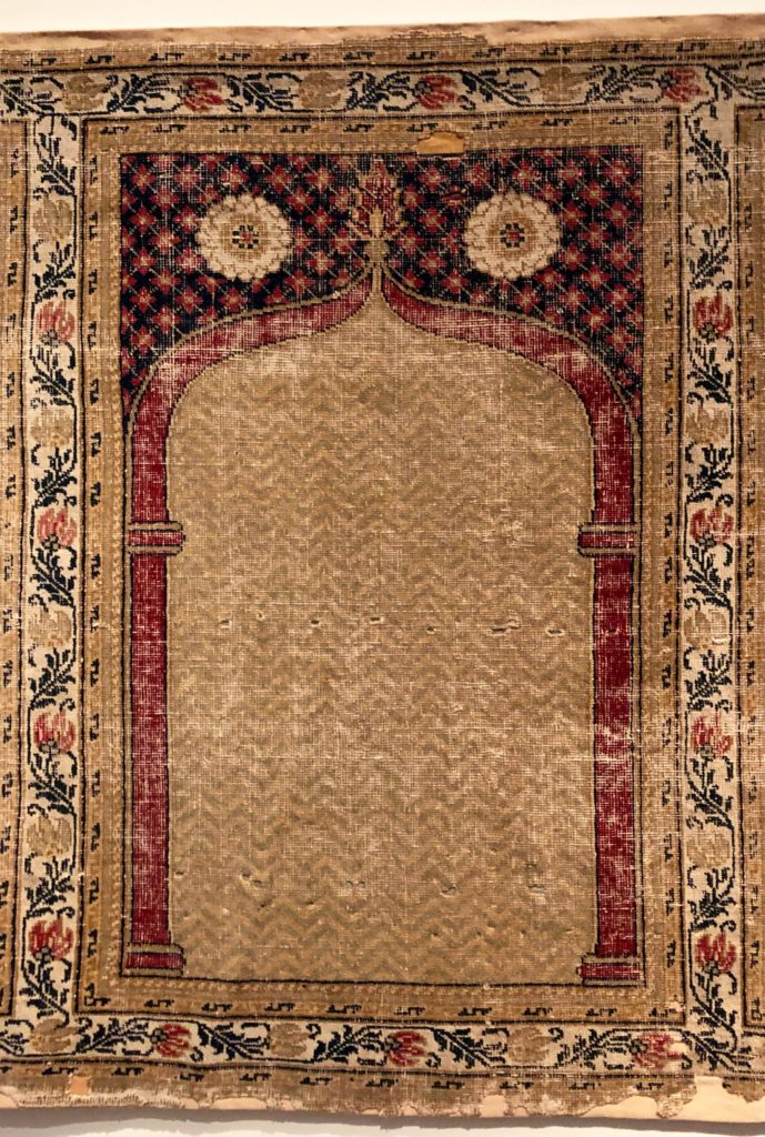
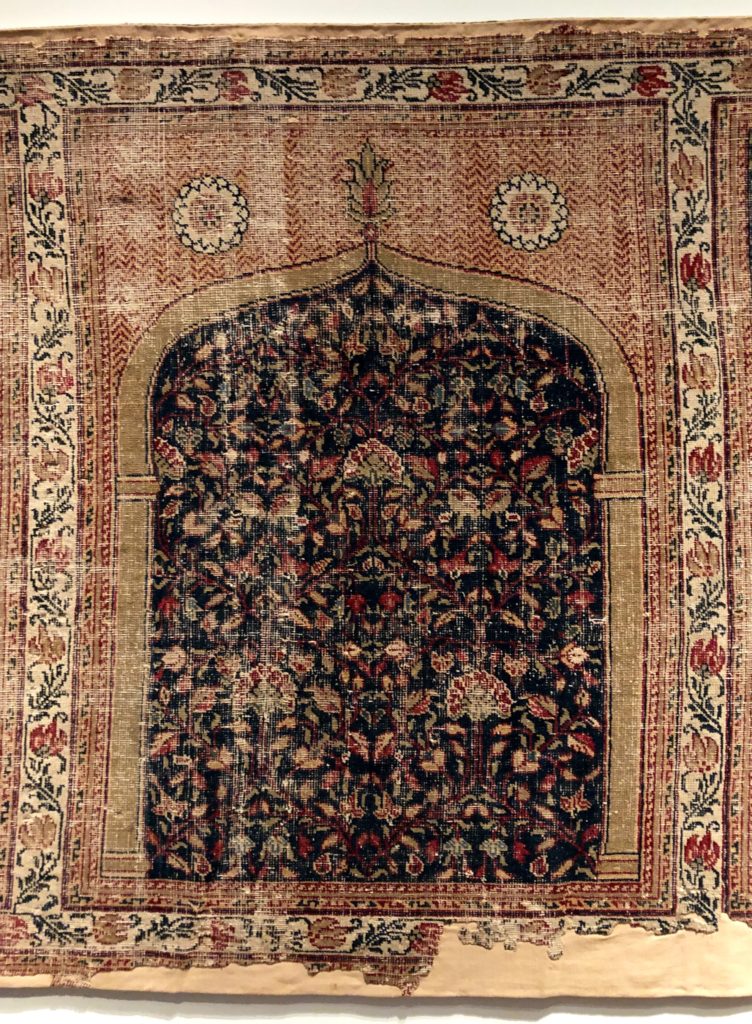
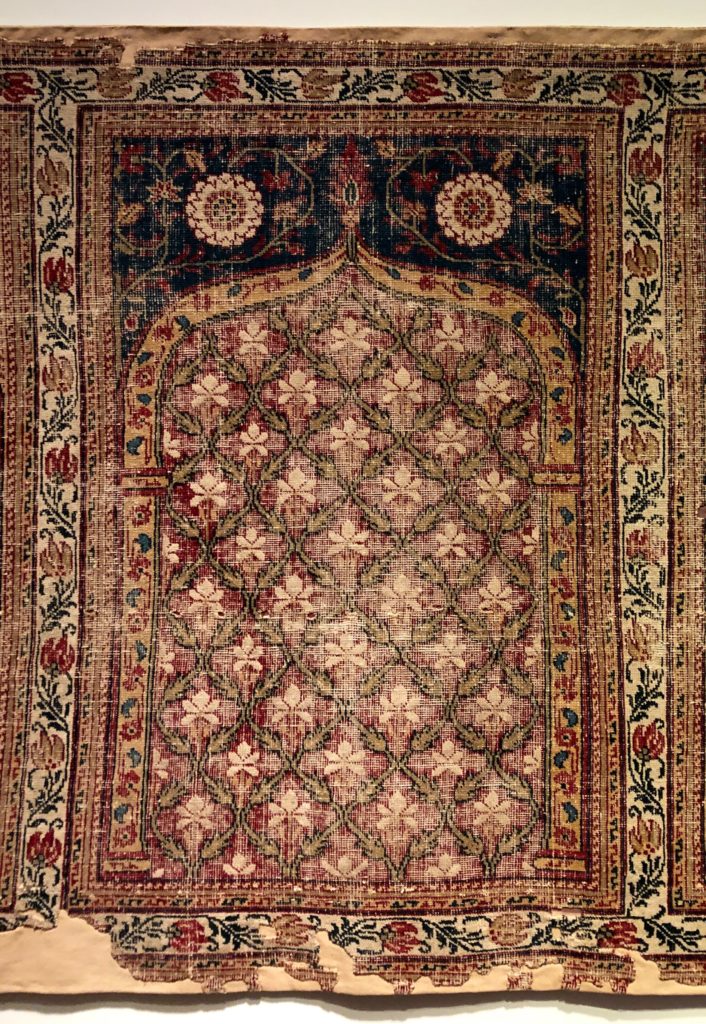
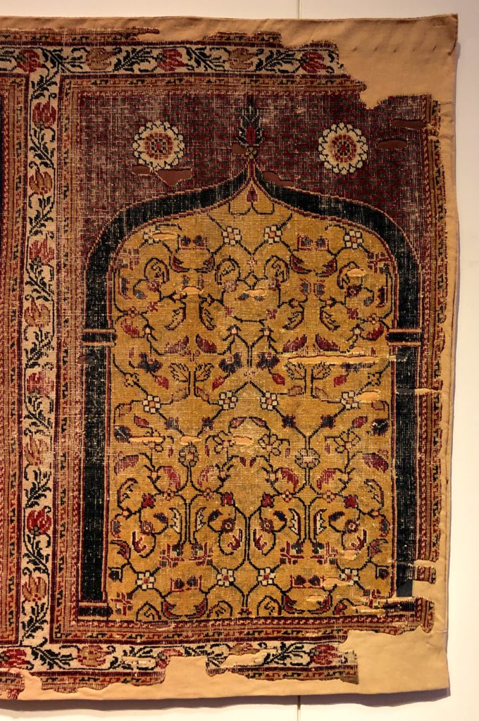
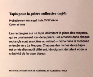
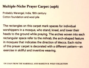
This 18th century Muslim prayer carpet is composed of a decorative frame and five insert panels. The panels are shown here in their sequence from left to right. An overall view is not included.
At the museum, the lead curatorial description provided for the public is in Canada’s two official languages. They are not direct translations. In french Tapis pour la prière collective highlights a group spiritually inspired action. In English, the phrase, Multiple Niche Prayer Carpet, describes attributes of the physical object. Pointing out this difference is not a criticism, or to suggest that a different version might be more successful. Both texts aim to find some truth in explaining what is being presented, and are in some respects, complementary.
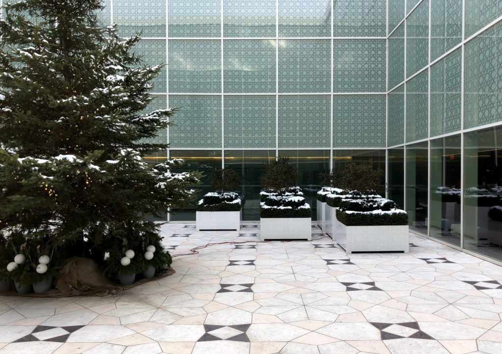
Below is an image of the Aga Khan Museum’s courtyard. The building, opened in 2014, was designed by Japanese architect Fumihiko Maki. Maki is a Pritzker Prize winner who has completed work internationally with projects in Germany, Switzerland, America, Korea and Singapore. The Aga Khan Foundation Canada engaged Maki for their headquarters in Ottawa. That project was completed in 2008.
NOA 80 – Trinity Ouest Concrete Model
NOA 79 – Sur l’eau / On Water
NOA 78 – La Pêche – L’avancement du projet
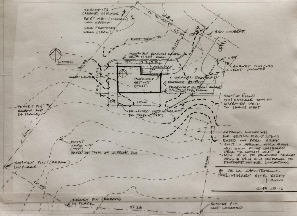
Le 12 aout / August 12th – The site plan shown above was done in advance of bringing in a surveyor – and as a general review and update of the proposed site layout and grading. The drawing could also be used in preliminary discussions with a contractor.
The survey work was needed to stake out the east property line, the only portion of the site’s boundaries where markers had not been found. This information was key to finalize the location of the well and septic field. On some properties, the requirements of this infrastructure will have a major impact, if not drive many site layout decisions.
*
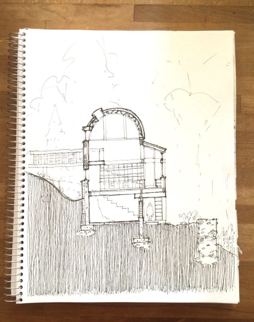
Le 5 septembre / September 5th – This north-south freehand section does not reflect one particular place in the plan. It shifts to capture several conditions. The purpose of the drawing was to look at specific details in section – to show architectural intent for materials and assemblies, and how they come together at typical junctures. For example how a typical wall and floor meet, or a wall and roof juncture. The individual components of the wall and roof assemblies, their thicknesses and sequence, start to be explored and identified here. As these details begin to have some level of technical resolution, they would be drawn larger, and to scale.
A section is also a tool to understand spatial relationships within a building. For some projects the building section is the ‘parti’, or core idea for the overall design.
Through completing this exercise, the design has evolved. Current thinking is to extend the use of exposed concrete for walls and floors to the upper levels. The drawing was done ‘by eye’ and ‘from memory’ – without a scale, straight edge, or reference to the plan. Not that there is any particular benefit to working this way – it just as likely could have been done using those tools.
While the photo here was taken in September, the sketch was completed sometime in July or August, at a time when there was some compulsion to really understand the building components and how they fit together. A next step in terms of sectional studies would be to complete a series of transversal cuts, at each of the main variations in the object – and at least one section on the east-west axis, at the top of the roof’s arc.
**
Le 8 septembre – sur le terrain / September 8th – on site
***
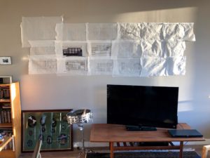
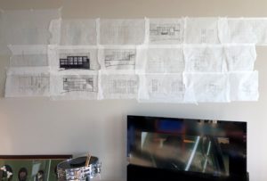
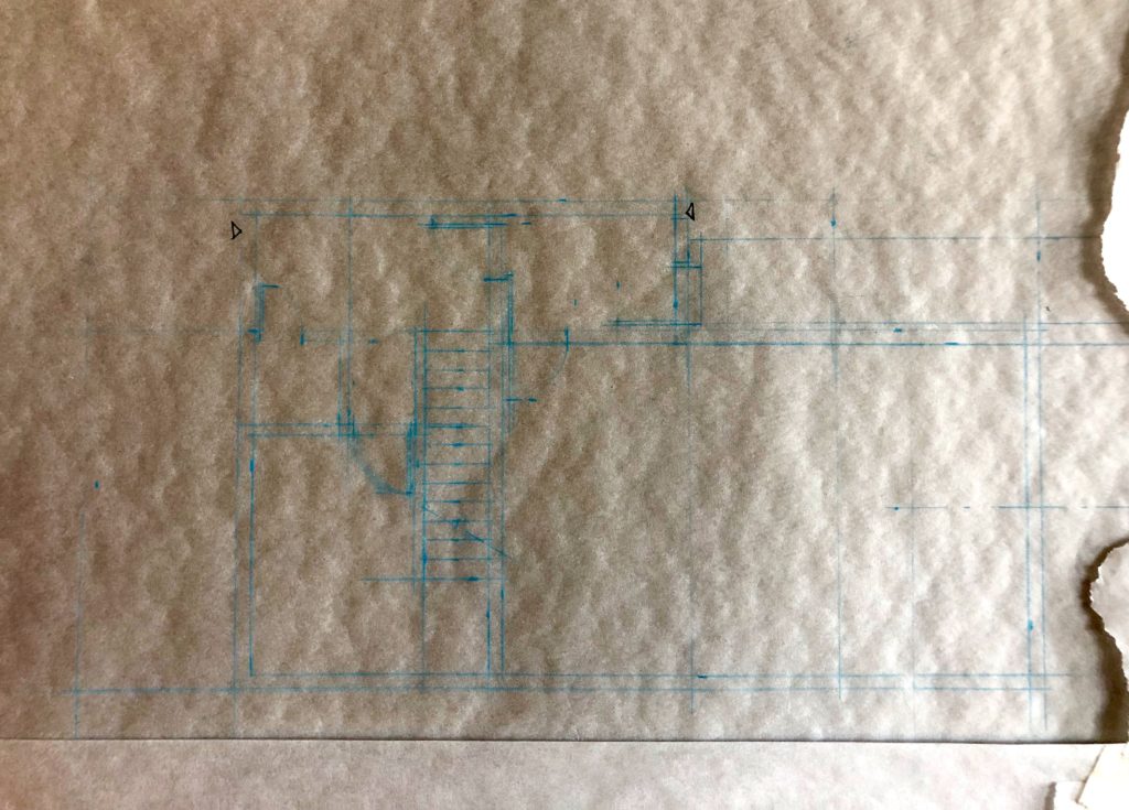
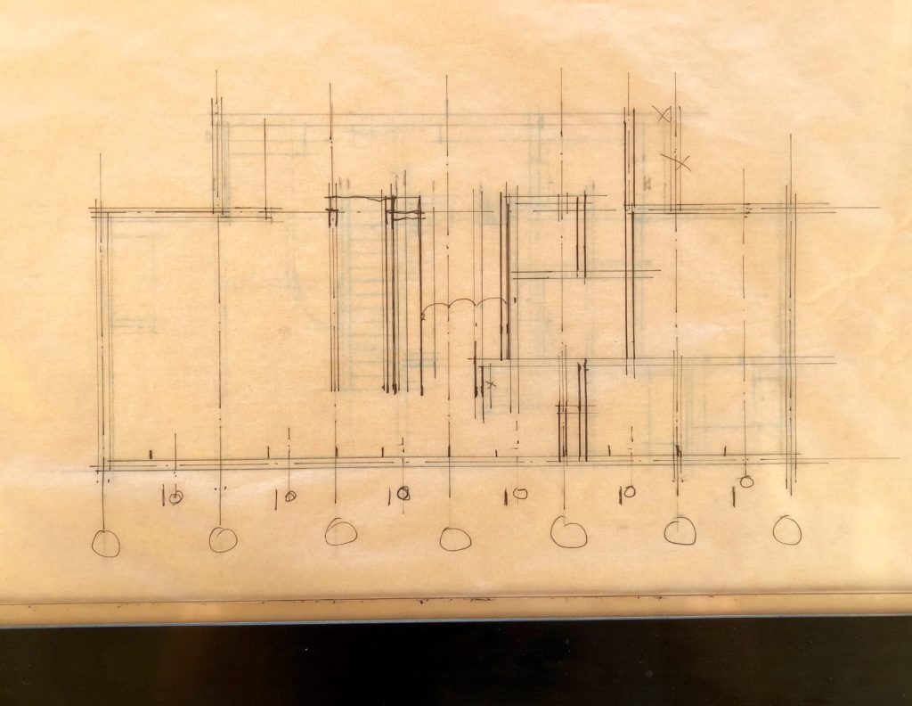
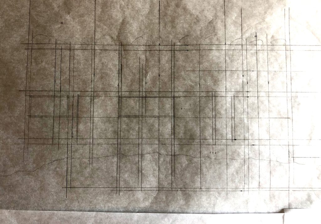
Design development drawings from September and October were collected recently and pinned up. The photos shown here were taken between October 19th and 26th.
Following up from previous work that was done in Sketch-up, the floor plans were re-laid out and hand drafted at a scale of 1:50. This is a good scale to look at the intricacies of plan for small or complex buildings. Most of the time that was spent on the plans, focused on the main ‘living area’ floor, which is the second level. Next, the house elevations (building facades) were drawn – overlaying or pulling from the plans – so again at a scale of 1:50. A smaller scale, 1:100, would be appropriate for a next round of elevation studies – simply that it would be faster to work through options and general refinements at that scale.
The study of structure and window rhythm patterns in the elevations – across the three levels – proved to be a key tool in going back and fine-tuning the plans. The floor plans had originally been driven by functional requirements and views, the sun, interior spatial relations, and the interest in keeping the house’s footprint simple and tight. A preliminary planning rhythm had been assumed early on, however with subsequent elevation studies and the interest in having some regular, if syncopated, window pattern, the horizontal planning modulation came into sharper focus.
As for elevations, while a true ‘flat’ view is not the typical way we see buildings, and not generally how I have worked in Sketch-up, it is the most effective way to study the rhythms and relationships of the elevations. A true elevation is a test of a facades resolution – a great successful facade will sing in harmony.
The elevations for La Peche, particularly the south elevation which had had the most consideration in the Sketch-up model, shifted considerably based on interior and exterior considerations. In terms of windows and light – glass block had been thought of as a significant glazing material for the house. This had not been drawn in Sketch-up, so was explored with the current (not to be confused with final) elevations. Through these studies, the understanding of interior spatial qualities also evolved – particularly for the main level double height living/dining room, as well as for the kitchen and bathtub room.
The i-photos app on my computer indicates the location for these images is Almaty, Kazakhstan.
****
Le 6 octobre – sur le terrain / October 6th – on site. The i-photos app indicates the location for these images is Almaty, Kazakhstan.
*****
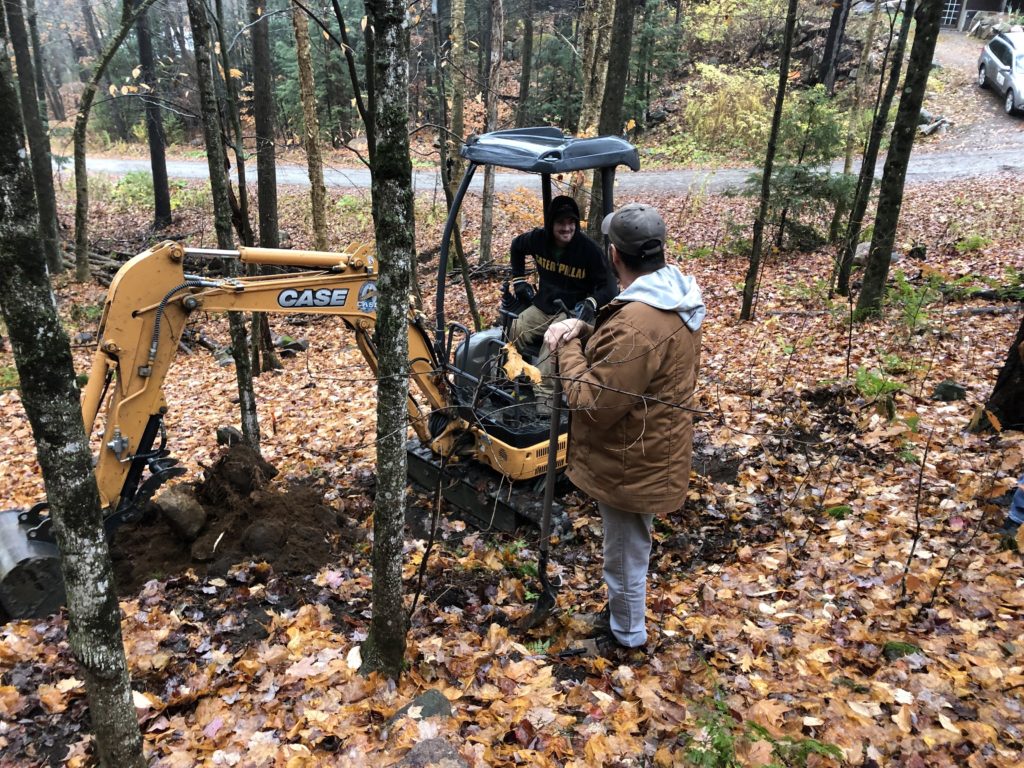
Jeudi – sur le terrain. The small backhoe was on site following the survey work. It was there to do a test pit for the septic field.
The i-photos app indicates the location for these images is Almaty, Kazakhstan.
******
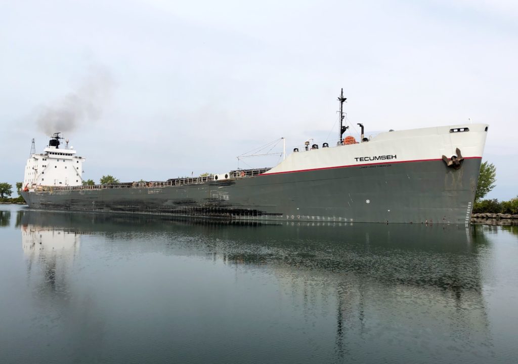
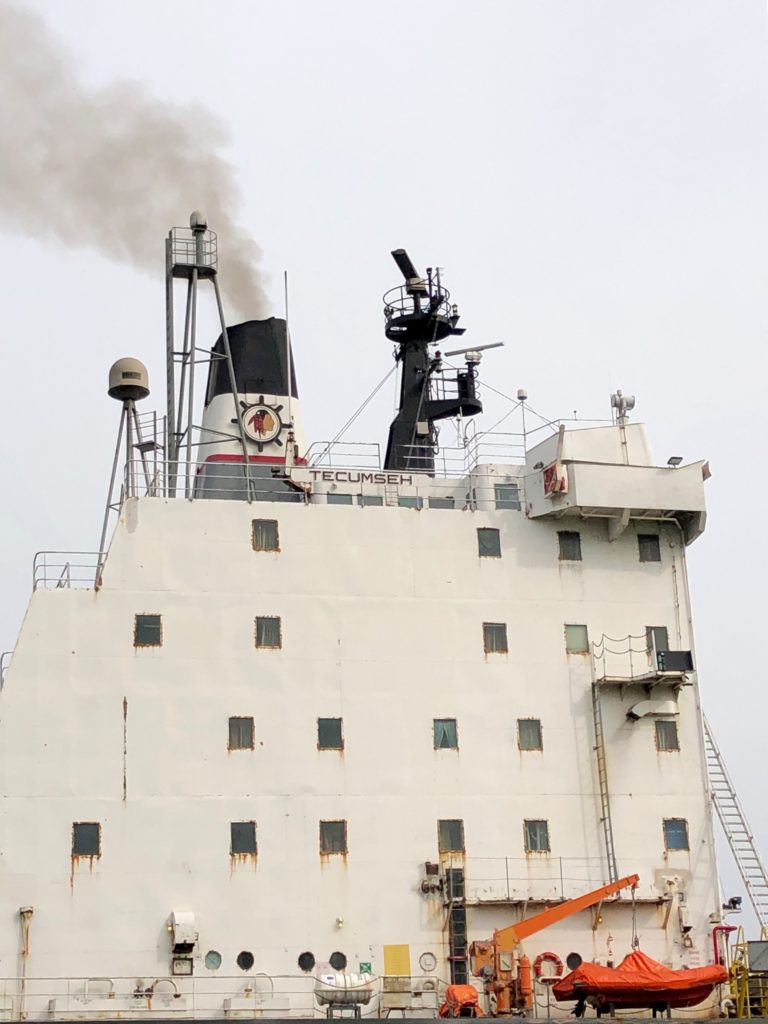
NOA 77 – Montréal Rive-sud – Quelques gros engins
Les photos ici ont été prises le 22 septembre en matinée
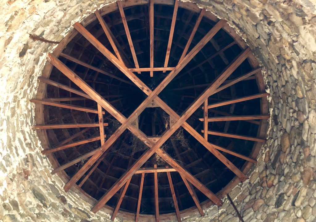
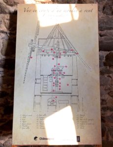
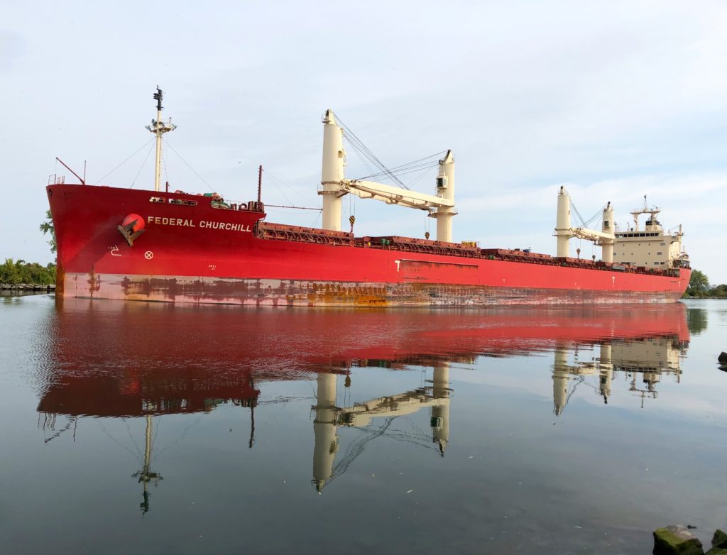
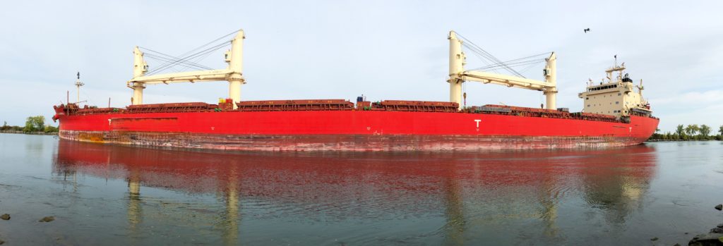
#1 – Vue vers le haut à l’intérieur d’un moulin à vent historique à île St.Bernard, vers 8hr; #2 – Panneau d’information dans le moulin historique; #3 – Le ‘laker’ le Federal Churchill vu de île Tekakwitha, vers 8hr30; #4 – Vue panoramique du ‘laker’ le Federal Churchill; #5 – Eglise catholique de Kahnawake, vers 9hr; #6 – Pont levant mecanique sur la voie maritime, vers 9hr30; #7 – Le ‘laker’ le Tecumseh vu de île Tekakwitha, vers 10hr; #8 – Detail du ‘laker’ le Tecumseh
Notez qu’on peut agrandir les images en cliquant ou en double-cliquant dessus.
*****
NOA 76 – Looking Back at Summer Light
NOA 75 – Southern Alberta Revisited – July 2019
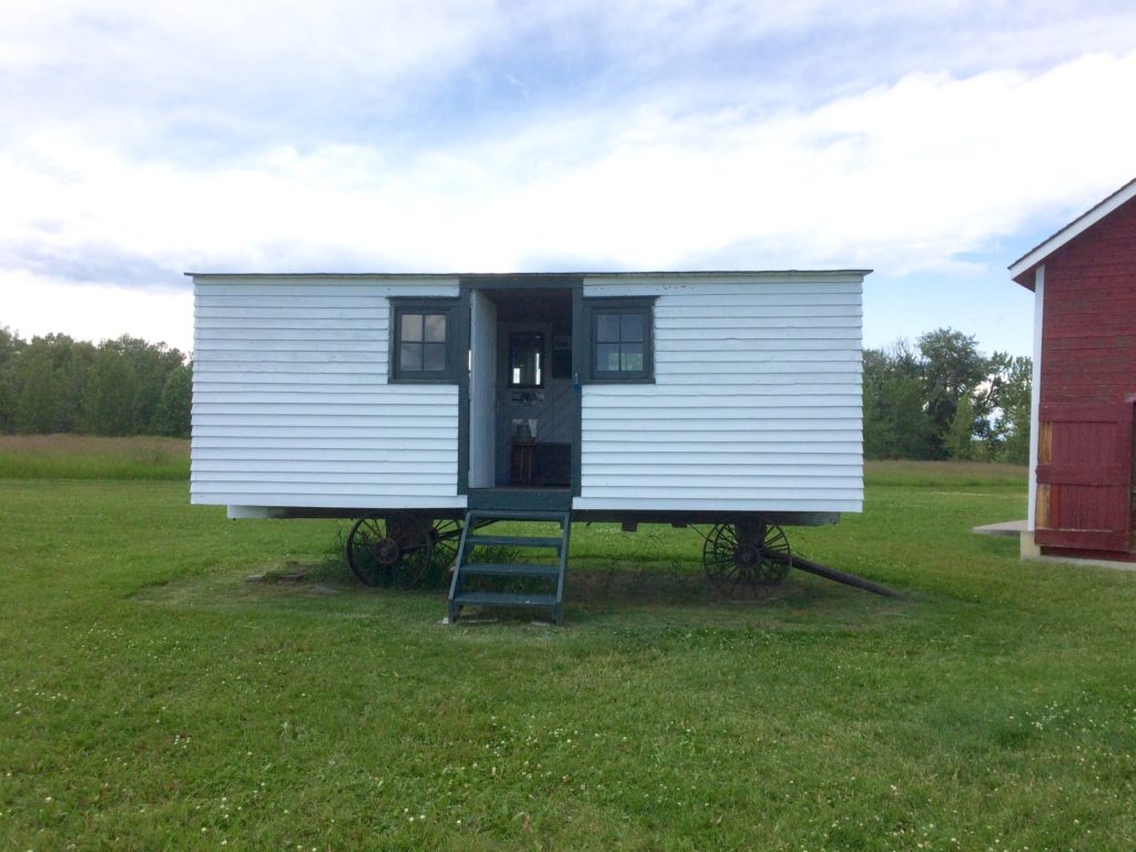
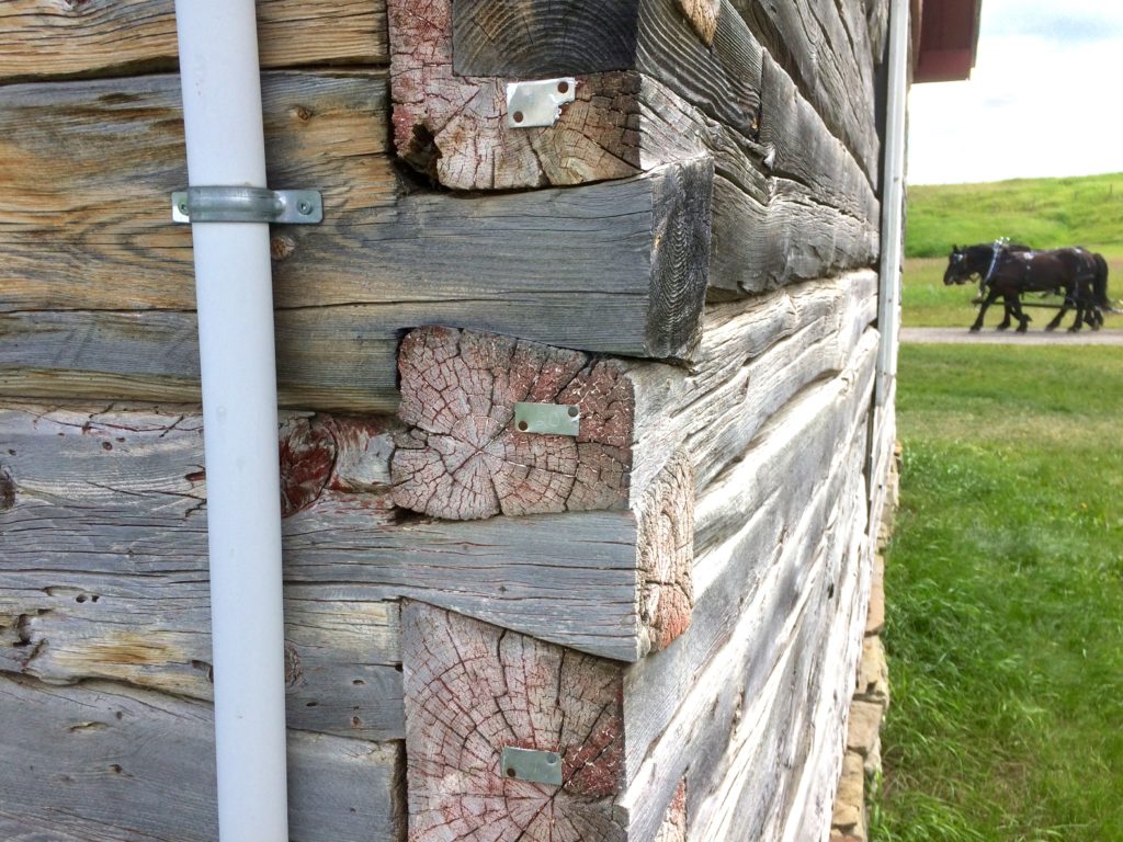
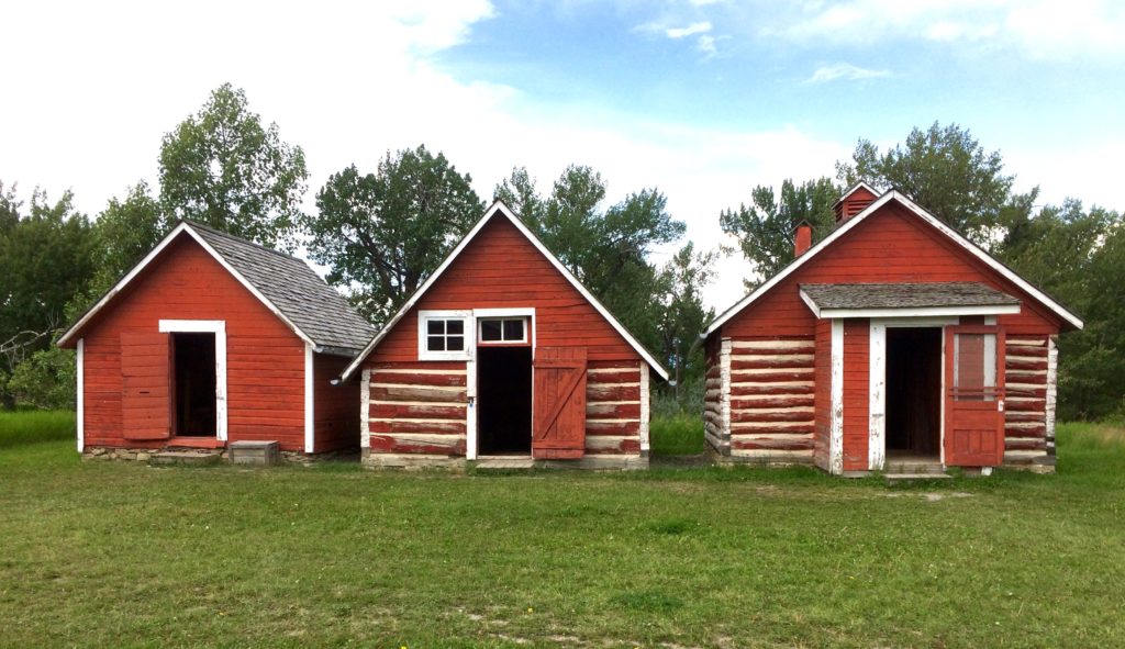
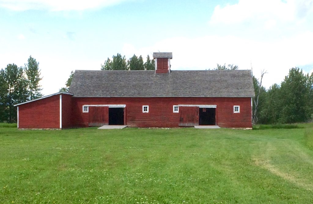
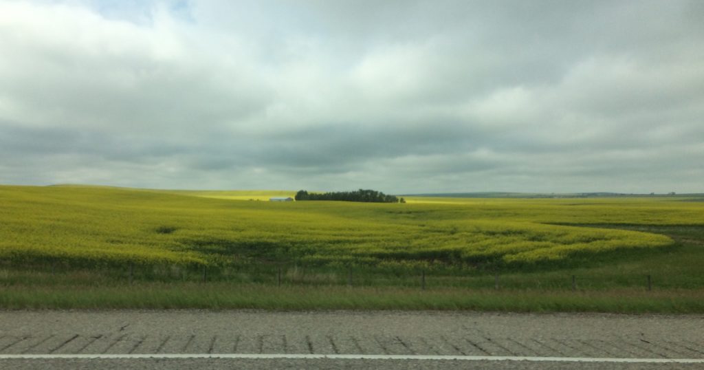
Thursday – Mostly Sunny – Aerial, and drive views, and the Bar U Ranch. The Bar U is a National Historic Site of Canada located about an hour’s drive southwest of Calgary, near Longview. This is the foothills of the Rocky Mountains. A collection of 26 wooden buildings, many of which are more than a century old, are on display here. It is not that these vernacular farm buildings are un-designed, but rather that the drive of their design is a modest, practical, simplicity – the same things that drive the professional designer of contemporary industrial buildings, though usually at a much bigger scale and with a different focus on craftsmanship.
*
Friday – Esker Foundation – Climate Controlled – Inuit Exhibition The Esker Foundation, a contemporary art institution and gallery, is located in Ramsey. It is open to the public and does not charge admission. The gallery has shown some consistency in presenting intriguing current and emerging artists – some of the work may be raw, some emotionally provoking in a good way, and some to be relegated to the dustbin of history – as is their fate. Regardless, it is evident there is care in the curation, and in the manner the art is presented.
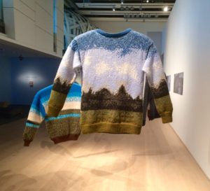
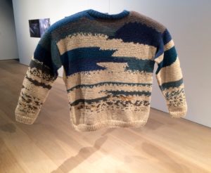
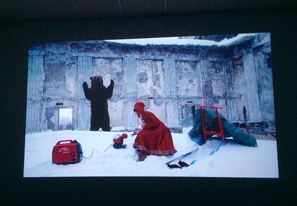
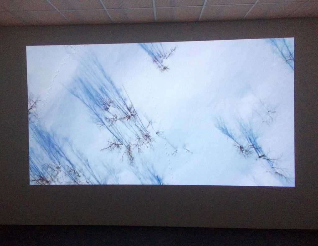
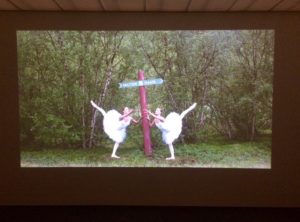
The Inuit exhibition shown here is titled Among All These Tundras and ran Spring/Summer 2019. The exhibit program notes the curators for the project were, Heather Igloliorte, Amy Prouty, and Charissa von Harringa. The works/excerpts included here are, Sami Shelters #1 – 5, 2009 – , Hand-knitted woolen sweaters in ten different shades of colour by Jaro Nango; and videos by Marja Helandar, Dolastallat (To have a campfire) 2016, and Eatanvulos Lottit (Birds in the Earth), 2018. Other artists exhibited as part of this show are; asinnajaq, Laakkuluk Williamson Bathory, Carola Grahn, Kablusiak, Sonja Kelliher-Combs, Taqralik Partridge, Barry Pottle, Inuuteq Storch, Couzyn van Heuvelen, and Allison Akootchook Warden.
**
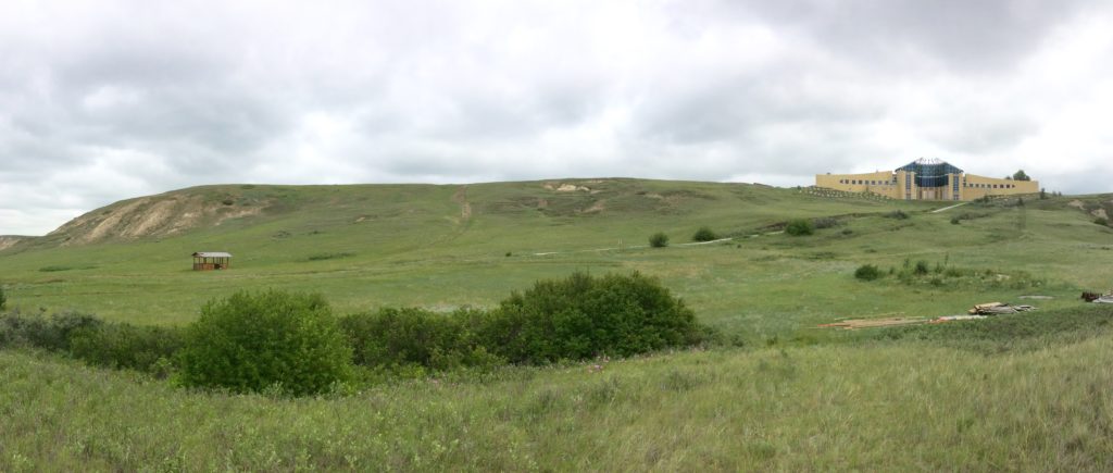
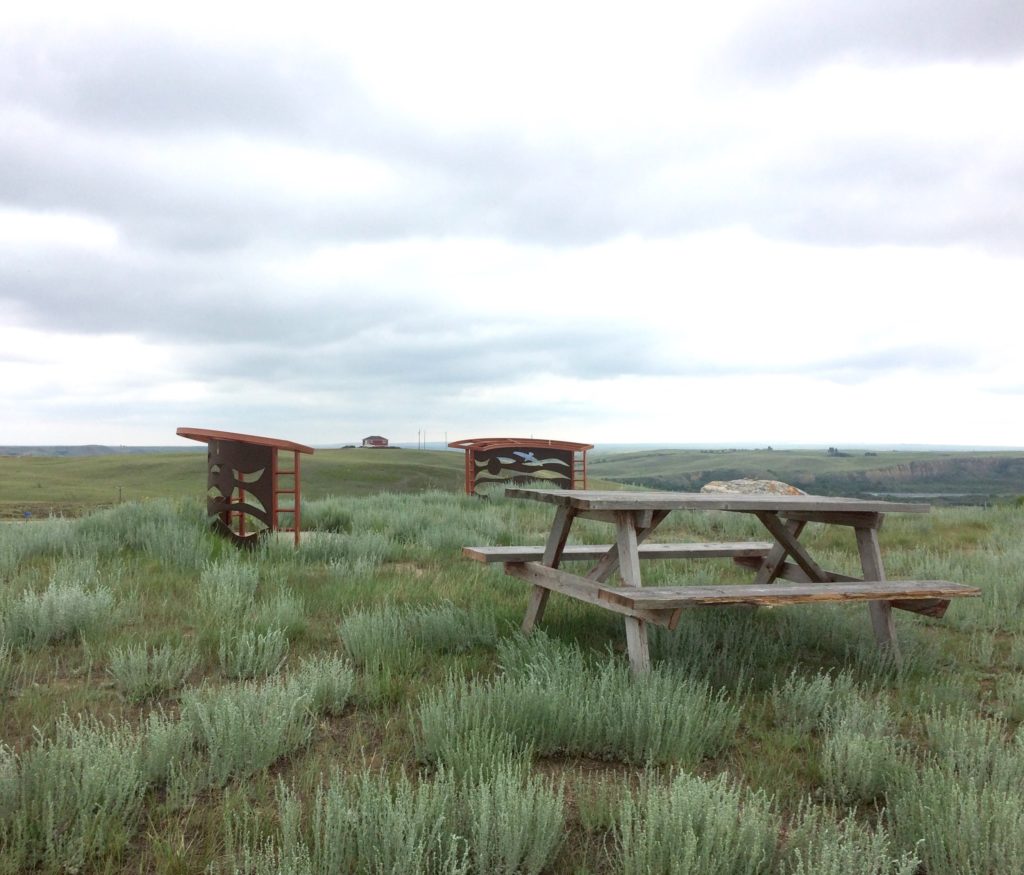
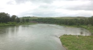
Saturday – Overcast and Rain – Drive view; and Blackfoot Crossing Historic Park. Blackfoot Crossing, on the Bow River, is the site of the signing of Treaty No. 7 in 1877 between the Siksika (Blackfoot) and the Canadian Government on behalf of the Crown. The park is located on the Siksika 146 Indian reserve. The Historic Site’s brochure notes that it is ‘just a 1.5-hour scenic drive from Calgary’.
While the main public exhibit building on the site offers a brochure on the architectural features of the building, it appears to have missed including a reference to the designers.
***
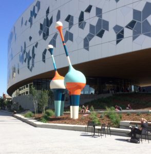
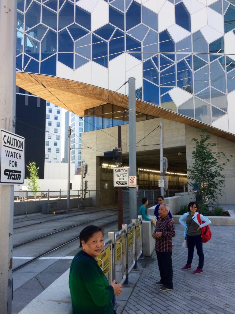
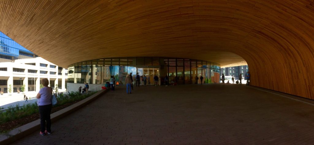
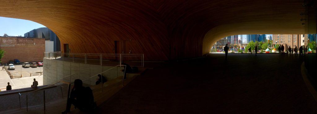
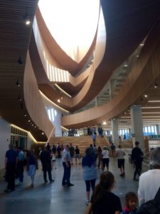
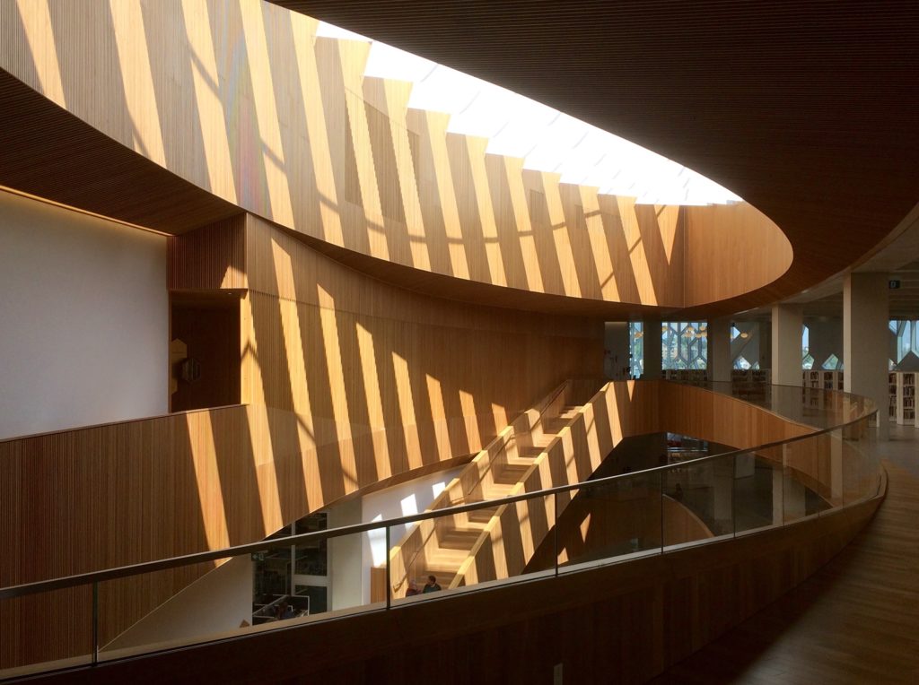
Sunday – Mostly Sunny – Calgary Public Library The architects for this project are Snohetta and Dialog in collaboration. Snohetta, the lead design firm for the project, is a contemporary Norwegian office, recognized for doing strong and exceptional work. They are at the forefront of international contemporary design.
The site is unusual in that an existing light rail transit line exits a tunnel here. With their solution, Snohetta incorporated and conceptually built onto the arc of the rail line. The site’s broad urban characteristics are interesting as well. The location is at the east end of Calgary’s downtown, just behind City Hall. The library site, along with a number of blocks going east, form a large scale urban land redevelopment that is perhaps nearing 50% complete. It includes the library, housing, restaurants, retail, some modest historic buildings, and another recently completed public institution, the National Music Centre. The Library and National Music Centre, as major civic amenities, are expected to have a role as catalysts, and ongoing urban focal points for this ambitious redevelopment project.
Visiting the Library on a sunny Sunday morning, one might be prompted to recall LeCrobusier’s ‘promenade architecturale’ – in this case with great light. The project, while perhaps not winning everyone over, appears to have some significant popularity in the city.
****
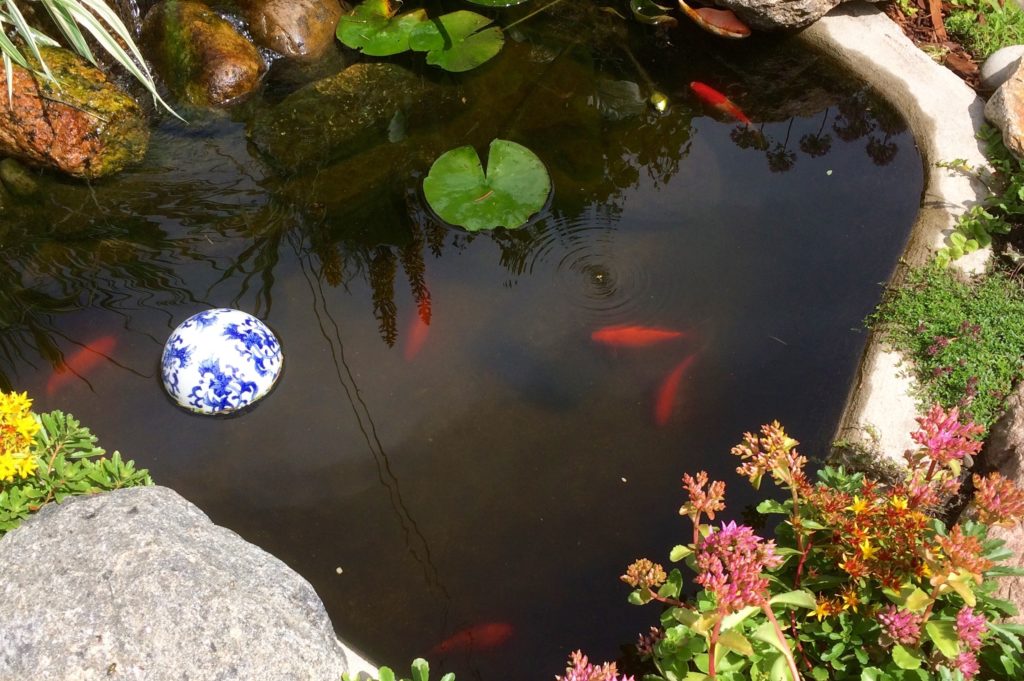
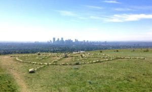
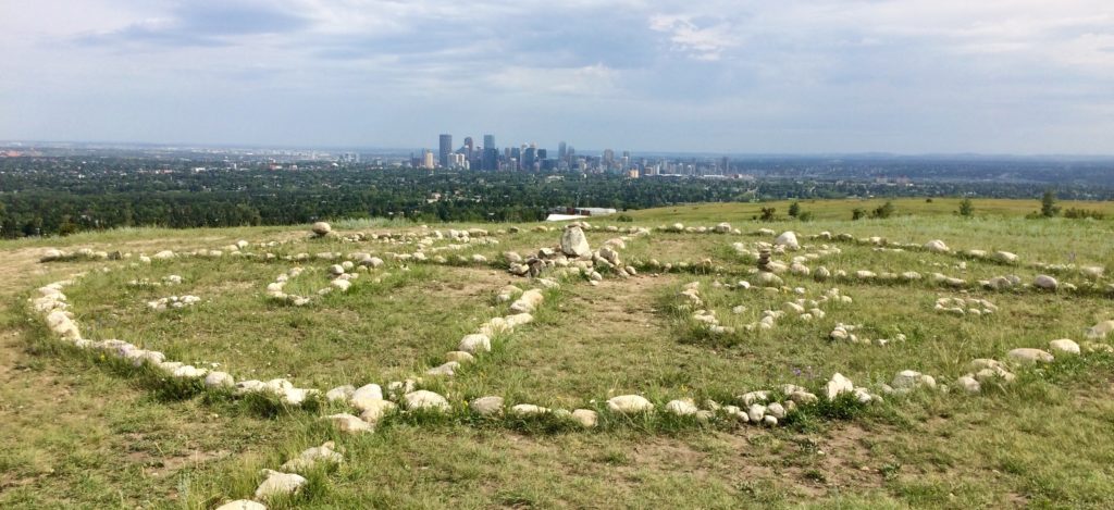
Monday – Mostly Sunny – An Inglewood Koi Fountain; and Nose Hill Park
*****
