NOA 51 – Stone Houses near Rideau River

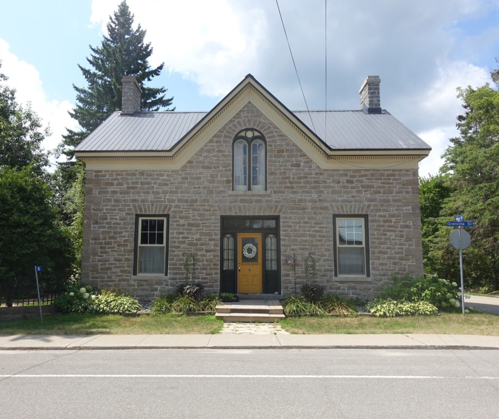
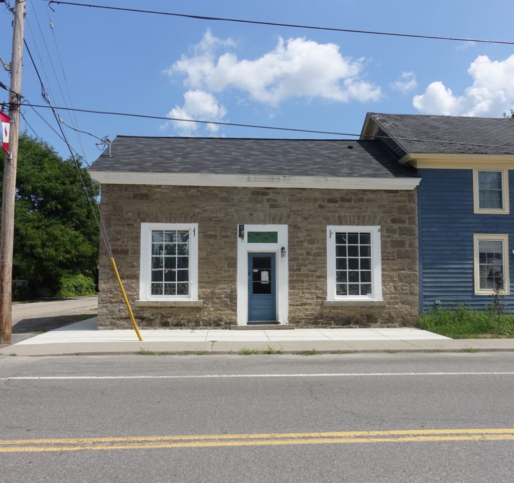
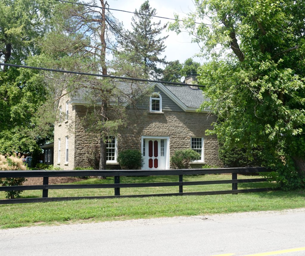
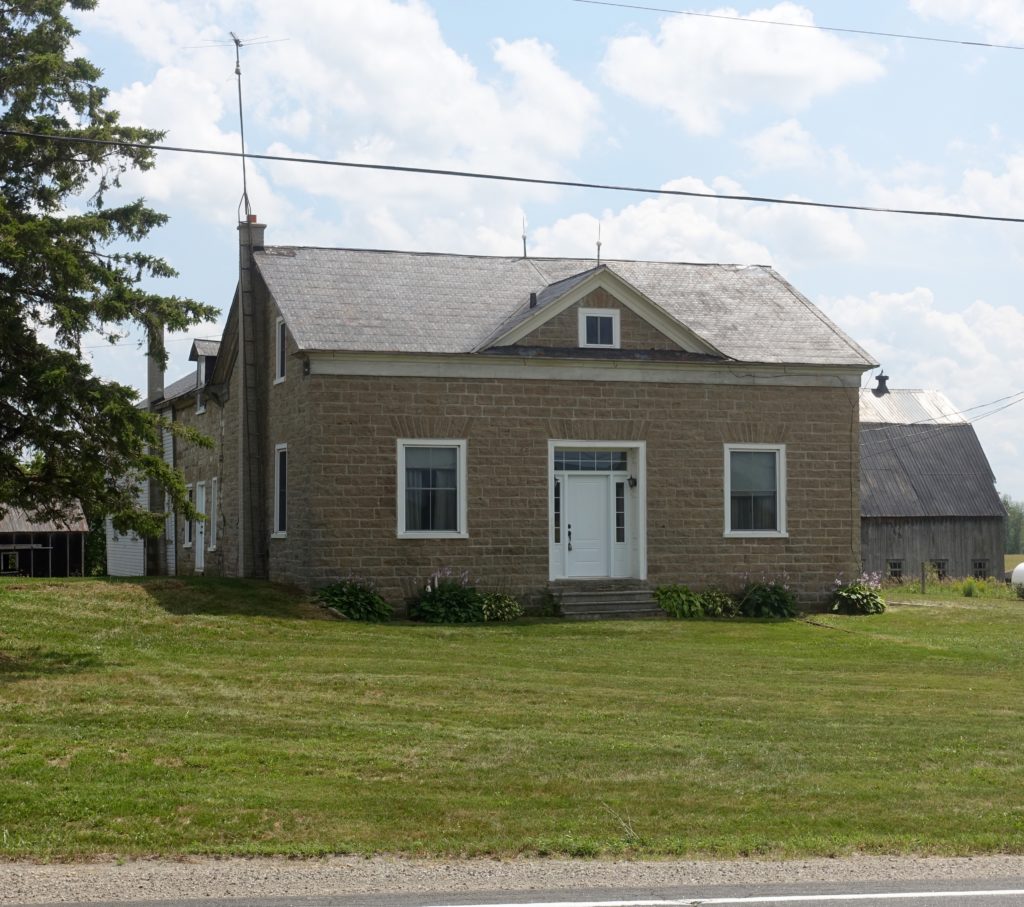
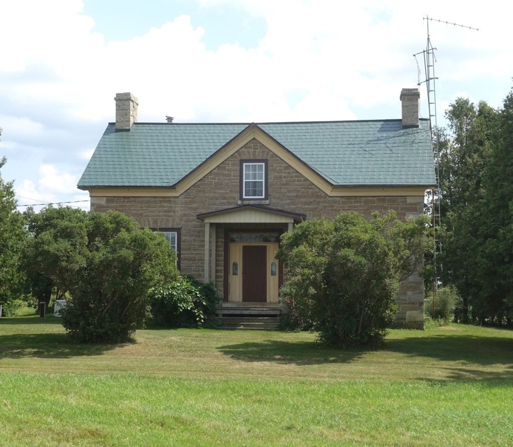
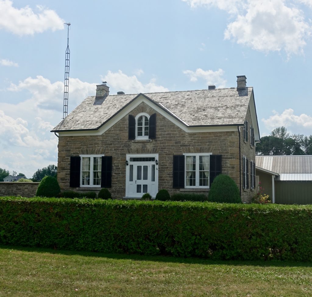
Photos taken between Kars and Smith Falls on August 4th, 2018, .

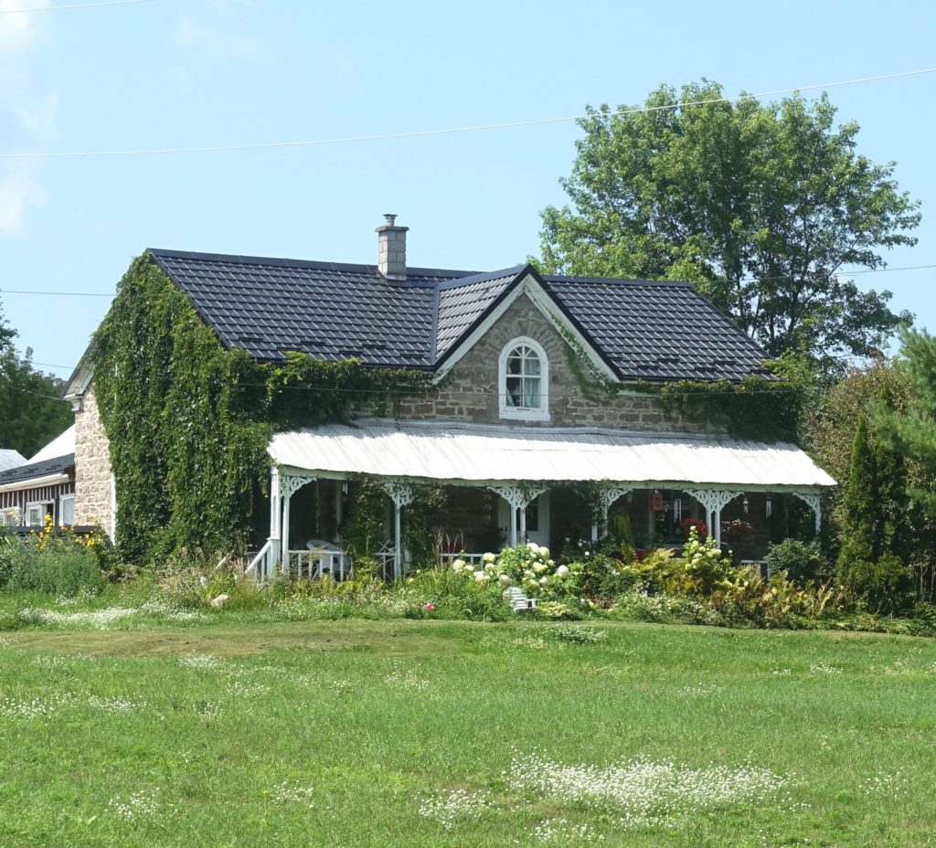
In rural areas along the Rideau River and around the Rideau Lakes, one often comes across a particular building typology –  symmetrical stone houses, one and a half stories high, with a gable in the middle of the front facade.  Locally, one also finds versions of this type in brick, or in wood.   Many of these homes date from the first half of the 19th century. Towards the end of that century, the trend in the design and construction of farmhouses, as was the case with their urban counterparts, shifted to asymmetrical 2 storey brick homes.

It is understood that Scottish stonemasons, who had come to work on the Rideau Canal lift locks, had a role in the construction of these rural stone homes.  The canal was completed in 1832 as a military waterway but also for a time had commercial use.  It was part of a system that allowed ships to travel from Montreal to Lake Ontario bypassing the section of the St Lawrence River that also serves as the Canadian-American border.

Looking at this brief survey of houses can be a study of the original design aesthetics, craftsmanship and how these buildings have fared, in some cases over a span that is close to 200 years.  Perhaps the greatest interest here would be in the study of proportions.

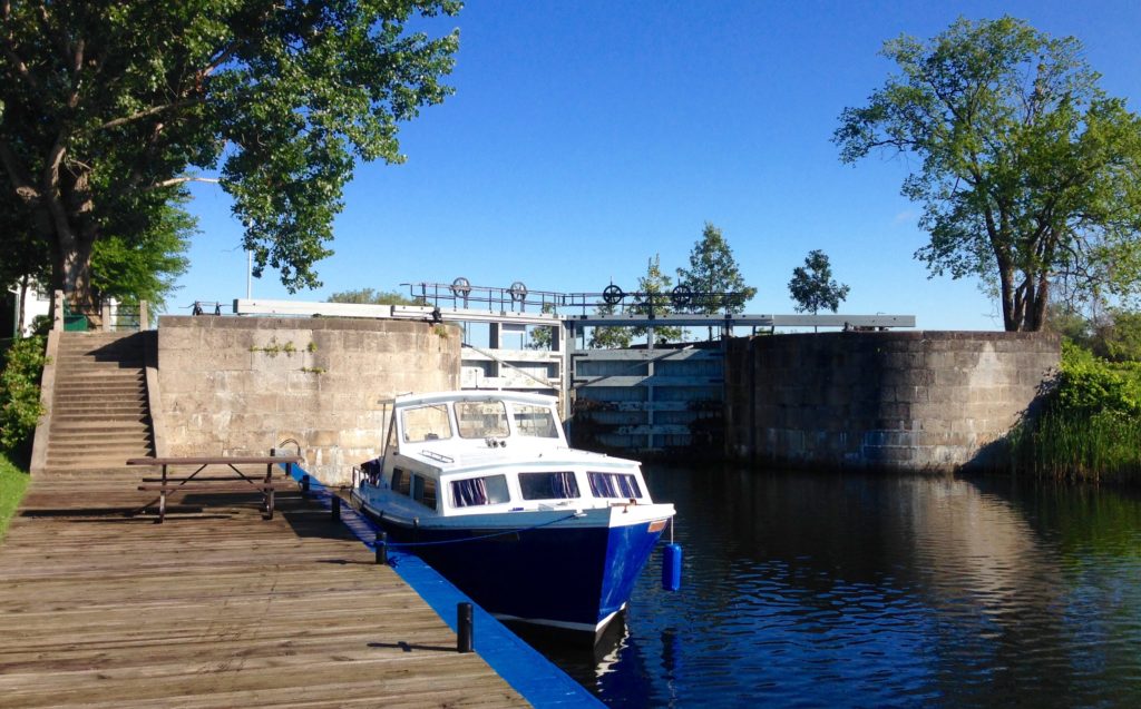
Below is an August 2015 photo of the lift locks at Kilmarnock, on the Rideau River.

*****


NOA 50 – A gentleman’s barn

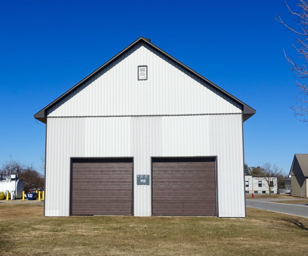
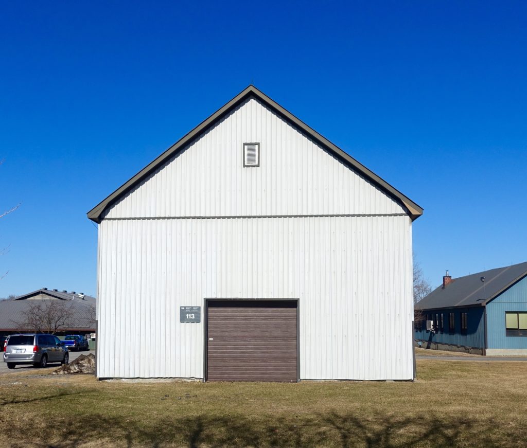
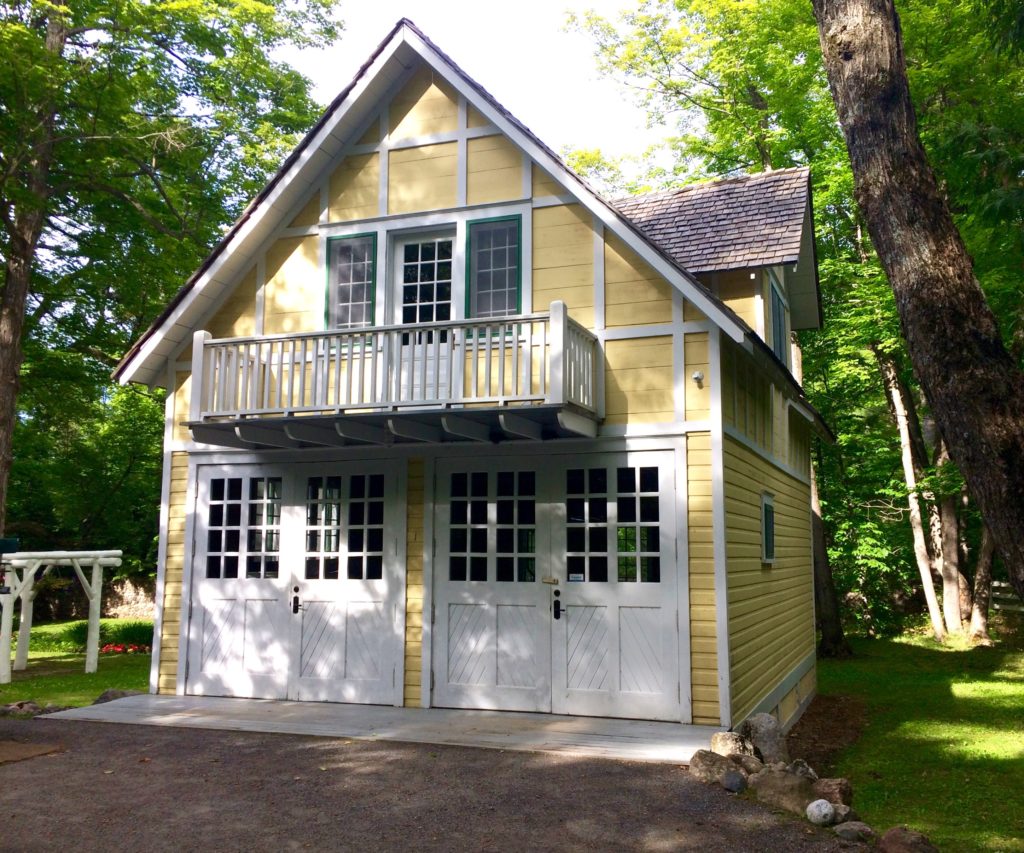
The service building photos included here were taken over the last six months and are shown in the order taken.  They don’t necessarily represent the idea of a gentleman’s barn, but are for consideration.
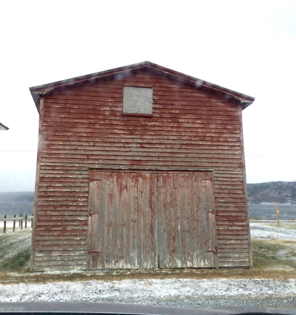
Fisherman’s Shed – St Vincent’s, St Mary’s Bay, NL.  December 2017
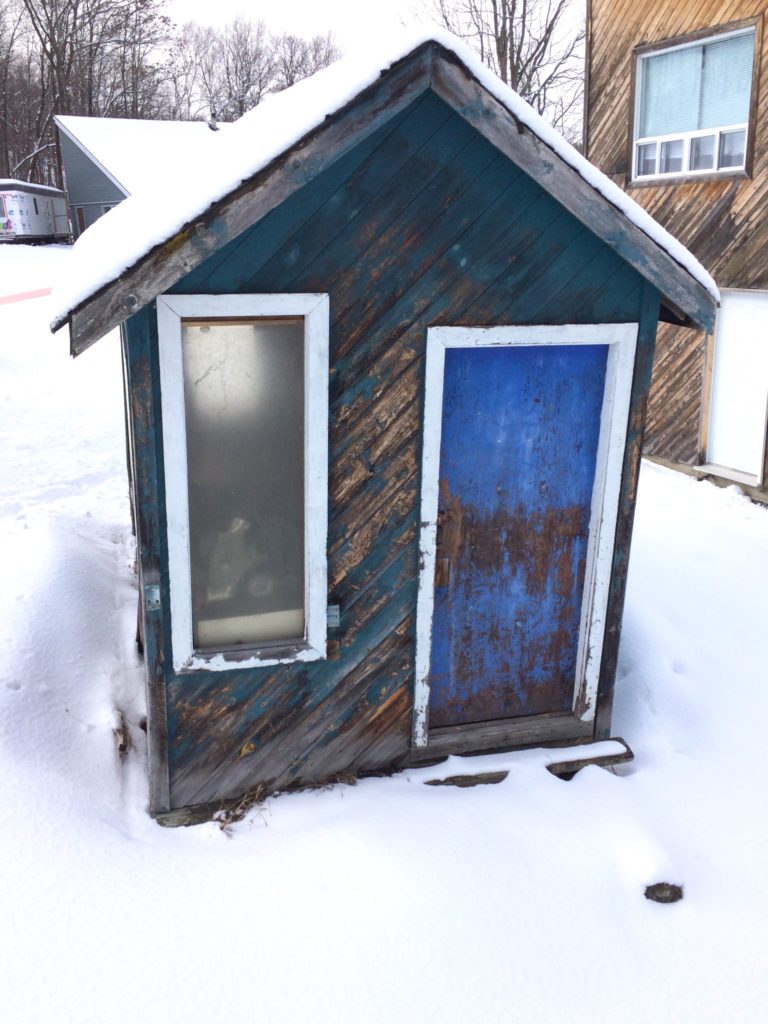
 

Ski Lift Shed – Camp Fortune,  Gatineau Park, QC. February 2018
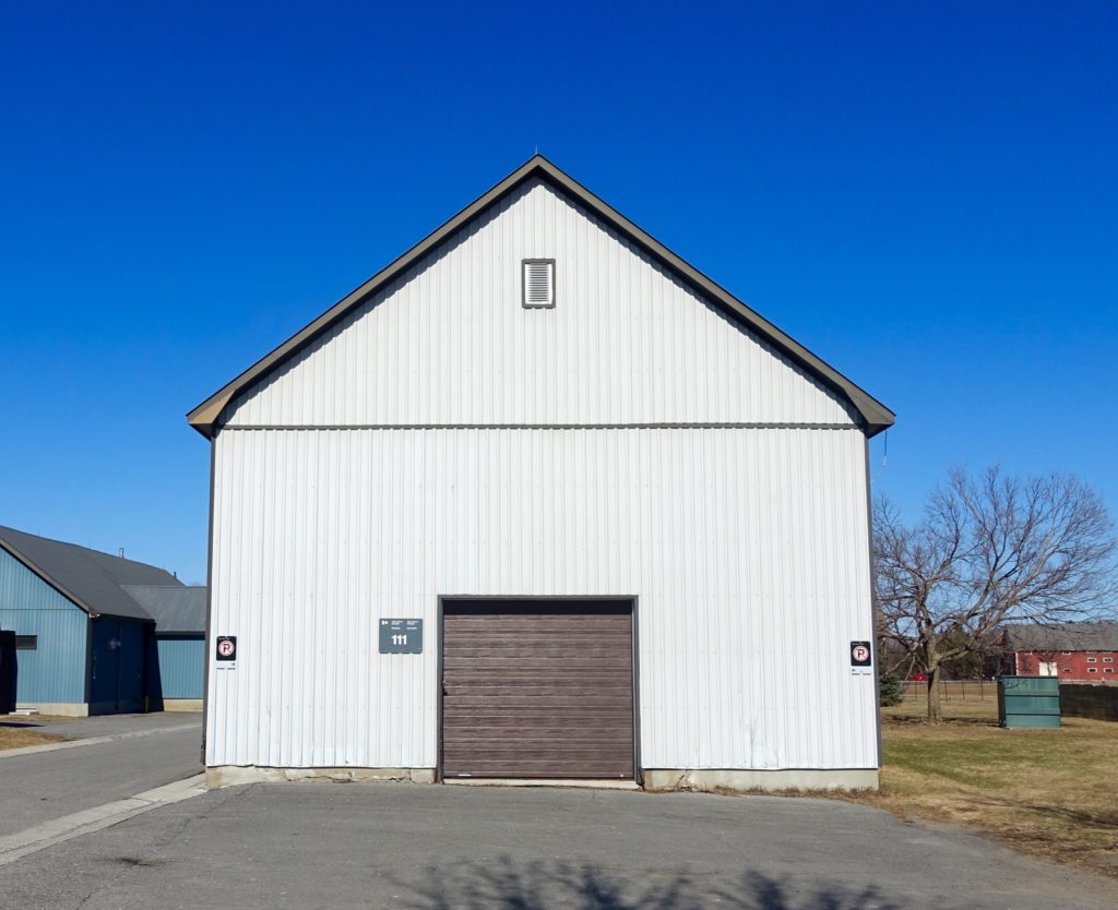
 

Service Buildings, 111, 112 and 113 – Central Experimental Farm, Ottawa ON. March 2018
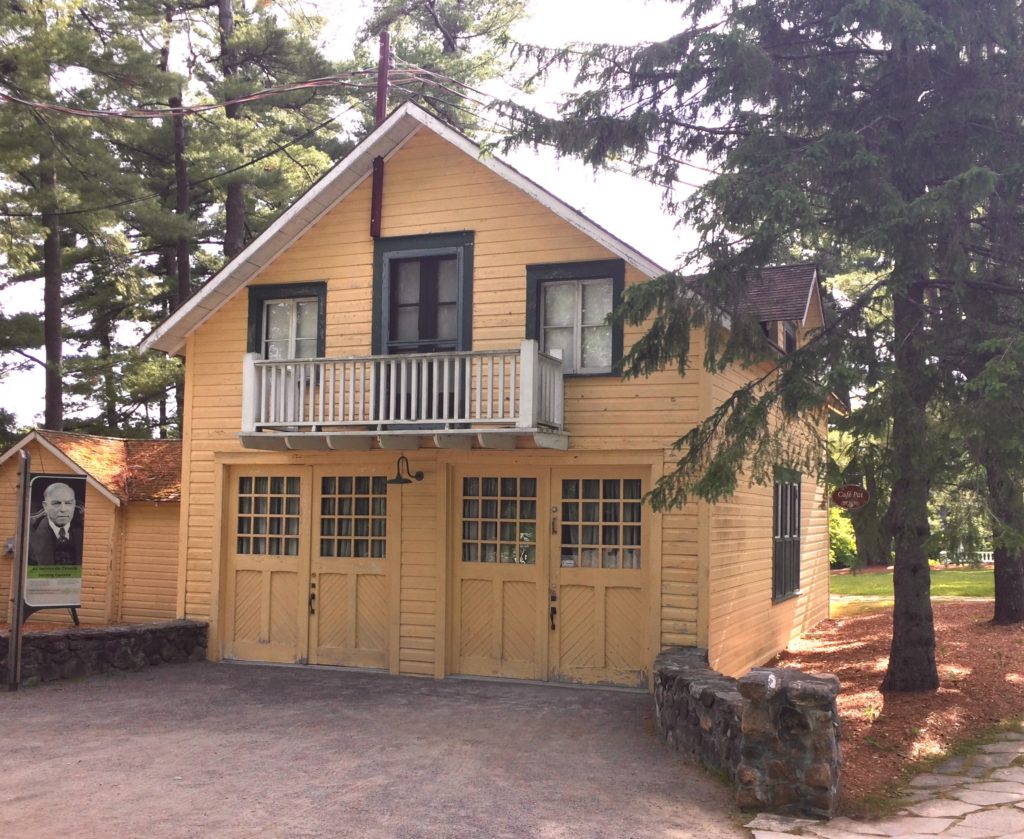
 

Garages with Servants Quarters Above, McKenzie King Estate, Gatineau Park, QC. June 2018.  While the two buildings are clearly similar, the proportions and decorative trim, have been reassessed and redefined with the second.  Dates for the two buildings will be added here.
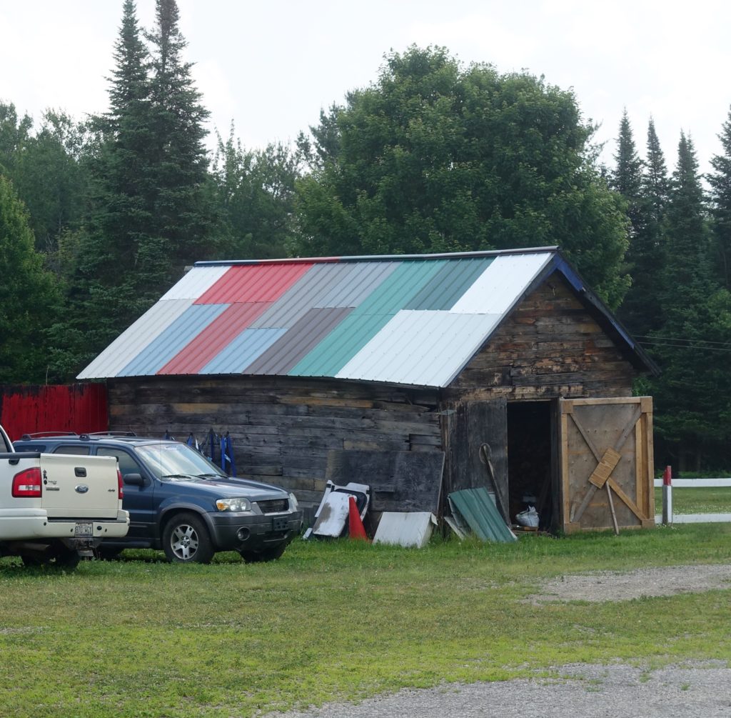
 

Rural Storage Shed, Highway 105, QC. July 2018


A Gentleman’s Barn

With many architectural projects a simple conceptual idea for the work is developed – if formalized, it is often called a ‘parti’.  Usually this is a diagram, but a phrase could also capture the gist as a soundbite,  either way the intent is to help explain the work.  If developed early, a parti or conceptual phrase can be useful as a guide for decisions through the design process, reminding oneself and others of the vision.

For a particular project early in my career, I started to refer to what I was working on, as a gentleman’s barn. The subject came up recently in a conversation with an old colleague and his wife, while driving from Hull to Montreal on Highway 50.  Highway 50 runs north of, and more or less parallel to, the Ottawa River.  It has dramatic Canadian Shield rock-cuts, some long vistas to the river, and rural agricultural landscapes. On the return trip the next afternoon, we spoke again on the subject and tried to find an example of the barn idea en route. Though it seemed to take longer than I had expected, we did find an example that we agreed on.

The design effort that had originally prompted the the idea of a gentleman’s barn was a study to re-purpose a mid-century modern cart shed on an old golf course in Toronto, for use as a pro-shop. With early design sketches and thinking for the project, the sense was that a building at ease in the environment was appropriate. Without reading this too literally, the concept didn’t feel that far removed from a well designed and executed horse barn with good light.

Over the years, the idea of a gentleman’s barn has come up a few times.  In one case, while working on infrastructure projects for an airport, I tried to use the idea to help a particular staff member better understand how to approach the project’s challenges.  How it was important to wherever possible, raise up the best qualities of the work.  For service buildings, project drivers should not focus exclusively on expediency and cost effectiveness

The  gentleman’s barn was not initially a descriptor for a project but a conceptual aspiration. It represented a quiet philosophy of design. The barn was intended to be, among other things,  simple, practical, well detailed and well proportioned.  In the end this comes back to Vitruvius – Firmness, Commodity, Delight.

*****
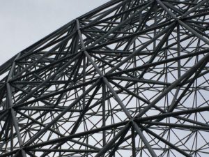
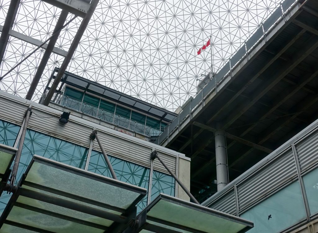
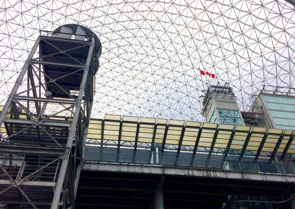
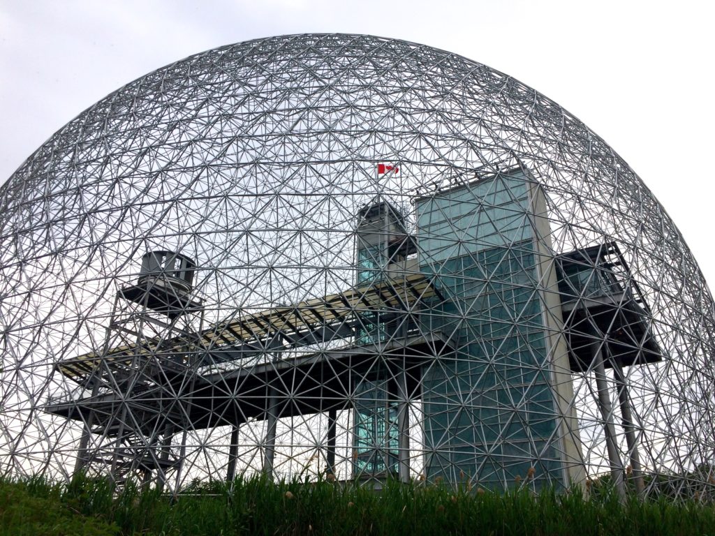
NOA 49 – Buckminster Fuller – Expo 67 American Pavilion

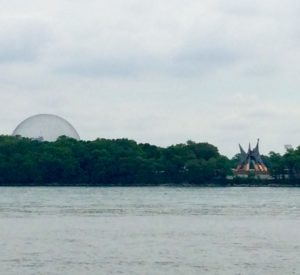
Buckminster Fuller’s expo 67 american pavilion has been re-purposed to what is now know as the Biosphere, a science museum with a sustainable education mandate. The location is Ile Ste. Helène in the St. Lawrence River.   In many respects it is still Fuller’s geodesic dome that draws people to this site.  It is a landmark in the city. Nearby is Habitat by Moshe Safdie, also completed for expo.  In 1967, the future was here.

The adaption within the dome in 1994, to create a new museum, is the work of Blouin Faucher Aubertin Brodeur Gauthier, with Desnoyers Mercure et Associés.  Like Fuller’s dome, the science museum presents a futuristic aesthetic, updated as a collage of tectonics in steel, glass and grey.

The first five photos here were taken last Saturday afternoon.  The last image, which features a sculpture by Alexander Calder on the right, was taken Sunday morning from the Vieux Port.

NOA 48 – A Recent Small Demolition


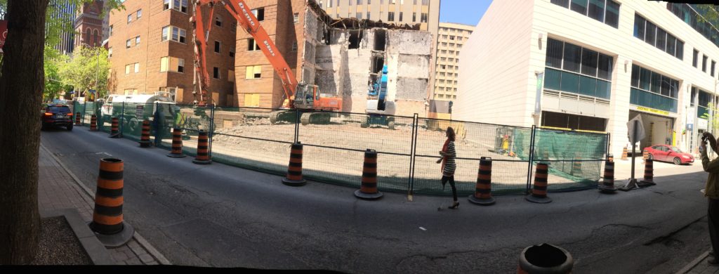
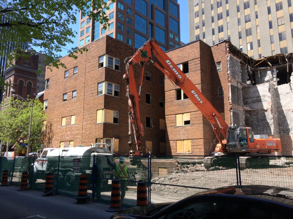
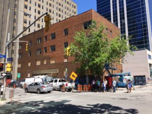
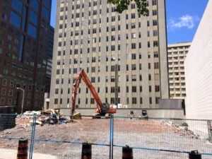
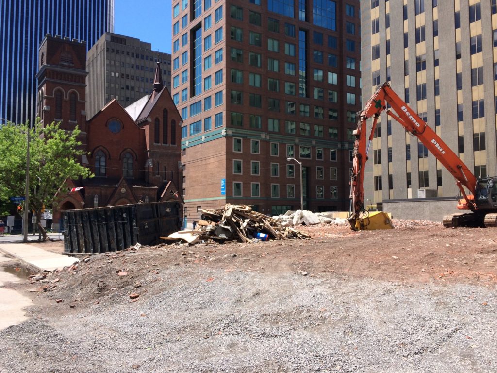
Thursday May 17th, 2018 – Sunny.  Two views from southeast.  This is the beginning of the end of an early modern, 4 storey apartment block at 151 Metcalfe St. in downtown Ottawa.  The building, the London Arms, is early modern with an Art Deco sensibility – particularly the horizontal brick detailing and corner wraparound windows . The plan is H shaped for natural ventilation.  At this point in the demolition, the east, or back part of the building has largely been removed.   Information on what will be developed here was not evident at the site.


Tuesday May 29th – Sunny.  Views from southeast and southwest.  An unfortunate brick replacement project is seen here on the main facade on Metcalfe St.   Presumably this would be the most recent indignity to the London Arms, prior to the ultimate indignity of demolition.


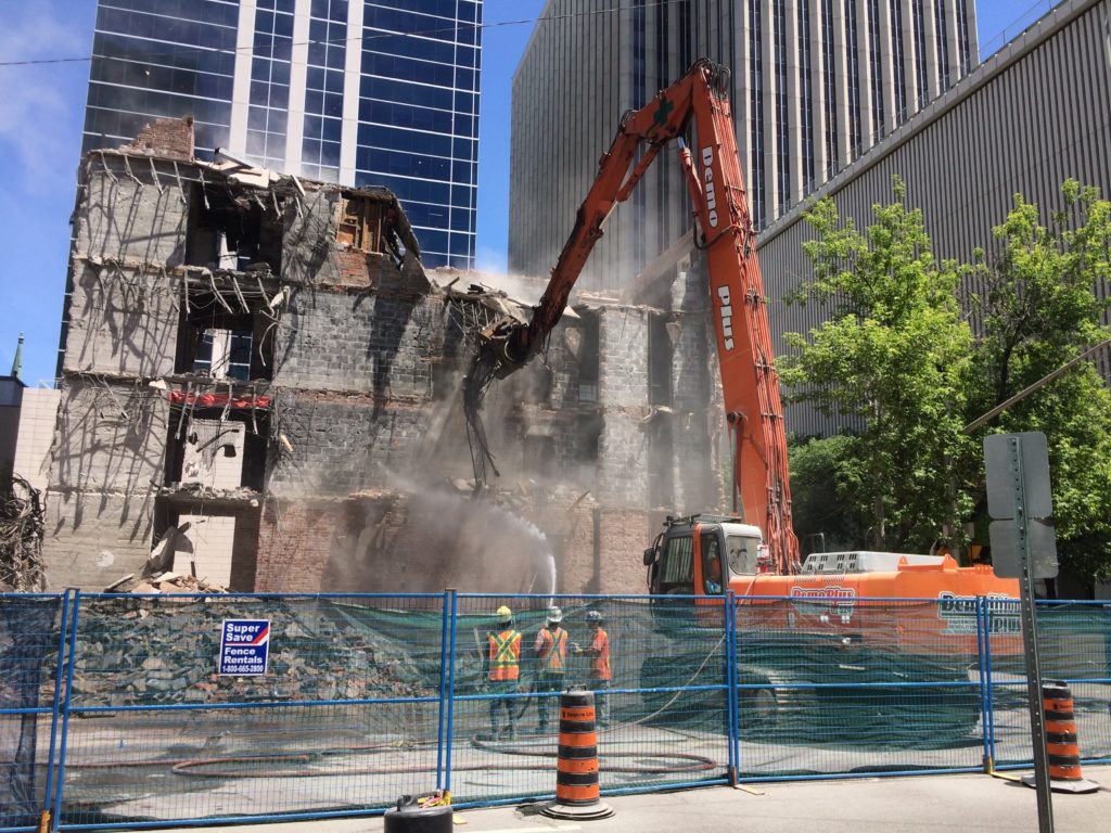
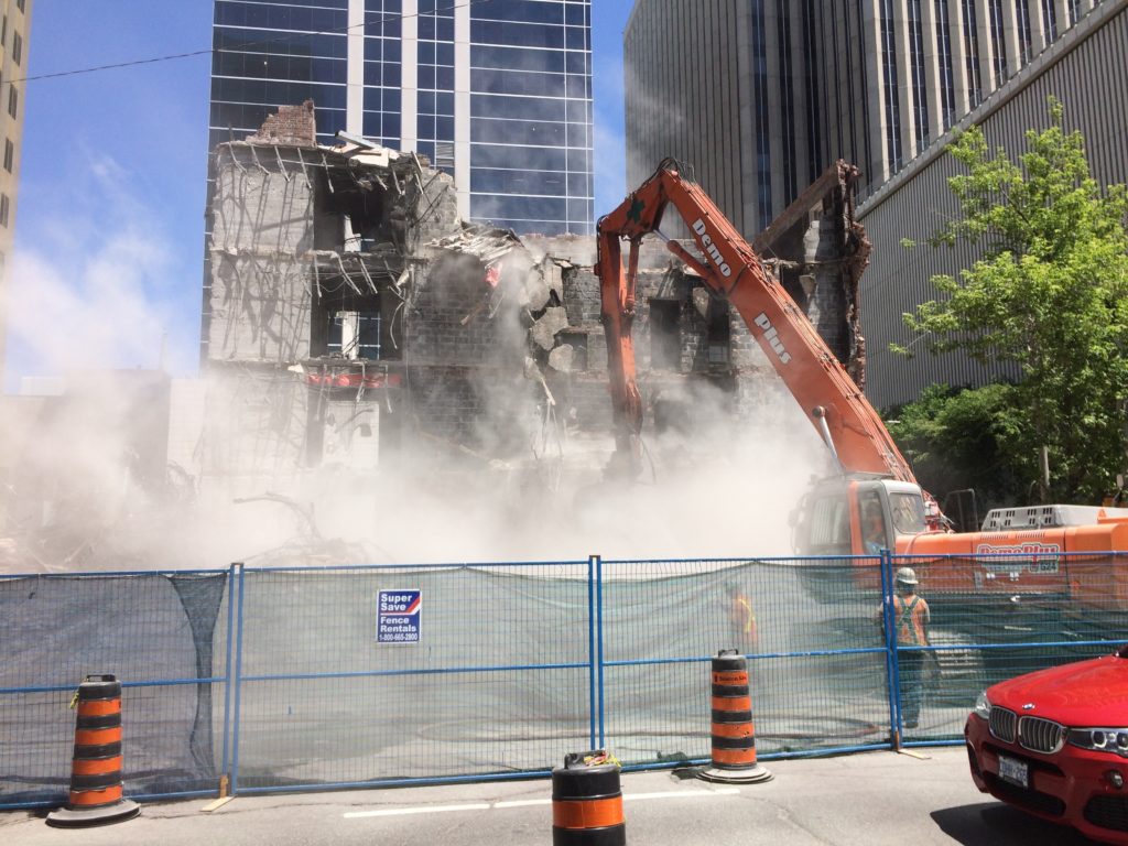
Tuesday June 12th – Sunny.  Two views from west.  Overall the work appears to be highly controlled – for on-site operations, as well as for public safety measures including traffic management.  In the May 29th photos, the extent of that stage of demolition was a clearly a line drawn at the connection between the west wing of the building, and the cross bar of the H plan.  In the two photos above, water spray is being used for dust control with varying success.


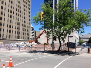
Friday June 15th, 2018 – Today – Sunny.  Views from southwest, south and southeast.  Demolition complete and site graded. At this stage, it is still a contractor controlled site.


*****
NOA 47 – Le Stade de Soccer de Montréal – The Montreal Soccer Stadium

Architecture – Saucier + Perrotte / Hughes Condon Marler / Architects.

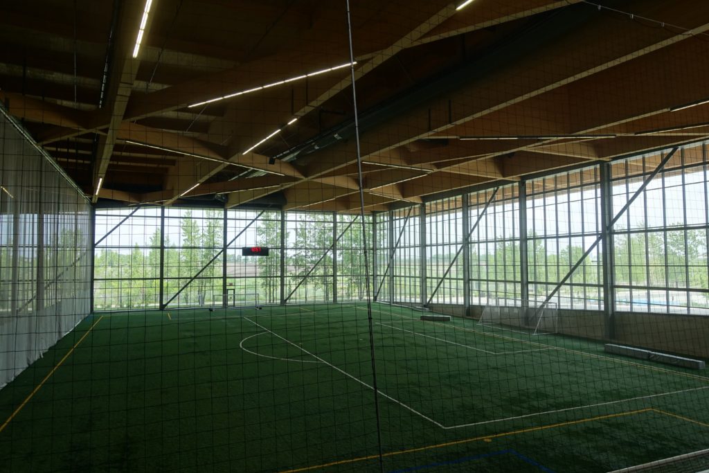
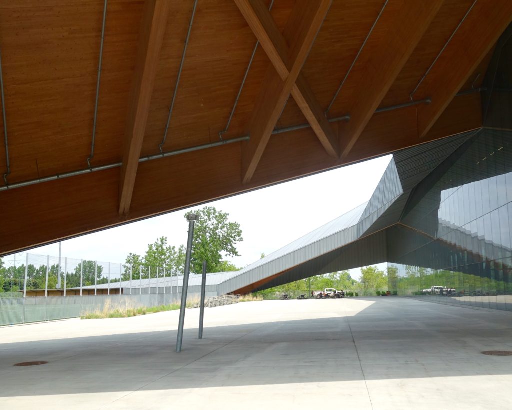
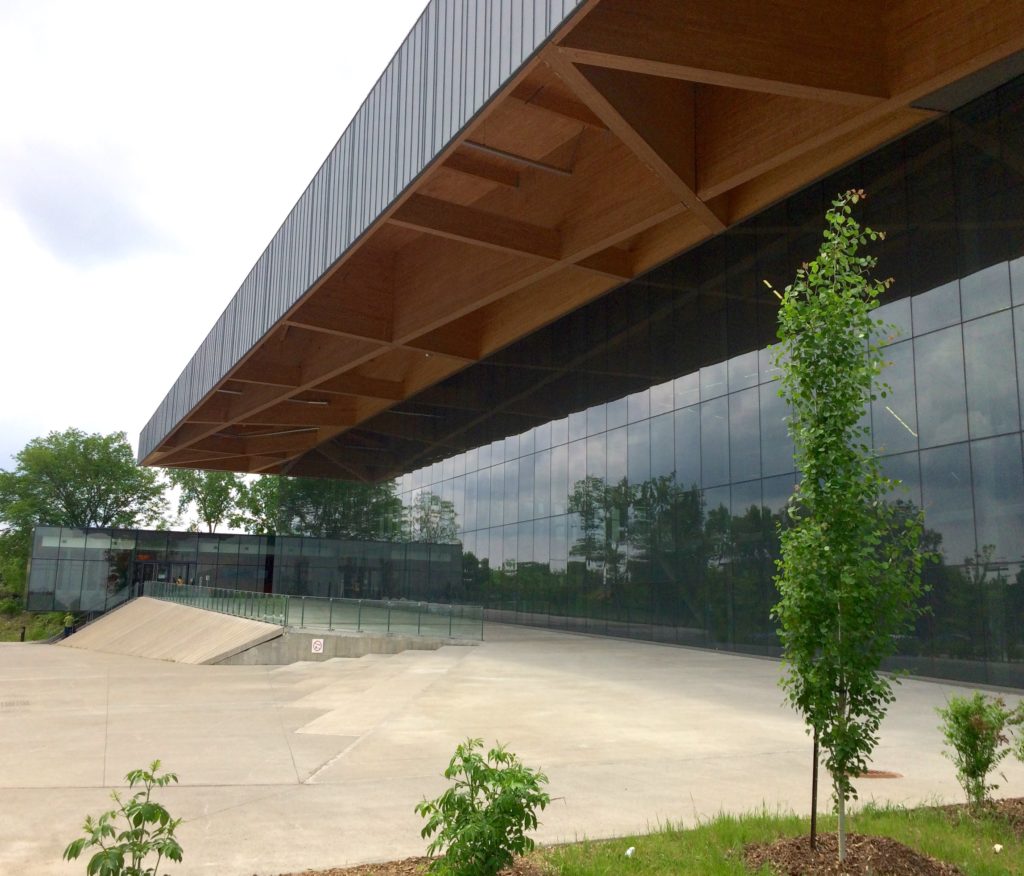
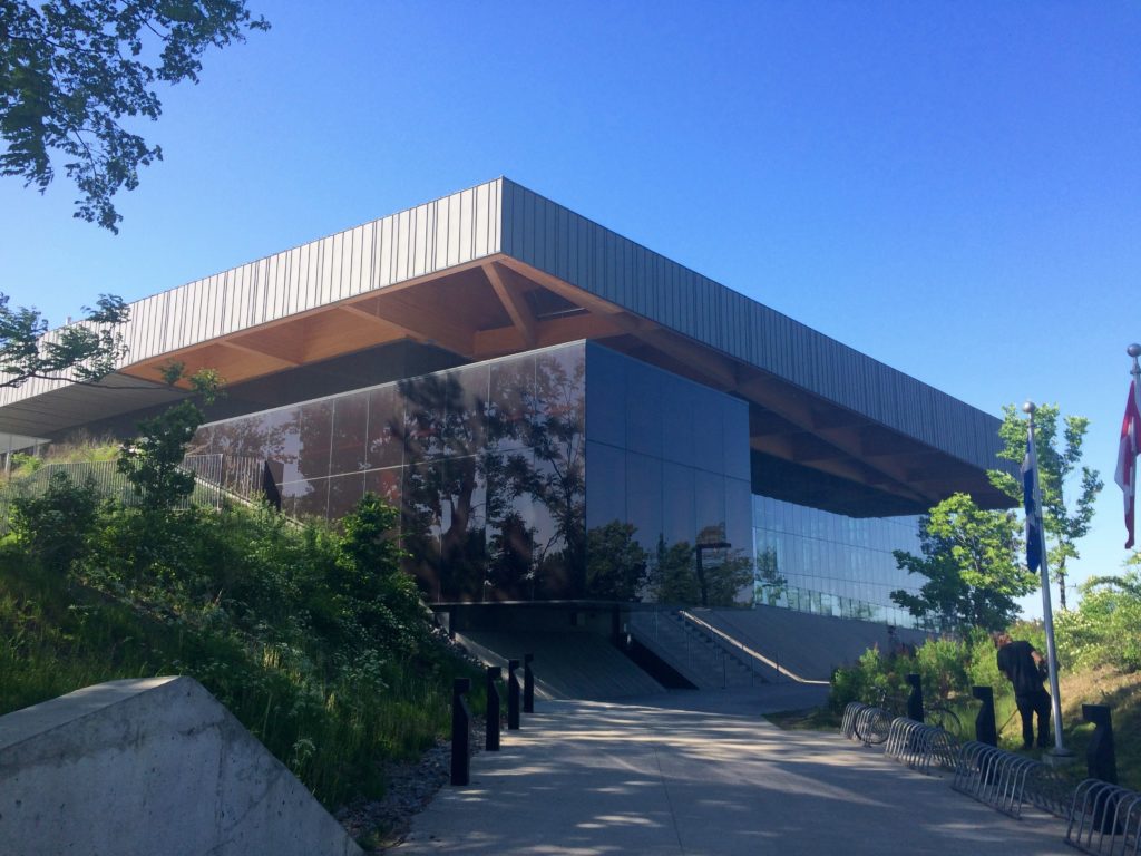
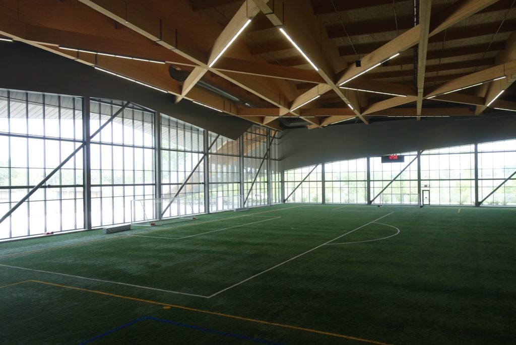
The Montreal Soccer Stadium project is the result of a competition in 2011 and was completed in 2015.  The Globe and Mail architecture critic called it ‘Canada’s most ambitious new public building’ in 2016. The ‘Stade’ is a community sports space defined broadly – the programme accommodates practices and games.  This is not a professional or spectator focused venue.

The centre is located on l’avenue Papineau, a major traffic artery where the stade’s  presence is minimized through the use of a large berm, soft landscaping and the breaking up of the streetside building volume.  In fact the facility barely registers from the road – this is not your big suburban sports box with a parking lot in front.  Other than the street parking entrance on the south side of the site, where there is little indication of what is to come, there are two pedestrian access points to the facility from Papineau – one modestly scaled while the other provides some glimpse of the drama of the project.

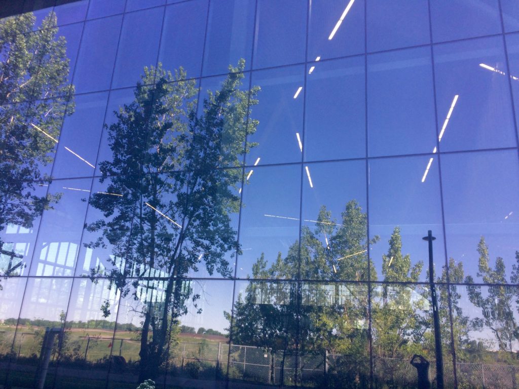
In terms of the mass that houses the main field, the building provides few cues on the exterior to help understand its size – and from a number of views, the scale is deceptive.  Some exterior photos here may be misleading until one finds a person for scale – for examples, enlarge the first and last photo below by clicking or double clinking on them. The building has its largest presence from the parking lot on the the south side.  Here the laminated wood beam roof structure, which is a key parti element, is highest and is expressed as a  big simple cantilever.  On this side the roof essentially floats above the large expanse of dark reflective glazing.  From above the south facade, the roof progressively drops toward the north, where eventually corner portions of the roof mass meet the ground to enclose a plaza space, and conceptually link to an exterior soccer field.  The simply glazed wall that is seen from the the parking lot is another key parti element.  From the south, the reflective glass wall wraps around to the the east and north, bringing in natural light to the main field on three sides, and providing visual connections to adjacent park space.

The photos here were taken June 1st and 3rd.

*****


NOA 46 – New Memorial Breaks Ground

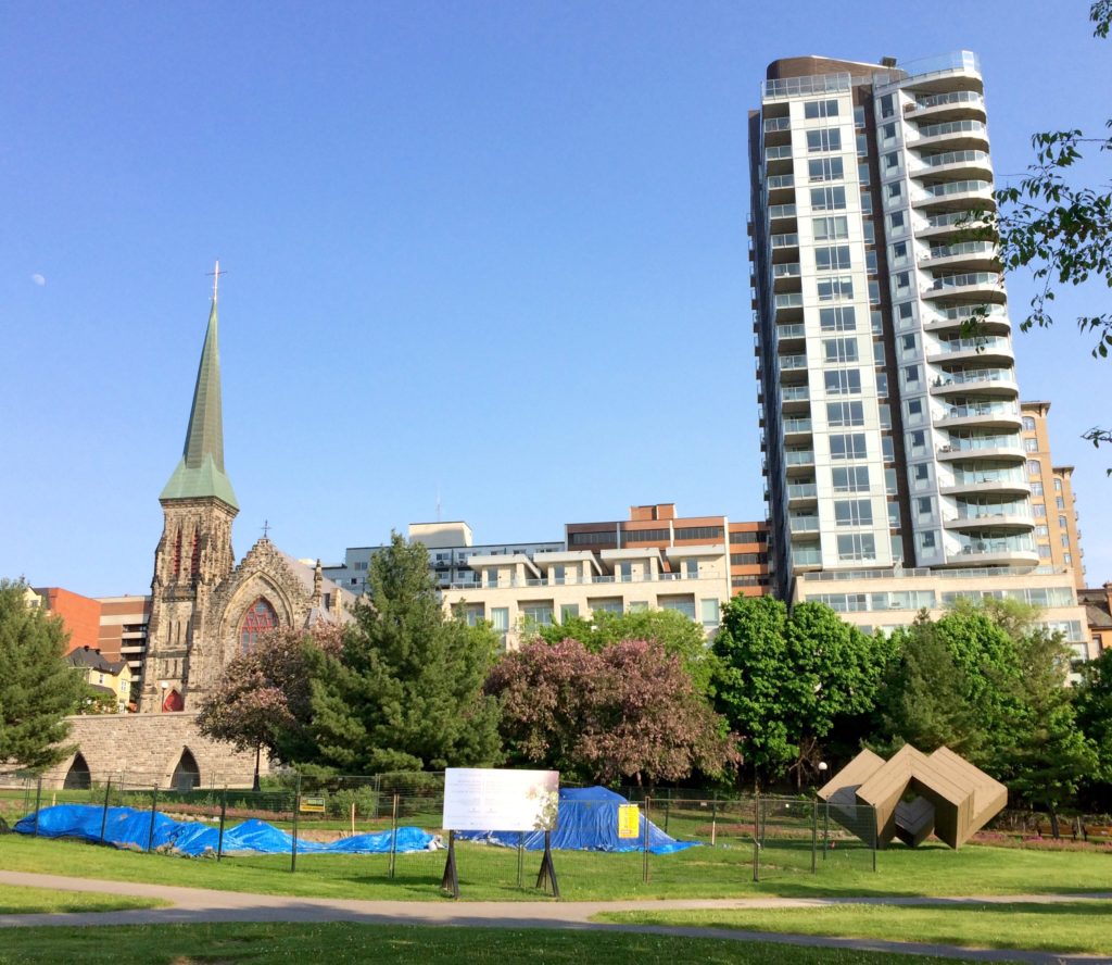
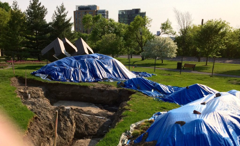
A new memorial in Ottawa has broken ground at the Garden of the Provinces, a downtown park.  The site is on the south side of Wellington Street, a high profile landscaped traffic artery.  Wellington Street is part of a ceremonial circuit that connects Ottawa and Hull, Quebec and Ontario – the route is also known as Confederation Boulevard.  The new memorial is dedicated to the victims of communism.   Over a number of  years that may be nearing a decade, the project has had some controversy, and has had seen at least one change in site.

The project design team includes Paul Raff, artist, architect and team lead; Michael A. Ormston-Holloway, designer and certified arborist; Brett Hoornaert, landscape architect; and Luke Kairys, landscape architect.


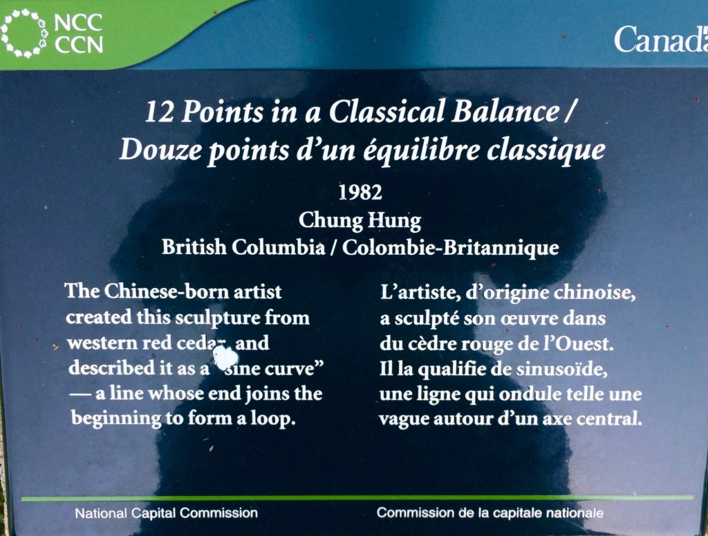
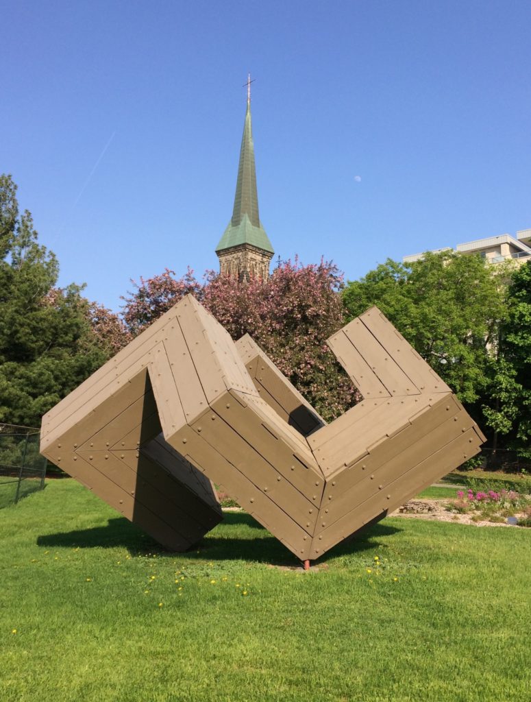
A sculpture titled 12 Points in a Classical Balance / Douze points d’un équilibre classique is currently located just west of the new memorial’s site.

*****
NOA 45 – Festival Style

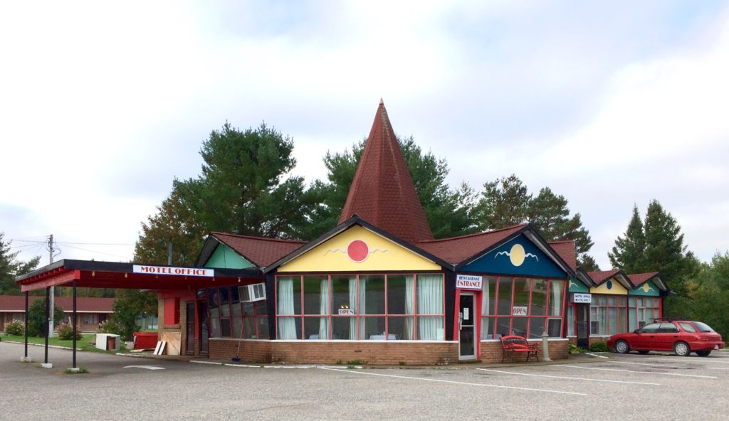
September 29th 2016 – The Red Top Motor Inn is located in the village of Iron Bridge in the Municipality of Huron Shores.

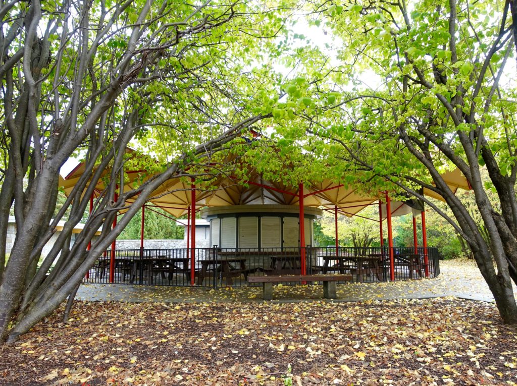
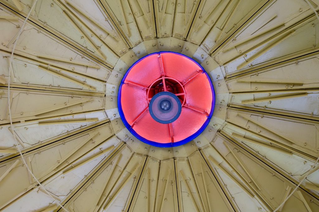
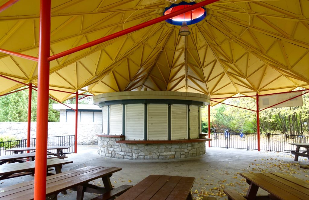
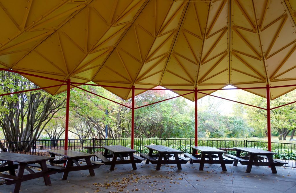
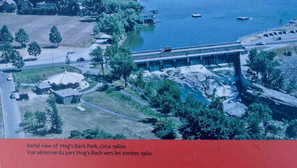
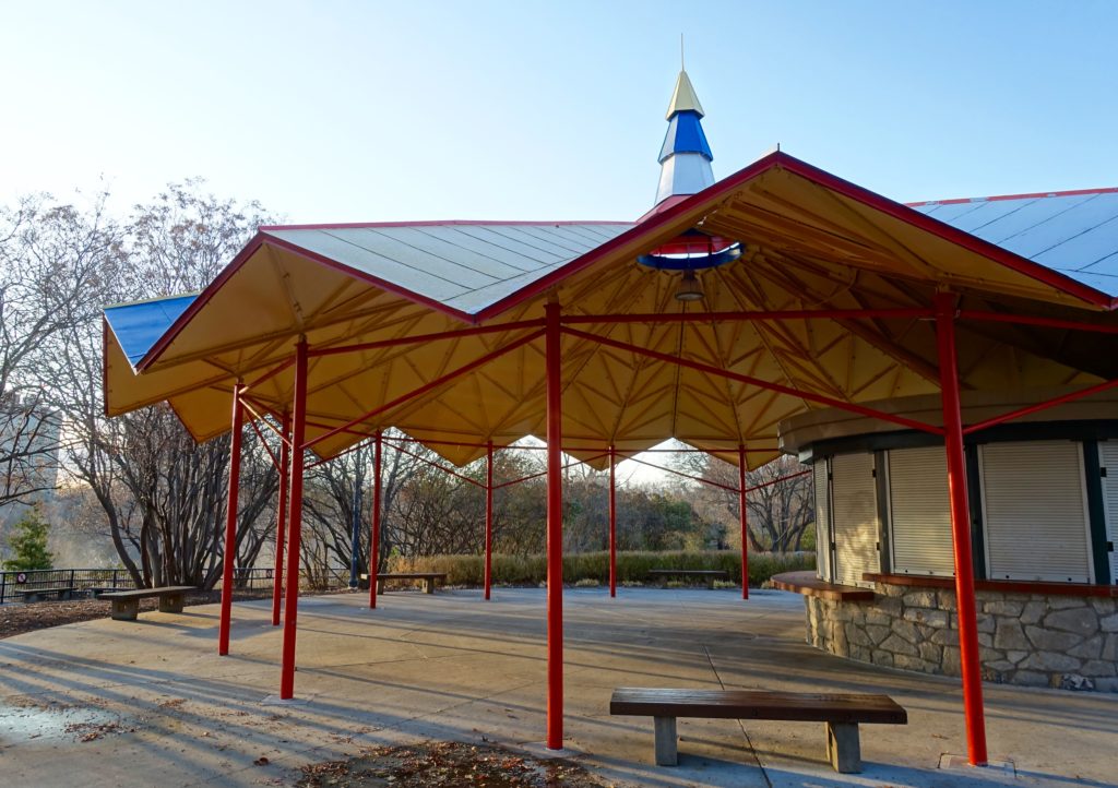
The The Red Top motel’s website claims  ‘Our unique main building, designed in the Festival Style and opened in 1961, is a landmark on Highway 17′.  Festival Style is not a common architectural term.  Doing a Google search today, no specific entry can be found online –  Wikipedia or otherwise.   The fact that background information on the Hog’s Back Park pavilion (see below) and the Red Top Motor Inn both reference the term, and that there is some aesthetic alignment between the buildings, could suggest that it is just a question of time before Wikipedia catches up.  Two buildings do not make a phenomenon, but it’s likely additional examples could be easily found.   That being said, Festival architecture is essentially a minor variation in modernism’s development but is still of some interest –  and as with any style, the quality of design and execution will vary widely.

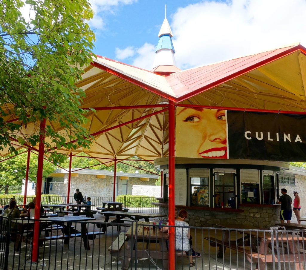
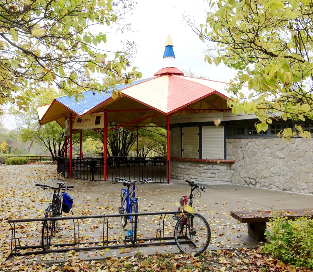
The photos below are images of the Hog’s Back Park pavilion that were taken  last fall.  An additional more recent photo of the pavilion, and reference to Festival Style, is included in the previous post on this site.

September 9th, 2017


October 15th, 2017


November 12th, 2017


*****
 

NOA 44 – Four Weeks

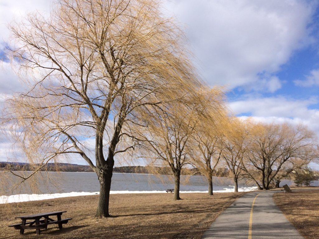
April 8 – Willows along Ottawa River Bikepath


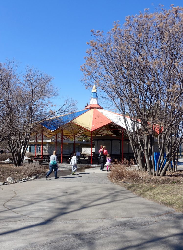
April 21st – Hogs Back Park

The concession pavilion at Hog’s Back Park was designed by architects Abra and Balharrie, and was completed in 1955.  According to an information panel that was added as part of a 2011 rehabilitation project, the style here is “festival architecture”, and apparently is ‘typical of this ebullient postwar era.’  The panel goes on to note that the ‘striking, colourful “folded” roof of the canopy, and the structure’s ultra-modern appearance were well appreciated when unveiled.’


May 6th – Azaleas at Arboretum


May 6th – Gatineau River


May 8th – Victoria Island


Today – Hull


*****
NOA 43 – Architectural Detail at the Memorial Buildings

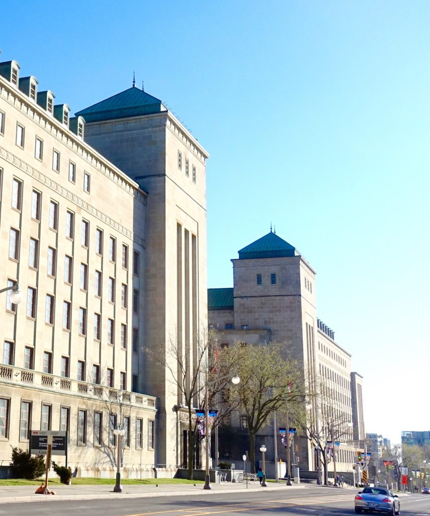
The images here highlight a few feature architectural elements at entrances to the almost matching East and West Memorial Buildings in Ottawa. The buildings were designed for civil service functions, and built between 1949 and 1958.  The architects are Alward and Goinlock.  The aesthetic blends federal pre-modern classicism with elements that have a more modern sensibility – this shows at the level of the complex’s overall massing, and with the architectural detail.  The designer’s challenge was to resolve the requirements of the formal environment, the programme, and the spirit of the post war period.  At the time, the aesthetic may have owed something to the British architect Lutyens who dealt successfully with many of the same challenges internationally.  Looking forward, the aesthetic is in some senses a precursor to the work of Leon Krier and other Post-modernists.

Images can be seen at a larger scale by clicking or double clicking on them


*****
NOA42 – New accommodations for a school of architecture

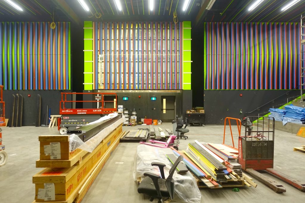
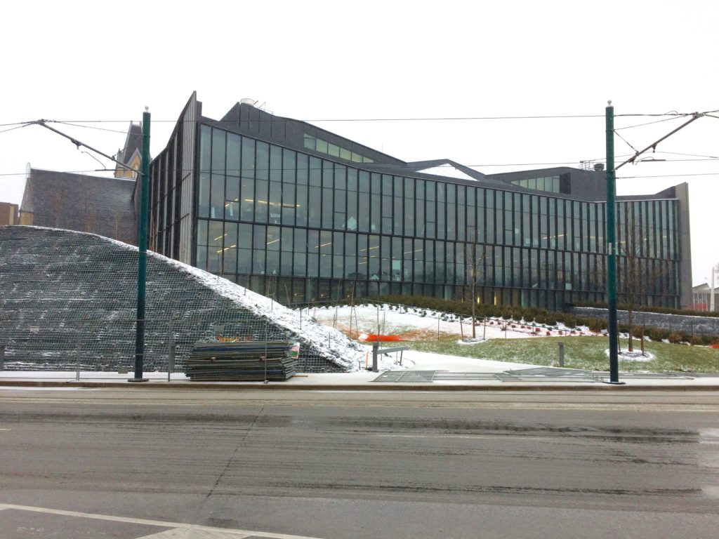
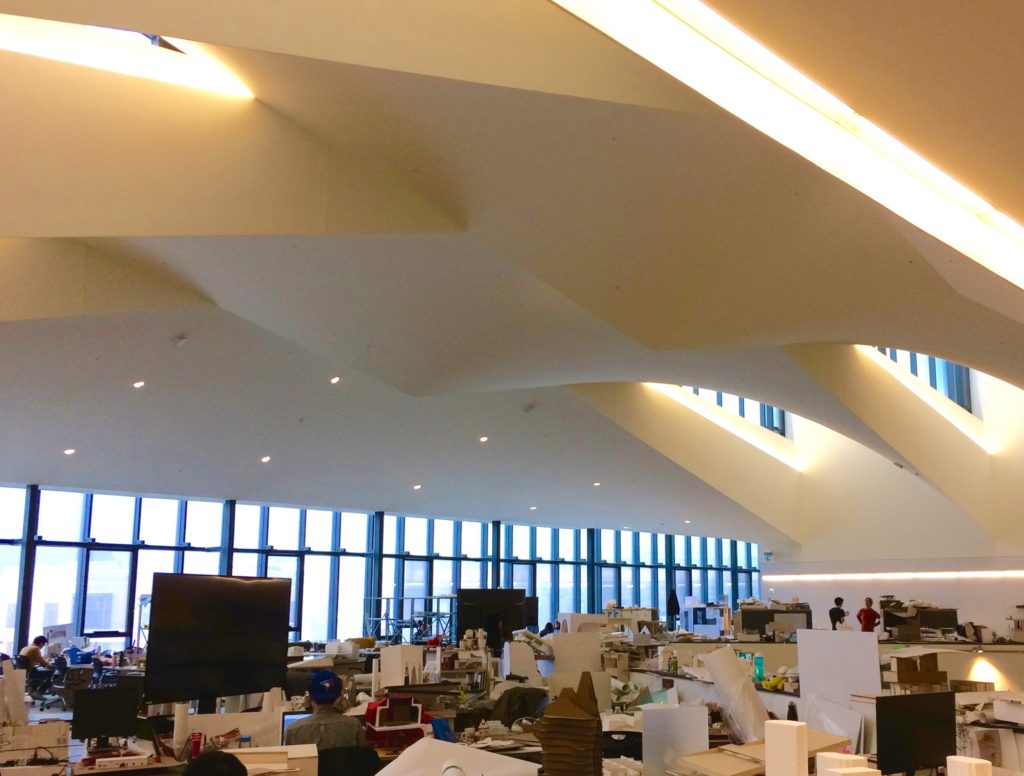
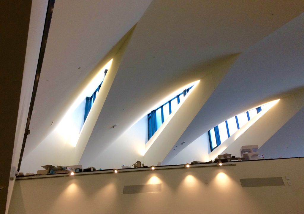
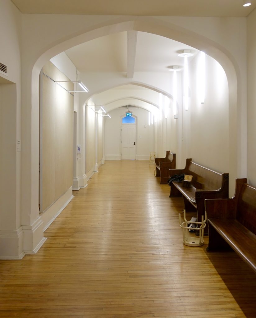
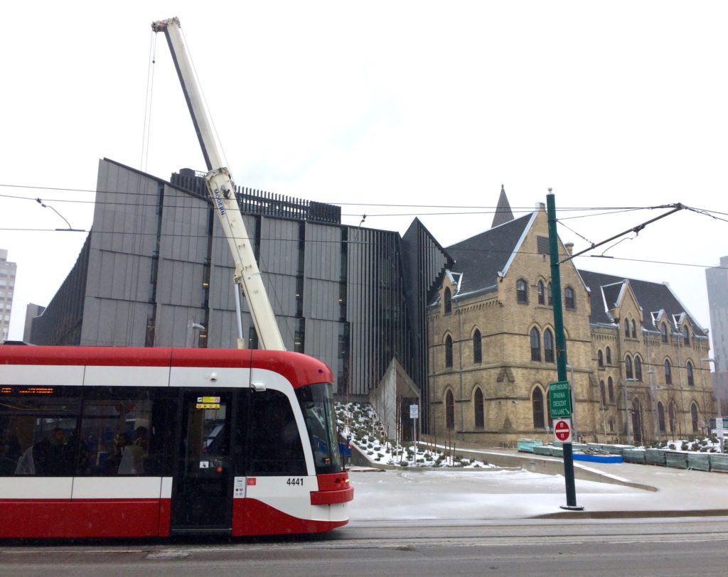
Construction activity is nearing completion at the University of Toronto’s John H. Daniels Faculty of Architecture, Landscape, and Design.  Some portions of the school, including the studios, are now open and being used by students and staff.

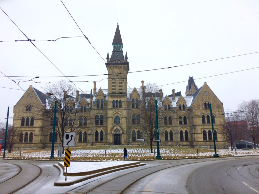
The project is on the university’s main downtown campus, within a traffic circle.  The design for the school brings together two key components – a substantial new addition and an older heritage building.    On the north side is the addition.  It is contemporary steel and glass.  To the south, is a former college of theology that dates from 1875.  It is brick victorian gothic revival.  Each part has a strong presence on the site, and as the new combined mass is seen from all sides, the hierarchy of front, back and side elevations is atypical.  The addition holds its own as a distinct piece and is not subordinate to the historic fabric.

The current renovation/addition is the outcome of a competition.  The project is designed by Boston and New York based NADAAA, with ERA architects as heritage consultants.  Given the contrasting aesthetics of the project, the relationships between the components, and the overall design resolution, it is to be expected that there will be some wide range of critique of the work. Certainly there are some challenging and debatable aspects to the concept and design – as well as successes.


*****

NOA41 – A Mies van der Rohe Service Station

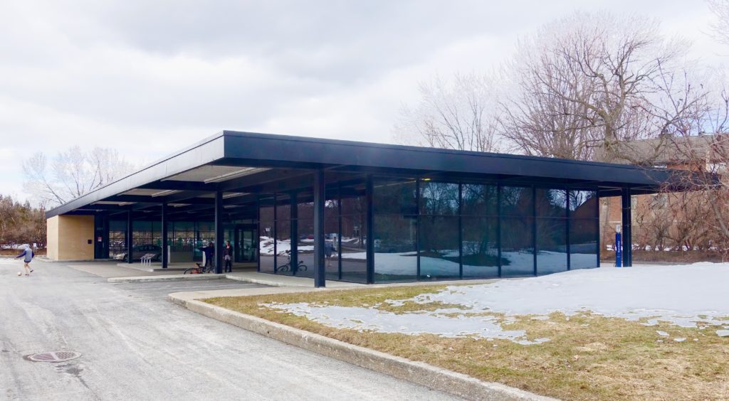
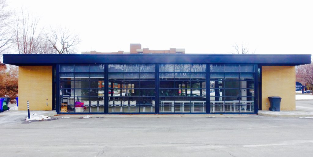
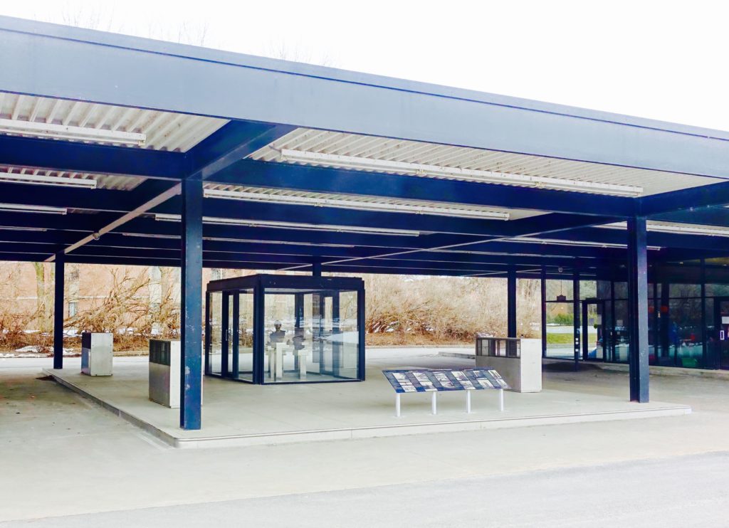
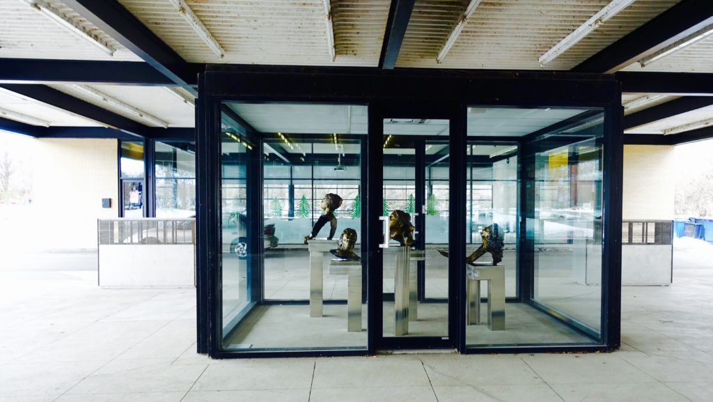
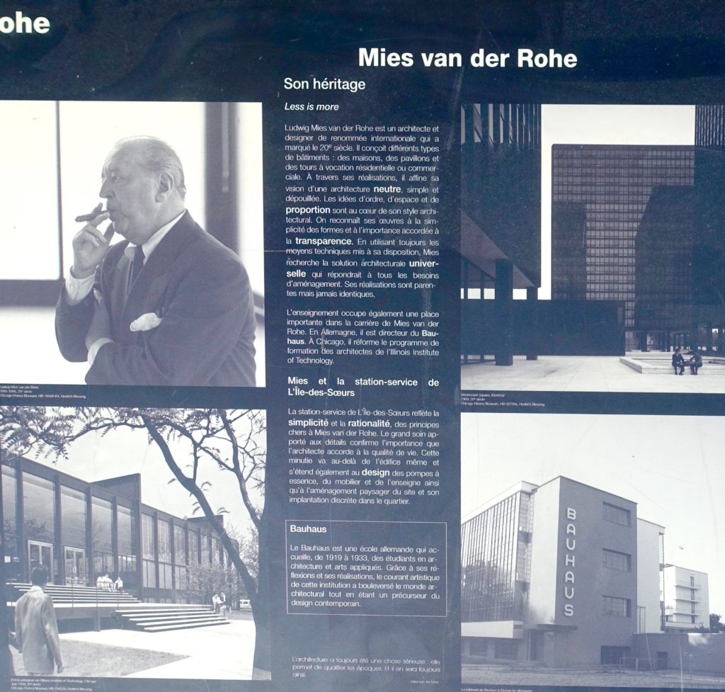
This service station was designed by Mies van der Rohe for ESSO in 1967 – 1968. It is located on l’ile des Soeurs in Montreal.  The station closed in 2008 and was converted three years later to an ‘intergenerational community centre’.  The renovation/restoration project was led by the architectural firm FABG in Montreal.  Much care was been taken with the recent project, to maintain the spirit of Mies’s  original aesthetic.  A series of exterior information panels have been added that provide some background and history on Mies, and the project itself.

At university in the 1990’s, I wrote a short essay on Japonism that included a comparison of the design aesthetics of the Katsura Detached Palace in Kyoto to those of Mies van der Rohe – with both there is an alignment of simplicity, idealized harmonious proportions, and the attention to, and expression of detail.  In both cases there is a quiet stability in the design of elements, which are arranged in balanced asymmetrical compositions. Two obvious contrasts between Mies and the japanese palace are that of materiality (modern industrial steel and glass vs natural wood and paper) and the variations in the colour palettes.

The photos with this post were taken on the afternoon of March 24th, a grey Saturday.  The raw digital files provided images that were dull and sombre.  Beyond the typical adjustments of cropping, fine tuning exposure and contrast, here the colour saturation has been turned up and in some cases a filter added.

The top portion of the panel here explains;

Mies van der Rohe – Son héritage

Less is more

Ludvig Mies Van der Rohe est une architecte et designer de renommée internationale qui a marqué le 20ieme siècle. Il conçoit différents types de bâtiments, des maisons, des pavillons et des tours à vocation résidentielle ou commerciales.  A travers ses réalisations, il affine sa vision d’une architecture neutre, simple et dépouillée.  Les idées d’ordre, d’espace et de proportion, sont au coeur de son style architectural.  On reconnaît ses oeuvres à la simplicité des formes et à l’importance accodée a la transparance.  En utilisant les moyen techniques mis à sa disposition, Mies recherche la solution architecturale universelle qui repondrait à tous les besoins d’amènagement.  Ses réalisations sont parentes mais jamais identiques

*****
NOA40 – National Gallery – Construction Hoarding

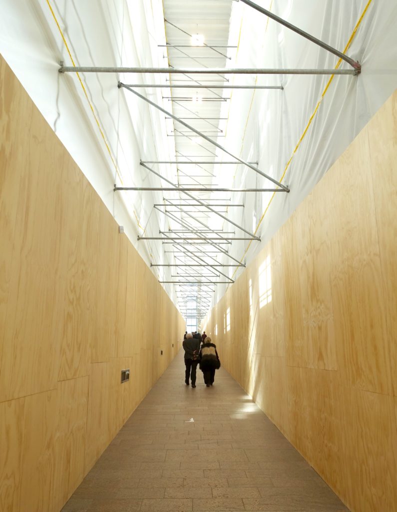
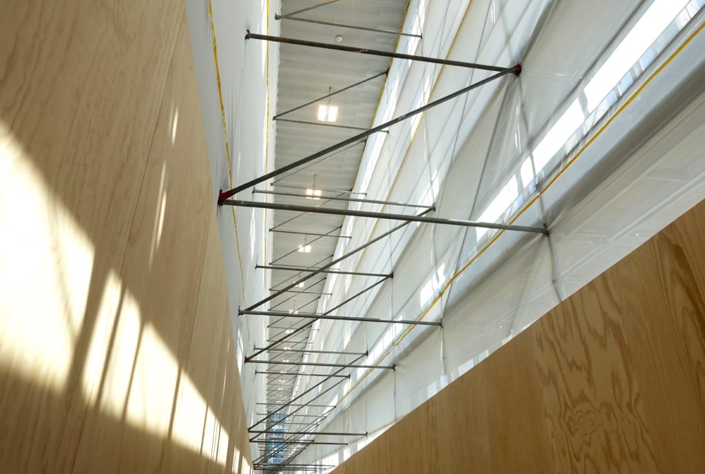
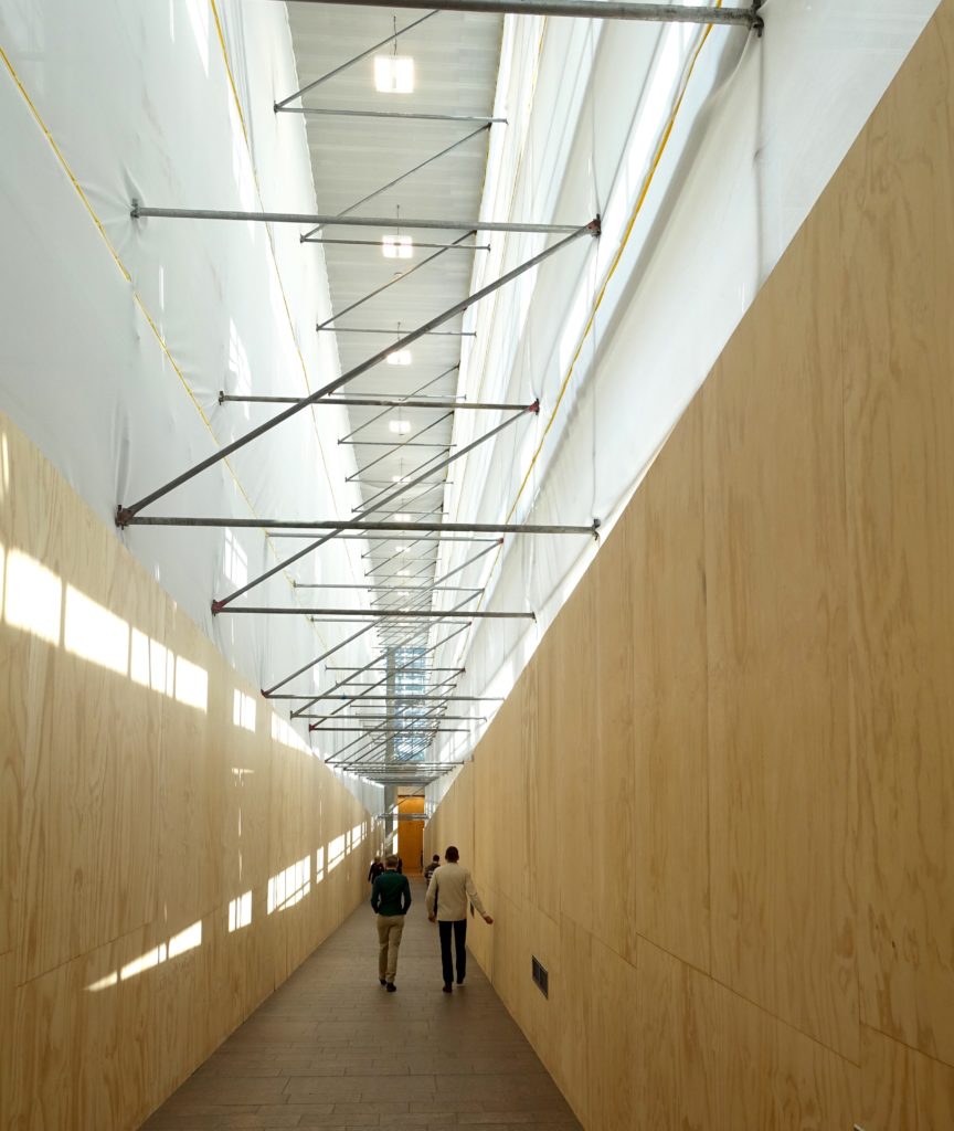
The image above shows the current state of a key linking portion of the National Gallery’s entry sequence.  This long multi-storied hall is a gently sloping ramp that connects two glass pavilions – the lower one serving as the main entrance and ticketing space – the upper one is the first access point into the galleries proper. This is a simple ‘promenade architectuale’ that brings visitors to art – a figurative and literal elevation.

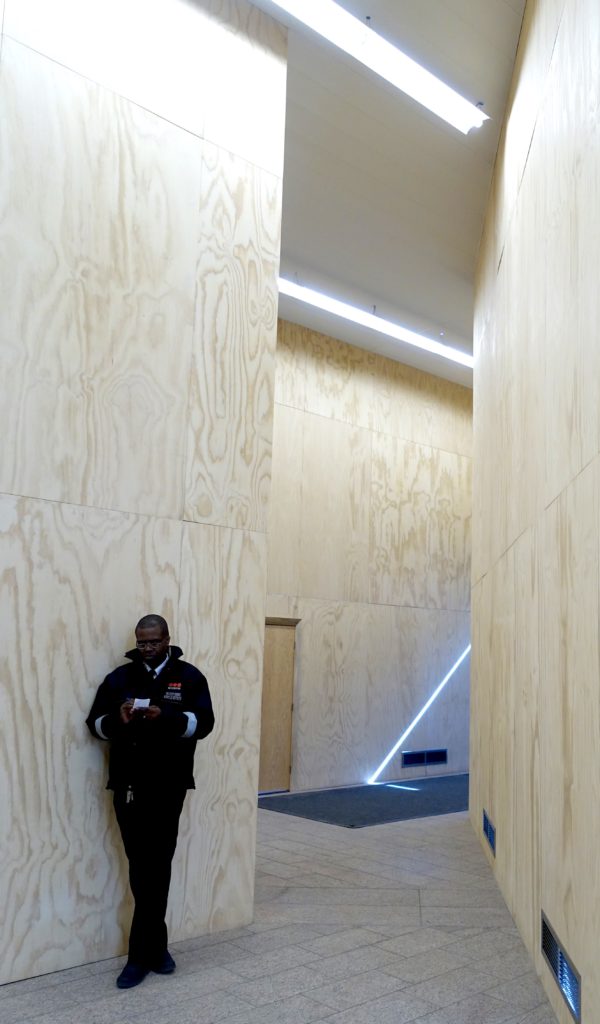
With the renovation project now underway, it is interesting that the institution has taken such care to maintain some aspects of the space’s original design qualities – in particular the walkway’s height and abundant natural light.  It is not usual to see hoarding go this far beyond the basic functional requirements for project safety.  This walkway, in it’s usual non-construction state, is striking – it is south facing with expansive views that include the Rideau Canal and Parliament Hill.  Now, with the warm unfinished plywood and vinyl canvas hoarding in place, the hall has the feel of a designed installation.

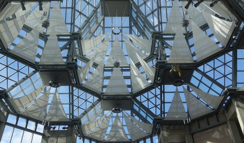
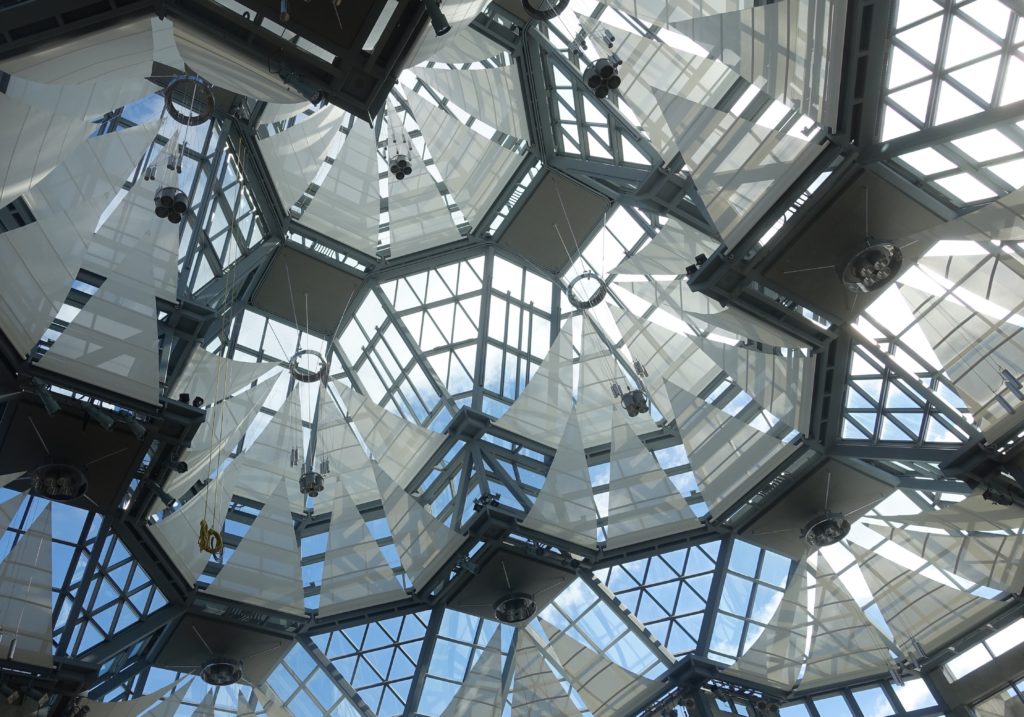
The images with this post are shown in the order taken on a visit to the gallery Saturday.  They can be enlarged by clicking or double clicking on them. The next image below is a detail from the upper glass pavilion, highlighting the regular complexity of the roof’s lantern structure.


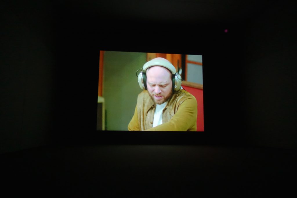
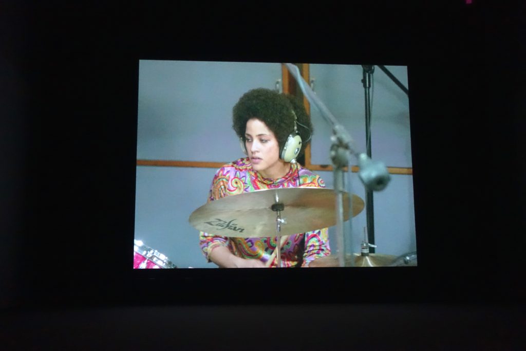
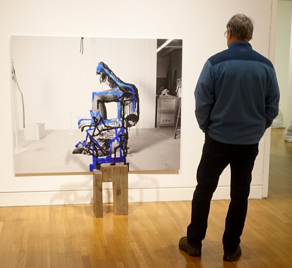
The six images following show work included in the 2017 Canadian Biennial which closed on Sunday.  The National Gallery’s website notes that the exhibition ‘brings together a comprehensive selection of works acquired since 2014 by the Gallery’s departments of Contemporary Art, Indigenous Art, and the Canadian Photography Institute…’

Maya Lin


Stan Douglas


Susan Point


Nick Cave


(artist reference to be added)


Exiting


*****