
A late winter half hour walk.
…..
Architectural Design+Process
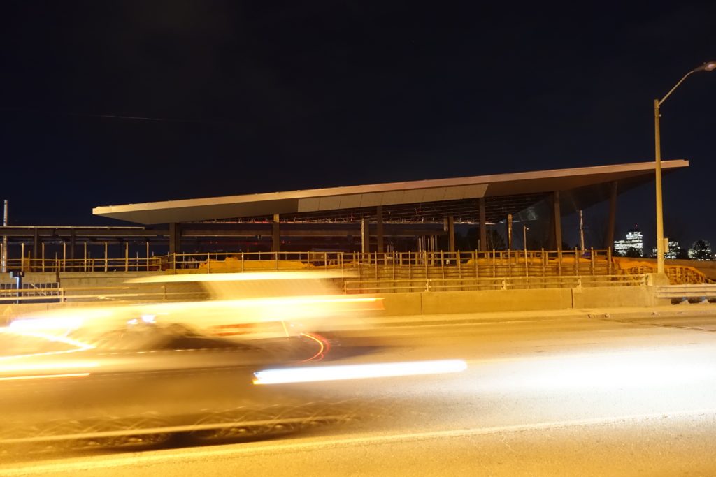
The photo above and the five following show Ottawa’s LRT Bayview Station under construction. It will be a transit hub linking the new Confederation Line to the existing Trillium Line. Street level here is in fact a raised bridge, as is the platform level for the Confederation Line. The station also connects to two major bike routes, is near city parks, and there are signs that show planning for large scale urban development nearby. The four photo’s furthest below are of the next station to the west on the Confederation Line, at Tunney’s Pasture. The new stations shown here, and under construction at a number of other locations in the city, are dynamic asymmetrical buildings, reflecting a popular variation in contemporary architecture – in this case a sort of small scale Blade Runneresque.
Photos can be viewed at a larger scale by clicking or double clicking on them.
The following photos show progress on the Tunney’s Pasture Station. Here the LRT line and platform are below street level in what is essentially an open trench. The trench was excavated as part of Ottawa’s last major public transportation effort that dates from the 1980’s and 90’s. At that time a number of transit dedicated bus routes were developed, in many cases using existing right-of-ways. The new LRT Confederation line overlays some portions of the dedicated routes. Similar to subway or LRTs, the bus system included connecting transfer stations. At these, shelters and bridges were designed using an aesthetic of poured-in-place concrete with red painted metal trim as accent elements. While the older stations have some subtle architectural sophistication, many today would only see them as now tired late brutalism. The new LRT stations are in sharp contrast to these.
Theses images show progress on the Booth Street LRT Station under construction in Ottawa. The first seven photos are from Saturday, February 17th, 2018. The last three shots, furthest below, were taken 8 weeks back, around the end of December. Earlier posts on this site, from June 2017, show the project when the steel framing was partially complete.
While not making any aesthetic conclusions at this time regarding the project, there are periods during the development and construction of an architectural work, where the design’s core idea or conceptual ‘parti’ is most clearly expressed. It is not always at the end of construction – it could have constancy, be earlier, or much latter.
The pictures here are all raw digital files. Information regarding the designers, builders and sponsors, will be added.
***
The images here are details from a permanent exhibit at the McCord Museum in Montreal, from the museum’s First Peoples Collection. The exhibit is titled Wearing our Identity – Porter Son Identité. The show also features contemporary artwork by first nations artists. This series of detail photos from the show highlights traditional and decorative patterns, much of this in the form of beadwork. Patterns range from figurative (e.g. flowers) to abstraction and symbolism.
All of the images here are raw digital files, they have not been cropped, or adjusted in any way. In some cases the colours appear to be oversaturated, or overexposed, but what is shown is simply the effect of the museums general and accent lighting, and the camera’s ‘intelligence’ in reading the subject. The photos are shown in the order they were taken.
By way of explanation on the show’s intent, the museum’s website states: This permanent exhibition enables the public to explore the complex heritage of the First Peoples of Canada and learn more about how their dress has helped define their rich cultures and identities. Wearing our Identity – The First Peoples Collection will also help visitors learn about the importance of clothing in the development, preservation and communication of the social, cultural, political and spiritual identities of the First Nations, Inuit and Métis.
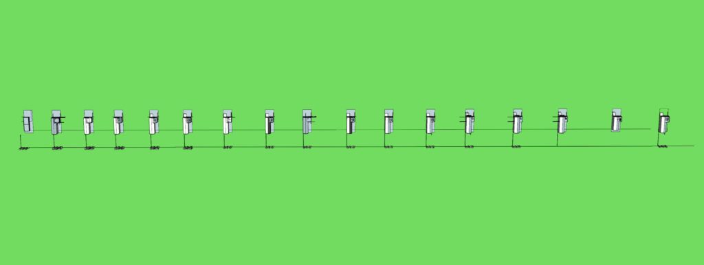
The studies here were done last summer for a renovation and addition project for a home located in a mature neighborhood in a mid-sized city. The scope included renovation areas and options within the existing two storey brick clad structure, and to one side, add a garage with a studio above.
As a major change to the home, and as a process, the addition was engaging. Though little is shown here of the project’s specific site, program and aesthetic constraints, there were a good number each requiring due consideration. The work started with interior planning exercises, and one preconceived massing solution for the addition. In terms of models, seventeen were generated side by side in a single digital file, presenting an unfolding linear process – that is ultimately non-linear. None of the individual models are fully resolved, but as a method, each contains a needed adjustment or exploration. Some of the models are sub-studies – themes to a persistent theme. This work were done over a relatively short period, and the execution is sketchy but appropriate for the purpose. At the end of the series as noted above, none of the models were fully resolved architecturally, but there were several ideas with potential. These could be appropriate for further review.
Earlier in the year I received the questions below from Kate, the daughter of an old friend of mine. Kate is in high school and was considering architecture as a career. I thought they were good questions and wasn’t able to respond thoughtfully right away – and then it took me some weeks to finally sit down one evening and reply. Re-visiting the Q&A now, I would be tempted to make multiple revisions, and may do so yet in another format. In any case, I will let the original answers stand here, but would welcome the thoughts of others on how they might provide guidance to someone like K, or to me for that matter.
Q – March 2017
Hi ……
Hope you are well. I am starting to think about what I might like to study in University and architecture is one thing I am considering. I wondered if I might ask you a few questions.
Do you think there are any particular courses in high school that I should take?
If I am not particularly good at drawing can I still be an architect?
What do you think the Job prospects are for architect graduates?
What are your favourite things about being an architect?
What are your least favourite things about being an architect?
Where did your interest in architecture come from?
There is no particular rush so feel free to respond at your convenience.
Thank you very much,
Kate
A – April 2017
Hi Kate – I am following up on your questions below. I think you should also talk to a career counsellor – I expect they would have helpful material
Q – Do you think there are any particular courses in high school that I should take?
A – A broad high school education is good. Many people suggest sciences and maths, but some level of arts is also good. I took several drafting courses – today I assume people are learning drawing and modelling on computers.
Q – If I am not particularly good at drawing can I still be an architect?
A – Yes – some level of innate drawing ability is great – but many architects are not particularly good ‘drawers’, and you can learn. My drawing ability is not exceptional, and what I can do, I learned.
Q – What do you think the Job prospects are for architect graduates?
A- I would say ok – not particularly good or bad – those who are really interested will find work.
Q – What are your favourite things about being an architect?
A – Lots of variety – at least that has been my case. I’ve worked on a whole range of projects. I also like looking at project scope and trying to make whatever I am working on better architecture.
Q – What are your least favourite things about being an architect?
A – It’s not all fun – deadlines, meetings – it is work.
Q – Where did your interest in architecture come from?
A – Good question – It was there. But I did have other interests too.
Conclusion
As noted above, I am tempted now to make revisions to the text sent to K in April. In some cases the answers, while perhaps holding some bit of truth, appear glib. That may have been partially the result of expediency the evening I sat down to reply – the interest in not further delaying a response.
The questions presented an opportunity to lay out a broad assessment of architecture as a career – to present a balanced outlook that can certainly be viewed positively. And this was an opportunity to provide the story of an individual in the field. There are millions of answers to this set of questions, and I would be interested in hearing other perspectives.
***
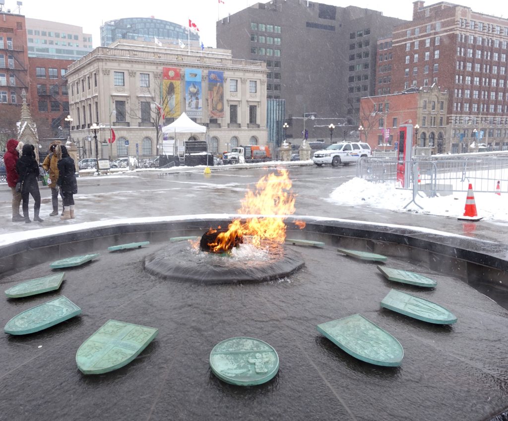
The Centennial Flame project for Canada 150 is now compete on Parliament Hill
Ice Rink on Parliament Hill – a minor hockey tournament will take place on the hill over the holidays.
Public art in one of the Byward Market ‘s courtyards – Together on a Winter Night, 2003 by Meelia Kelly 1940 – 2006
***
November 23rd – Rink on Parliament Hill.
The building that shows behind the ice rink here was formerly known as the Langevin Block. It was announced by the Prime Minister on June 21st, National Aboriginal Day, that the building would be renamed. Until there is an official change, the temporary designation for the building is the Office of the Prime Minister and Privy Council.
November 23rd – The Centennial Flame
The Centennial Flame which is adjacent to the rink on Parliament Hill, is undergoing a renovation project. The project will recognize the latest canadian territory realignment – which created Nunavut. The new territory will have presence among the 10 provinces and two territories that have been featured here for the last fifty years – since Canada’s Centennial year 1967. The image above is from the construction hoarding at the site. It shows the proposed updated design with 13 sides.
December 1st – Dusk The ice rink on Parliament Hill with the East Block behind
December 1st – Dusk Detail
***
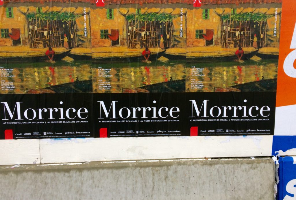
Above – Morrice Morrice Morrice Construction Hoarding.
Note all images can be viewed at a larger scale by clicking or double clicking on them. In the case of JWM, blowing up an image is generally less about getting information on the subject matter, than it is about looking at painterly qualities.
James Wilson Morrice b. 1865, Montreal, d. 1924 Tunis
A modestly scaled feature exhibition of Morrice’s work at the National Gallery continues to March 2018. As part of its permanent collection, the institution also includes a room of Morrice paintings in the Canadian galleries. The cropped snapshots of work shown here come from both the temporary and permanent exhibits. These small paintings, many of them bright and light driven, many of them landscapes, many of them exotic, are of interest. Morrice as a colourist is sophisticated, and the pictures, as a friend pointed out, have an architectural quality – both in terms of their subject matter, as well as the painter’s frequent use of flat orthogonal compositions. Much of his inspiration came from overseas travel with destinations in France, Italy, North Africa and the Caribbean. In fact, his adult life was essentially Paris based, but did include annual visits home to Quebec. In terms of art history, J. W. Morrice is considered a Post-Impressionist.
The works on display at the National Gallery have made available through a gift by A. K. Prakash.
Detail from Tanger, paysage, 1912
***